9.7
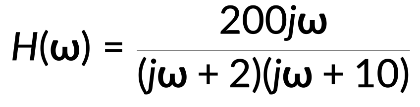
伯德图(Bode plot)是控制系统分析中必不可少的重要工具,它能够通过均与对数频率轴为基准的幅度图和相位图来映射系统的频率响应。要绘制伯德图,那么则需要对传递函数H (ω) 来进行分析:
它具有恒定增益、零点和极点。在经过标准化处理后,便能够将传递函数写为:
这个标准化函数中的每个项都会对伯德图…
心电图(E-C-G)中的组织电极在组织与测量电极之间建立导电通路,从而实现对心脏活动的观测。
电极-组织界面的动力学可用一个电路模型来描述,该模型包括电极电阻、电极-组织界面处的电容以及组织电阻。电位差表示电极与组织之间的电压差。
此处,输入阻抗等于组织电阻。输出阻抗为组织电阻与电极-组织界面处电阻和电容并联组合的阻抗之和。
利用已知的电阻和电容值计算输出相量与输入相量的比值,即为传递函数。
这可以通过三个不同的频率范围进行近似。
半对数坐标图上的伯德幅频特性曲线表示以分贝为单位计算的对数增益与以弧度每秒为单位的频率之间的关系。
低频和高频渐近线是具有恒定增益的水平线。在中频范围内,渐近幅值图呈线性,斜率为每十倍频程20分贝。
View the full transcript and gain access to JoVE Core videos
Q1: What is a Bode plot and why is it used in frequency response analysis?
A Bode plot is an essential tool in control system analysis that maps the frequency response of a system through a magnitude plot and a phase plot, both against a logarithmic frequency axis. It enables engineers to visualize how a system responds across different frequencies, making it invaluable for designing and analyzing circuits and control systems.
Q2: How do zeros and poles affect the construction of a Bode plot?
Zeros and poles are critical components of the transfer function that determine the Bode plot's shape. A zero at the origin contributes a positive slope starting from the origin, while each pole introduces a breakpoint or corner frequency where the magnitude plot's slope decreases by 20 decibels per decade. Superposing the individual contributions of all zeros and poles creates the overall Bode plot.
Q3: What are corner frequencies and how do they influence the magnitude plot?
Corner frequencies, also called breakpoints, are specific frequencies where poles or zeros cause changes in the magnitude plot's slope. At each corner frequency, the slope of the magnitude plot decreases by 20 decibels per decade for poles. These frequencies mark transitions between different frequency ranges and are essential for constructing accurate asymptotic Bode plots.
Q4: How does the magnitude plot behave across low, intermediate, and high frequency ranges?
At low frequencies, the magnitude plot maintains a flat response with constant gain until reaching the first corner frequency. In the intermediate frequency range, the asymptotic magnitude plot becomes linear with a 20-decibel-per-decade slope. At high frequencies, the plot again becomes flat with a constant gain determined by the cumulative effect of all poles and zeros.
Q5: What role does the phase plot play in a complete Bode plot representation?
The phase plot complements the magnitude plot by showing how the system's phase response varies with frequency on a logarithmic scale. A zero at the origin causes the phase plot to start at 90 degrees, while poles cause the phase to decrease. The phase plot bends downward at corner frequencies, approaching -90 degrees at frequencies much higher than the highest corner frequency.
Q6: How is the asymptotic Bode plot refined to approximate actual frequency response?
The asymptotic Bode plot consists of straight lines connecting the contributions of each term in the transfer function. To approximate the actual frequency response more closely, smooth curves are added that intersect the asymptotic plot at each corner frequency. This refinement typically results in slight overshoot near corner frequencies, known as peaking.
Q7: How does the electrode-tissue interface model relate to Bode plot construction in biomedical applications?
In electrocardiogram electrodes, the electrode-tissue interface has a circuit model with resistance, capacitance, and tissue resistance components. The transfer function derived from this model can be approximated across three frequency ranges and plotted as a Bode magnitude plot on a semilog graph, showing logarithmic gain in decibels against frequency in radians per second.
