9.7
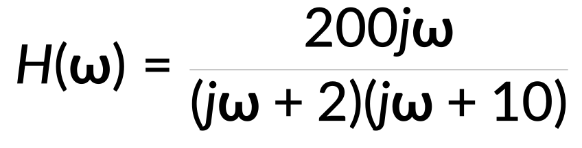
ボード線図は、制御システム解析に不可欠なツールで、システムの周波数応答を、対数周波数軸に対して振幅プロットと位相プロットでマッピングします。ボード線図を作成するには、伝達関数 H(ω) を考えます。
この関数には、一定のゲイン、ゼロ、および極があります。正規化後の伝達関数は、次のように記述されます。
…心電図の組織電極(E-C-G)は、組織と測定電極との間の電流の伝導経路を確立し、心臓の活動の観察を可能にします。
電極-組織界面ダイナミクスは、電極抵抗、電極-組織界面の静電容量、および組織抵抗を包含する回路モデルを持っています。電位差は、電極と組織との間の電圧差を表します。
ここで、入力インピーダンスは組織抵抗と等しくなります。出力インピーダンスは、電極-組織界面における抵抗と容量の並列組み合わせに組織抵抗を加算したものです。
出力フェーザと入力フェッサの比は、既知の抵抗値と静電容量の値を使用して計算され、伝達関数です。
これは、3つの異なる周波数範囲で近似できます。
半対数グラフ上のボード振幅プロットは、ラジアン/秒の周波数に対して計算された対数ゲインをデシベル単位で示しています。
低周波と高周波の漸近線は、ゲインが一定の水平線です。中間周波数範囲では、漸近振幅プロットは線形で、10 桁あたり 20 デシベルの傾きになります。
View the full transcript and gain access to JoVE Core videos
Q1: What is a Bode plot and why is it used in frequency response analysis?
A Bode plot is an essential tool in control system analysis that maps the frequency response of a system through a magnitude plot and a phase plot, both against a logarithmic frequency axis. It enables engineers to visualize how a system responds across different frequencies, making it invaluable for designing and analyzing circuits and control systems.
Q2: How do zeros and poles affect the construction of a Bode plot?
Zeros and poles are critical components of the transfer function that determine the Bode plot's shape. A zero at the origin contributes a positive slope starting from the origin, while each pole introduces a breakpoint or corner frequency where the magnitude plot's slope decreases by 20 decibels per decade. Superposing the individual contributions of all zeros and poles creates the overall Bode plot.
Q3: What are corner frequencies and how do they influence the magnitude plot?
Corner frequencies, also called breakpoints, are specific frequencies where poles or zeros cause changes in the magnitude plot's slope. At each corner frequency, the slope of the magnitude plot decreases by 20 decibels per decade for poles. These frequencies mark transitions between different frequency ranges and are essential for constructing accurate asymptotic Bode plots.
Q4: How does the magnitude plot behave across low, intermediate, and high frequency ranges?
At low frequencies, the magnitude plot maintains a flat response with constant gain until reaching the first corner frequency. In the intermediate frequency range, the asymptotic magnitude plot becomes linear with a 20-decibel-per-decade slope. At high frequencies, the plot again becomes flat with a constant gain determined by the cumulative effect of all poles and zeros.
Q5: What role does the phase plot play in a complete Bode plot representation?
The phase plot complements the magnitude plot by showing how the system's phase response varies with frequency on a logarithmic scale. A zero at the origin causes the phase plot to start at 90 degrees, while poles cause the phase to decrease. The phase plot bends downward at corner frequencies, approaching -90 degrees at frequencies much higher than the highest corner frequency.
Q6: How is the asymptotic Bode plot refined to approximate actual frequency response?
The asymptotic Bode plot consists of straight lines connecting the contributions of each term in the transfer function. To approximate the actual frequency response more closely, smooth curves are added that intersect the asymptotic plot at each corner frequency. This refinement typically results in slight overshoot near corner frequencies, known as peaking.
Q7: How does the electrode-tissue interface model relate to Bode plot construction in biomedical applications?
In electrocardiogram electrodes, the electrode-tissue interface has a circuit model with resistance, capacitance, and tissue resistance components. The transfer function derived from this model can be approximated across three frequency ranges and plotted as a Bode magnitude plot on a semilog graph, showing logarithmic gain in decibels against frequency in radians per second.