We present a flexible, extendible Jupyter-lab-based workflow for the unsupervised analysis of complex multi-omics datasets that combines different pre-processing steps, estimation of the multi-omics factor analysis model, and several downstream analyses.
Method Article
Application of Unsupervised Multi-Omic Factor Analysis to Uncover Patterns of Variation and Molecular Processes Linked to Cardiovascular Disease
In This Article
Summary
Abstract
Disease mechanisms are usually complex and governed by the interaction of several distinct molecular processes. Complex, multidimensional datasets are a valuable resource to generate more insights into those processes, but the analysis of such datasets can be challenging due to the high dimensionality resulting, for example, from different disease conditions, timepoints, and omics capturing the process at different resolutions.
Here, we showcase an approach to analyze and explore such a complex multiomics dataset in an unsupervised way by applying multi-omics factor analysis (MOFA) to a dataset generated from blood samples that capture the immune response in acute and chronic coronary syndromes. The dataset consists of several assays at differing resolutions, including sample-level cytokine data, plasma-proteomics and neutrophil prime-seq, and single-cell RNA-seq (scRNA-seq) data. Further complexity is added by having several different time points measured per patient and several patient subgroups.
The analysis workflow outlines how to integrate and analyze the data in several steps: (1) Data pre-processing and harmonization, (2) Estimation of the MOFA model, (3) Downstream analysis. Step 1 outlines how to process the features of the different data types, filter out low-quality features, and normalize them to harmonize their distributions for further analysis. Step 2 shows how to apply the MOFA model and explore the major sources of variance within the dataset across all omics and features. Step 3 presents several strategies for the downstream analysis of the captured patterns, linking them to the disease conditions and potential molecular processes governing those conditions.
Overall, we present a workflow for unsupervised data exploration of complex multi-omics datasets to enable the identification of major axes of variation composed of differing molecular features that can also be applied to other contexts and multi-omics datasets (including other assays as presented in the exemplary use case).
Introduction
Disease mechanisms are usually complex and governed by the interaction of several distinct molecular processes. Deciphering the complex molecular mechanisms that lead to specific diseases or govern the evolution of a disease is a task with high medical relevance as it might reveal new insights for understanding and treating diseases.
Recent technological advances enable to measure those processes on a higher resolution (e.g., on the single-cell level) and at various biological layers (e.g., DNA, mRNA, chromatin accessibility, DNA methylation, proteomics) at the same time. This leads to the increasing generation of large multidimensional biological datasets, which can be jointly analyzed to generate more insights into the underlying processes. At the same time, combining and analyzing the different data sources in a biologically meaningful way remains a challenging task1.
Different technological limits, noises, and ranges of variability between different omics pose one challenge. For example, single-cell RNA-sequencing (scRNA-seq) data is very sparse and often influenced by large technical or batch effects. Additionally, the feature space is often very large, ranging across several thousand measured genes or proteins, while sample sizes are limited. This is further complicated by complex designs, which might include several disease conditions, confounding factors, time points, and resolutions. For example, in the presented use case, different data types were available either on the single-cell or sample (bulk) level. Besides that, the data may be incomplete, and not all measurements might be available for all analyzed subjects.
Due to these challenges, different omics and included features are still often analyzed only separately2 even though performing an integrated analysis cannot only provide a complete picture of the process but biological and technical noises from one omic might also be compensated by other omics3,4. Several different methods have been proposed to perform an integrated analysis of multi-omics data, including Bayesian methods, network-based methods5,6, multimodal deep learning7, and dimensionality reduction methods via matrix factorization8,9. For the latter, the results of a large benchmarking study10 have shown the MOFA9 (multi-omic factor analysis) method to be one of the better-suited tools when data should be linked to clinical annotations.
Especially in complex settings, unsupervised matrix factorization methods are a useful approach to reduce complexity and extract shared and complementary signals from different data sources and features. By decomposing the complex space into lower-rank latent representations, the major sources of variance within the data can be quickly explored and linked to known covariates. In case the same pattern of variation is shared across multiple features (e.g., genes or proteins), this may be aggregated to a few factors while noise is reduced. Regularization can be used to increase the sparsity of model coefficients, which makes the approach well-suited in settings where the feature space is large while the number of samples is limited9.
This protocol presents a flexible analysis workflow that uses the MOFA model to showcase how to quickly explore a complex multi-omics dataset and distill the main patterns of variation that characterize this dataset. The workflow consists of three main steps. In the first step, Data pre-processing and harmonization, different strategies for data preprocessing based on different input data types (scRNA-seq, proteomics, cytokine, clinical data) are presented. The protocol elaborates on how to process the features of the different input datasets, filter out low-quality features, and normalize them to harmonize their distributions. We also show how those pre-processing decisions might affect downstream results. In the second step, the MOFA model is applied to the data, and the resulting variance decomposition can be used to evaluate the integration of the different datasets. The third step shows how to link the captured factors to covariates and uncover the molecular programs that define those factors. With the presented workflow, we were able to extract several latent factors linked to clinical covariates in a dataset of patients suffering from coronary syndromes and identify potential underlying multicellular immune programs from a previous project11. We will use this dataset here, but the protocol can easily be applied to other contexts, including other omics.
The dataset consists of samples from patients with stable chronic coronary syndromes (CCS), acute coronary syndromes (ACS), and a control group with healthy coronaries (non-CCS) (Figure 1). ACS is caused by plaque rupture in preexisting CCS, leading to an acute disruption of blood flow to the myocardium and a subsequent ischaemic injury of the heart. This injury causes an inflammatory response by the immune system followed by a reparative phase, which lasts until several days after the acute event12. To be able to characterize this immune response for ACS patients, blood samples were taken at four different timepoints: acute (TP1); after recanalization (14 [± 8] h) (TP2); 60 [± 12] h later (TP3); before discharge (6.5 [±1.5] days) (TP4) (Figure 1A). For CCS and patients with healthy coronaries, only one time point was available- (TP0). For all patients and time points different assays based on the blood samples were measured: clinical markers of inflammation (Creatine-Kinase (CK), CK-MB, Troponin, C-reactive protein (CRP)), scRNA-seq of peripheral blood mononuclear cells (PBMCs), cytokine analysis, plasma proteomics and prime-seq13 data of neutrophils.

Figure 1: Myocardial infarction multi-omic input dataset. Input dataset: The analyzed data includes blood samples from patients (n = 62) with acute coronary syndrome (ACS), chronic coronary syndromes (CCS), and patients with healthy coronaries (non-CCS). For ACS patients blood samples were included at four different time points (TP1-4), for CCS and non-CCS patients at a single time point (TP0). Each patient and time point combination is treated as a separate sample in the analysis. Different omic assays were measured on the samples: clinical blood tests (n = 125), scRNA-seq (n = 121), plasma-proteomics (n = 119), cytokine assay (n = 127) and neutrophil prime-seq (n = 121). Subsequently, the described protocol was applied to integrate the data across all omics and explore it using the MOFA model and further downstream analysis (factor analysis, pathway enrichment). Please click here to view a larger version of this figure.
As input for the workflow as presented here, we take raw counts from scRNA-seq data after processing with cellranger and quality control (QC) as, for example, outlined in the scanpy14 preprocessing tutorial. For cell-type annotation, we used the automated Azimuth15 pipeline. The counts are then aggregated on the sample level for each cell-type by taking the mean across all cells for each sample and cell-type (pseudobulk aggregation). Plasma-proteomics is included as normalized and median-centered intensities, and for neutrophils, we take the umi unique molecular identifier (UMI) exon counts from the prime-seq. On cytokine and clinical values, no previous preprocessing has been applied. Further details on the (experimental) data generation are outlined in the corresponding manuscript11. As the results presented here are based on using the automated Azimuth annotation for cell-types in the scRNA-seq data compared to the marker based strategy that was used in the referenced publication the results presented here are similar but not exactly the same as presented in the publication. In the manuscript it could be shown that the cell-type annotation strategy does not change the main patterns and biological interpretations of the analysis but small changes in the exact values resulting from the model might vary. Overall the input data was a complex multi-dimensional dataset including different time points and measurement levels (single-cells vs. bulk) of more than 10,000 different features (genes, proteins, clinical values). A strict pre-processing and data harmonization strategy followed by MOFA analysis has been shown to be a useful and quick tool for exploring the data and extracting relevant immune program. Each time point and patient combination is treated as an independent sample in the MOFA analysis. Each data type and cell-type is considered a separate view in the MOFA analysis.
This protocol provides instructions for preparing the input data for the workflow, executing the different workflow steps, customizing configurations, interpreting the resulting figures, and iteratively adjusting the configurations based on the interpretations. An overview of the different steps of the protocol, the required input datasets at each step, and resulting figures and datasets is given by the technical workflow overview (Figure 2).
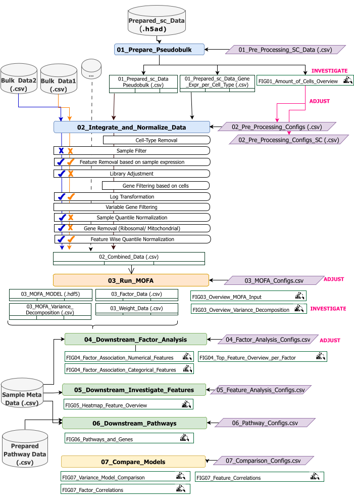
Figure 2: Technical workflow overview. Outline of the workflow for the analysis of the multi-omics dataset. The different elements are highlighted by different colors and symbols. Jupyter Notebooks belonging to the Data Preprocessing and Harmonization (1) step are colored in blue. Jupyter Notebooks belonging to the 'MOFA Model' (2) step are colored in orange. Jupyter Notebooks belonging to the 'Downstream Analysis' (3) step are colored in green. One Jupyter Notebook to be used for comparison of the results is colored in yellow. Configuration files where parameters for the execution of the workflow can be modified are highlighted in purple. Input datasets that are required to run the workflow are indicated by the dataset symbol and highlighted in grey. All figure outputs that are generated during the workflow execution are indicated by the magnifying glass symbol. Datasets generated during workflow execution are indicated as tables. In general, the workflow is executed sequentially: (1) Data Preprocessing and Harmonization consists of two steps: first generation of a pseudobulk table based on the scRNA-seq input data (01_Prepare_Pseudobulk) and subsequent integration and normalization of this data together with all the other sample-level (bulk) inputs (02_Integrate_and_Normalize_Data). Within this step via the configuration files, it is possible to configure for each dataset separately which of the indicated pre-processing and normalization steps (e.g., Sample Filter) should be applied. (2) 'MOFA Model': runs the MOFA model on the generated input of the first step with the configurations specified in the configuration file (03_MOFA_configs.csv) (3) 'Downstream Analysis': consists of three different notebooks which may be run independently of each other to generate insights into the generated MOFA results and associate them with sample meta-data (covariates) provided as input via the 'Sample Meta Data.csv' file. (4) 'Model Comparison': is a small separate step that may be used to compare different models generated in step 2. Please click here to view a larger version of this figure.
The workflow consists of several Jupyter Notebooks written in R and Python (knowledge of the R and Python language is not required to run the workflow but might be helpful in case errors appear). In various steps of the protocol, parameters are changed via configuration files ('.csv' files containing the postfix '_Configs' in the name). Within the protocol, we only outline the parameters that need to be changed starting from the default configuration.
Several other parameters may also be changed, for example to customize the pre-processing. A documentation of these parameters and explanations is given in the file 'Documentation_Config_Parameter', which is included in the downloaded repository.
Protocol
1. Preparations: Technical setup and installation
NOTE: To run this program, have wget, git, and Apptainer preinstalled on the device. A guide for installing Apptainer on different systems (Linux, Windows, Mac) is given here: https://apptainer.org/docs/admin/main/installation.html. Installation information on git can be found here: https://git-scm.com/book/en/v2/Getting-Started-Installing-Git. Depending on the size of the different input datasets, running the workflow on a suitable machine (16 CPU, 64GB Memory) is recommended. A smoke test with the provided example data can be executed on the local machine. Instructions and expected outputs from running the protocol on the example data are given in Supplementary File 1. Refer to Supplementary Video File 1 for the important steps of the protocol which are executed on the dataset outlined above.
- Open the console and choose or create a folder where all the analysis code and outputs will be stored. Navigate to the folder by typing the command: cd path_to_folder in the terminal.
- Download or clone the code repository from Github (https://github.com/heiniglab/mofa_workflow) or by typing git clone https://github.com/heiniglab/mofa_workflow.git in the terminal window.
- Download the image that contains all the required installations from Zenodo by typing wget https://zenodo.org/records/11192947/files/mofa_image.sif in the terminal window.
- Generate a folder in which all the result data will be stored by typing mkdir results in the terminal window.
- Generate a folder in which all the input data to be used in the analysis will be added by typing mkdir input_data in the terminal window.
- Execute the container that will start a JupyterLab session by typing the following command in the terminal: apptainer run mofa_image.sif. Copy the URL that is returned by the command to the browser, which will open up a Jupyter-lab session (more information on Jupyter-lab can be found in the software documentation16).
NOTE: When the workflow is executed locally on a laptop, it is recommended to use the command apptainer exec mofa_image.sif jupyter-lab instead, which will directly return a local host address. In case the container is executed within a clustered computing environment, it might be necessary to set up port forwarding, which can be done via ssh.
2. Initialization and data preparation
- In the Jupyter-Lab session, use the navigation menu on the left side. Navigate to the input_data folder by double-clicking on input_data.
- Copy all the datasets that will be used as input for the analysis to the input_data directory using Drag&Drop. Drag the file from the folder where it is currently located and drop it in the Jupyter-lab session in the area below the input_data folder.
NOTE: All datasets need to be either in .csv or .h5ad (in the case of single-cell data) format. All .csv files must contain a matching sample_id column (identical IDs have to be used across the datasets). All other columns will be used as features. Within the h5ad- file, the cell annotation must contain two identifiers specifying the sample_id and cluster_id. Those will be used for aggregation and matching. Omic datasets in other formats need to be converted to the specified .csv format before usage (Figure 3). scRNA-seq datasets given in .h5seurat format might be converted to .h5ad executing the Jupyter-notebook: 00_Data_Conversion.ipynb. - Navigate to the configurations folder by clicking on the folder symbol and then double-clicking on the folders mofa_workflow, scripts, and configurations. Within the folder, open the file Data_configs.csv by double-clicking on it.
- In the value column, add the paths to the folders of the input_data (data_path) and results (result_path) folders. Add a name that will be added as a file extension to all saved files in the value column for the configuration_name (this protocol used MI_v1 [Myocardial Infarction version1]) (Figure 4).
- Save the changes by clicking on File > Save CSV File in the menu at the top.
- Use the navigation menu on the left side to navigate to the scripts folder by clicking on scripts. Open the initialization notebook by double-clicking on 00_Configuration_Update.ipynb. Execute the script by clicking on the Restart kernel and run all cells button at the top, and clicking Restart in the pop-up (Figure 5).

Figure 3: Data input and setup. For the execution of the workflow, all data needs to be stored in a specified input_data folder. For each input dataset a separate file should be provided. Single-cell data should be given as .h5ad containing cell-annotation on the cluster_id (resulting, e.g., from previous cell-type annotation steps) and a sample_id column (uniquely identifying each separate sample that should be analyzed). All other input datasets should be given in '.csv' format, including one column specifying the sample_id (matching to the corresponding column of the single-cell data) and features to be used in the MOFA analysis in all other columns. Please click here to view a larger version of this figure.
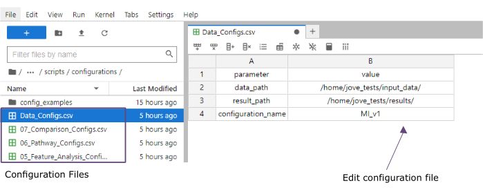
Figure 4: Jupyter-lab configuration files. During the execution of the workflow, changes in parameters (e.g., adjusting filtering options etc.) are specified via '.csv' configuration files. Within the cloned repository, default configuration files for each step are included. They may be edited directly in the jupyter-lab console, similarly as in a spreadsheet. Please click here to view a larger version of this figure.
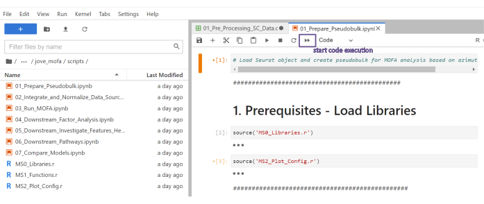
Figure 5: Jupyter-notebooks scripts. The complete workflow consists of a series of Jupyter notebooks that will be executed sequentially after the corresponding configuration files have been modified. By double clicking on the Jupyter notebook on the left side the corresponding file will be opened up on the right side. The complete execution of the file can be started with the button highlighted at the top. Please click here to view a larger version of this figure.
3. Data pre-processing and harmonization
- Pre-processing - Convert sc data to pseudobulk.
NOTE: This step only needs to be executed if single-cell data is used in the analysis.- Use the navigation menu on the left side to navigate to the configurations folder by double-clicking on configuration. Open the file 01_Preprocessing_SC_Data.csv by double-clicking. Check the automatically filled-in values in the file and, if necessary, adjust the values in the data_name column to correspond to the filenames of the single-cell datasets in the input_data folder that will be used for the analysis.
NOTE: By default, all the names of .h5ad files in the input data folder will be added to the configuration file in the initialization script. If some of the datasets should not be used for the analysis, they can be removed here. - Save made changes by clicking on File > Save CSV File in the menu on the top.
- Use the navigation menu on the left side to navigate to the scripts folder by clicking on scripts. Open the notebook 01_Prepare_Pseudobulk.ipynb by double-clicking on it. Execute the script by clicking on the Restart kernel and run all cells button at the top, and clicking Restart in the pop-up.
- Use the navigation menu on the left side to navigate to the figures folder by double-clicking first on figures and then on 01_figures. Open the newly generated plot FIG01_Amount_of_Cells_overview by double-clicking on it.
NOTE: The execution of the notebook might take several minutes. When the notebook has been executed successfully a popup will appear and the file FIG01_Amount_of_Cells_Overview will either be updated by the notebook or generated newly. The Last Modified column can indicate when the file was generated to evaluate whether it is a new or old file. - Investigate the plot to identify cell-type clusters with a very low number of cells per sample. Note down the names of those cluster_ids to exclude them in the subsequent steps (Figure 6).
- Use the navigation menu on the left side to navigate back to the configurations folder by clicking on … and then double-clicking on configurations. Open the file 02_Preprocessing_Configs_SC.csv by double-clicking on it.
- Check the values in the configuration_name and data_name columns and adjust them if necessary.
NOTE: Within the initialization script, those values are pre-filled in with all the names of .h5ad files in the input data folder and the configuration_name value set within the Data_Configs.csv file previously. In case files should be excluded from the analysis or another extension for filenames should be used, this can be adjusted here. - Adjust the value in the cell_type_exclusion column and add all cluster_id's that have been identified to exclude in the previous step separated by ','.
- Save the changes by clicking on File > Save CSV File in the navigation bar on the top.
- Use the navigation menu on the left side to navigate to the configurations folder by double-clicking on configuration. Open the file 01_Preprocessing_SC_Data.csv by double-clicking. Check the automatically filled-in values in the file and, if necessary, adjust the values in the data_name column to correspond to the filenames of the single-cell datasets in the input_data folder that will be used for the analysis.
- Pre-processing - Harmonize and Integrate other omics data sources.
- Open the file 02_Preprocessing_Configs.csv by double-clicking on it and adjust the pre-processing configuration for each of the datasets that will be included and is stored in the data_input folder (one row per dataset).
- Check the values in the configuration_name and data_name columns and adjust them if necessary.
- Adjust the other parameters in the columns accordingly, depending on which pre-processing steps should be applied.
NOTE: Default values are added for each dataset that is found within the input_dataset folder but are not specific to the single data types of the data. Therefore, adjustments will be necessary. A detailed documentation of parameters is given in the Documentation_Config_Parameter.doc file. - Save the changes by clicking on File > Save CSV File.
- Use the navigation menu on the left side to navigate to the scripts folder by clicking on scripts. Open the notebook 02_Integrate_and_Normalized_Data_Sources.ipynb by double-clicking on it. Execute the script by clicking on the Restart kernel and run all cells button at the top, and clicking Restart in the pop-up.
- Use the navigation menu on the left side to navigate to the generated 02_results folder by clicking on the folder symbol and then double-clicking on results and 02_results. Check whether it includes the file 02_Combined_data_'configuration_name'_Integrated.csv containing the combined pre-processed data input file.
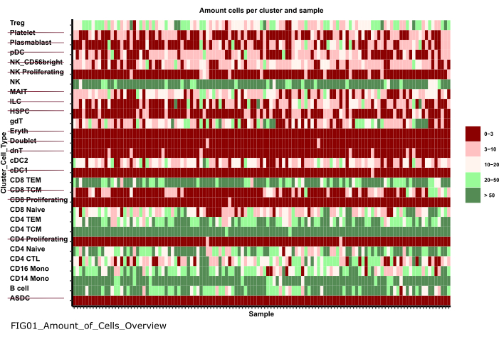
Figure 6: Data pre-processing and harmonization. One output of the '01_Prepare_Pseudobulk' step is the plot 'Fig01_Amount_of_Cells_Overview'. Here, for each cluster_id (y-axis indicating the cell type from previous cell-type annotation steps), the number of cells per sample ('sample_id') is given. Within the presented results, cell types with a low amount of cells per sample are excluded from the subsequent analysis (indicated by the strikethrough). Please click here to view a larger version of this figure.
4. Running MOFA
- In Jupyter-Lab, use the navigation menu on the left side to navigate to the configurations folder by clicking on the folder symbol and then double-clicking on mofa_workflow, followed by double-clicking on scripts and configurations. Open the file 03_MOFA_Configs.csv by double-clicking on it.
- Check the entries for the configuration_name and mofa_result_name columns and adjust the entries if alternative names should be used.
NOTE: The mofa_result_name will be appended as a file extension to all the result files generated based on the MOFA. This can be different from the configuration_name value as different MOFA setups might be run with the same input data (this protocol uses MI_v1_MOFA). - Enter the amount of factors that should be estimated in the MOFA model (amount_of_factors column) and define whether weighting and scaling should be applied (weighting_of_views and scale_views columns) by adjusting the values in the file.
- Save the changes by clicking on File > Save CSV File.
- Use the navigation menu on the left side to navigate to the scripts folder by clicking on 'scripts'. Open the notebook 03_Run_MOFA.ipynb by double-clicking on the file. Execute the script by clicking on the Restart kernel and run all cells button at the top and clicking Restart in the pop-up.
- Navigate to the 03_figures folder by double-clicking on figures and then 03_figures. Open the generated plot FIG03_Overview_Variance_Decomposition_'mofa_result_name and investigate the model result (Figure 7A).
- Use the navigation menu on the left side to navigate to the generated 03_results folder by clicking on the folder symbol and then double-clicking on results and 03_results. Check whether it includes the sample factor value file 03_Factor_Data_'mofa_result_name'.csv and the feature factor weight file 03_Weight_Data_'mofa_result_name'.csv.
5. Downstream analysis
- Factor interpretation.
- Use the Navigation menu on the left side to navigate to the input_data folder by clicking on the folder symbol, followed by double-clicking on input_data.
- Prepare a .csv file (Prepared_Sample_Meta_Data.csv) that contains all the meta-data (covariates) of the samples that will be analyzed in association with the generated factors. Copy the file to the input_data folder by using Drag&Drop dropping the file in the folder overview of the input_data folder.
NOTE: It needs to contain the sample_id column for matching it to the previously used data and further columns for each feature that should be analyzed. - In Jupyter-Lab, use the navigation menu on the left to navigate back to the configurations folder by clicking on the folder symbol and then double-clicking on mofa_workflow, followed by scripts and configuration. Open the file 04_Factor_Analysis.csv by double-clicking on it.
- Check that the entries for the configuration_name and mofa_result_name contain the names of the configuration and MOFA results that will be analyzed in the script and adjust them if necessary.
- In the numeric_covariates column, add the name of all numeric columns in the Prepared_Sample_Meta_Data.csv file that will be investigated in relation to the MOFA factors separated by comma (This protocol uses CRP,CK).
- In the categorical_covariates' column, add the name of all categorical columns in the Prepared_Sample_Meta_Data.csv file that will be investigated in relation to the MOFA factors separated by comma (This protocol uses measurement).
- Save the changes by clicking on File > Save CSV File.
- Use the navigation menu on the left to navigate to the 'scripts' folder by clicking on scripts. Open the notebook 04_Downstream_Factor_Analysis.ipynb by double-clicking on it. Execute the script by clicking on the Restart kernel and run all cells button at the top and clicking restart in the pop-up.
- Use the navigation menu on the left to navigate to the 04_figures folder by double-clicking on figures and then 04_figures. Open the generated plots by double clicking on them and investigate the factors for interesting patterns and associations: FIG04_Factor_Association_with_numeric_features_
'mofa_result_name.pdf (Figure 7B). FIG04_Factor_Association_
with_categorical_features_'mofa_result_name.pdf (Figure 7C). FIG04_Top_Feature_Overview_per_Factor _'mofa_result_name.pdf (Figure 8A).
- Feature analysis
- Use the navigation menu on the left to navigate back to the configurations folder by clicking on … and then double-clicking on configurations. Open the file 05_Feature_Analysis_Configs.csv by double-clicking on it.
- Check that the entries for the configuration_name and mofa_result_name columns correspond to the names of the configuration and generated MOFA result that will be used for the downstream analysis and adjust them if necessary.
- In the factor column, add the factor for which the top features will be plotted within the next script.
- In the column faceting_variable, add a column name of a categorical column in the Prepared_Sample_Meta_Data.csv that will be used to group the samples in the plot (This protocol uses measurement)
- Save the changes by clicking on File > Save CSV File.
- Use the navigation menu on the left to navigate to the scripts folder by clicking on scripts. Open the notebook 05_Downstream_Investigate_Features_Heatmap.ipynb by double-clicking on it. Execute the script by clicking on the Restart kernel and run all cells button at the top, and clicking Restart in the pop-up.
- Use the navigation menu on the left to navigate to the 05_figures folder by double-clicking first on figures and then on 05_figures. Open and investigate the generated plot FIG05_Heatmap_Feature_Overview__ 'mofa_result_name'.pdf by double-clicking on the file (Figure 8B).
NOTE: Depending on the amount of features that will be shown in the plot it might be necessary to adjust the parameters plot_width and plot_height within the 05_Feature_Analysis_Configs.csv and re-run the script to make sure everything fits in the plot.
- Pathway analysis
- Use the Navigation menu on the left side to navigate to the input_data folder by clicking on the folder symbol, followed by double-clicking on input_data.
- Prepare a .csv file (Prepared_Pathway_Data.csv) that contains a list of pathways that will be tested for enrichment. Copy the file to the input_data folder by using Drag&Drop dropping the file in the folder overview of the input_data folder.
NOTE: It needs to contain three columns: ID (a unique identifier of the pathway), gene (the genes given by their gene name (SYMBOL) belonging to the pathway, one row per gene), pathway_name (a name/textual description of the pathways). - In the Jupyter-Lab session, use the navigation menu on the left to navigate to the configurations folder by clicking on … and then double-clicking on configurations. Open the file 06_Pathway_Configs.csv by double-clicking on it.
- Check the entry for the mofa_result_name column and make sure that it correspond to the name of the generated MOFA result that will be used for the pathway enrichment calculation.
- Check the entry in the types column and remove the entries within the types column that do not contain features that match the gene column in the Prepared_Pathway_Data.csv file.
NOTE: By default all different views that have been used within the MOFA model are added to this file during the execution of the workflow. In case there are views that do not contain features that match at least one pathway, they need to be removed; otherwise, the execution will fail. An example would be the pathway file contains only pathway annotations for genes, but there is a view containing protein names. - Save the changes by clicking on File > Save CSV File.
- Use the navigation menu to navigate to the scripts folder by clicking on scripts. Open the notebook 06_Downstream_Pathways.ipynb by double-clicking on it. Execute the script by clicking on the Restart kernel and run all cells button in the top, and clicking Restart in the pop-up.
- Use the navigation menu on the left to navigate to the 06_figures folder by first double-clicking on figures and then 06_figures. Open the generated plot FIG06_Pathways_and_Genes_ 'mofa_result_name by double-clicking on it and investigate the visualized pathways (Figure 8C).
NOTE: How the visualized pathways are selected can be configured via the configuration file. For more details, refer to the documentation of the parameters. - Use the navigation menu on the left side to navigate to the generated 06_results folder by clicking on the folder symbol and then double-clicking on results and 06_results. Check whether it includes the file including the enriched pathways 06_Pathway_enrichment__'mofa_result_name'.
6. Comparing different configurations and versions (Supplementary Figure 1, Supplementary Figure 2, Supplementary Figure 3, Supplementary Figure 4)
- To compare the effect of using different parameters/ configurations throughout the workflow, re-run sections 3-5, modifying the parameters in the configuration files and using different configuration_name and mofa_result_name identifiers.
NOTE: New results will be stored with these names to be used for comparing different runs. - In Jupyter-Lab, use the navigation menu on the left to navigate to the configurations folder. Open the file 07_Comparison_Configs.csv by double-clicking on it.
- In the mofa_result_name column, add the names of all previous MOFA runs that will be compared (one row per name/configuration, e.g., MI_v1_MOFA, MI_v2_MOFA).
- In the compare_factors column, add the factors that will be compared between the models. By default, it is Factor1,Factor2,Factor3. (Supplementary Figure 2A).
NOTE: In this script the feature and factor values of the different models will be compared by correlating them. This only works for models being based on the same samples (indicated by sample_id) and the same set of features. In case samples or features are not matching between the compared versions they will be excluded from the comparison. - Save the changes by clicking on File > Save CSV File.
- Use the menu on the left to navigate to the scripts folder by clicking on scripts. Open the notebook 07_Compare_Models.ipynb by double-clicking on it. Execute the script by clicking on the Restart kernel and run all cells button and clicking Restart in the pop-up.
- Use the menu on the left to navigate to the 06_figures folder by double-clicking first on figures and then 06_figures. Open the generated plots by double-clicking on the files to analyze the similarity of the different versions:
FIG07_Variance_Model_Comparison.pdf (Supplementary Figure 2B)
FIG07_Factor_Correlations.pdf
(Supplementary Figure 2C)
FIG07_Feature_Correlations.pdf
(Supplementary Figure 3C)
7. Extending the workflow: Adding other parameters and configurations
NOTE: Besides the parameters that are currently configurable in the configuration files, other adjustments in the code or other parameters might be included. For example, the MOFA model itself offers several other training parameters17 that can either be modified directly in the code or made adjustable via the configuration files. The next section of the protocol will outline an example of how to do this for additional MOFA model training parameters. For this part, R programing knowledge is required.
- In Jupyter-Lab, use the navigation menu on the left to navigate to the scripts folder. Open the notebook 03_Run_MOFA.ipynb by double-clicking on it.
- Click on the Table of Contents tab on the left side and then navigate to the subsection 4.3 Set MOFA Training Options and run the Model Training by clicking on it. Scroll down to see the printed output of the MOFA model of configurable parameters in the notebook.
- Within the R for loop in the code below the heading, all the MOFA data, model, and training options are set. Below the line model_opts$num_factors = mofa_configs$amount_of_factors[i], add another line with the code below
model_opts$likelihoods['data_type'] = 'poisson'.
NOTE: This will change the distribution the model takes as input for the view specified by the name data_type for all MOFA runs. When specifying poisson for a data type, the model will only run when features for this data type are integers (e.g., read counts from RNA-seq). To get more information about the MOFA data, training, and model options, one can also refer to the MOFA tutorials and documentation17. - Save the changes in the notebook by clicking on the Save button at the top.
- To hand over new parameters via the .csv configuration files, use the navigation on the left side to navigate to the configurations folder by double-clicking on configurations and open the file 03_MOFA_Configs.csv by double-clicking.
- Add a new column specifying the parameter name, e.g., number_iterations and enter a value, e.g., 1000. Save the changes by clicking on File > Save CSV File.
- Use the navigation menu to navigate the scripts folder by clicking on scripts. Open the notebook 03_Run_Mofa.ipynb by double-clicking on it. Click on the Table of Contents tab on the left side and then navigate to the subsection 4.3 Set MOFA Training Options and run the Model Training by clicking on it.
- Replace the line train_opts$maxiter = 50000 by train_opts$maxiter = mofa_configs$column_name[i] (when the name of the added column is number_of_iterations it is train_opts$maxiter = mofa_configs$number_of_iterations[i]).
NOTE: The configuration file 03_MOFA_Configs.csv in this notebook is read at the beginning of the notebook (subsection: Prerequisites Configurations & Parameters) as mofa_config data.frame in the session and therefore, in this line of code, this object and the corresponding newly generated column are referred. As multiple configurations can be run at the same time the i identifies the row of the data.frame as the model estimation is run in a for loop across all the different rows in the .csv file. The principle of reading in the configuration file at the beginning of the notebook in the section 'Prerequisites Configurations & Parameters' is the same for all notebooks, and further modifications can be made like this. - Save the changes in the notebook by clicking on the Save button.
Results
Following the successful execution of the workflow, several tables and figures are generated as indicated by Figure 2. Figures are placed in the /figures folder (Figure 6, Figure 7, Figure 8, Supplementary Figure 1, Supplementary Figure 2, Supplementary Figure 3, Supplementary Figure 4), and tables will be placed in the specified /results folder.
In case the workflow execution is not successful, this might be mainly due to: technical errors caused, for example, by insufficient memory (especially in the first step where a large single-cell dataset is loaded), incorrectly formatted data (e.g., non-matching sample_id columns between datasets) or incorrect specifications in the configuration files (e.g., excluding to many features). In this case, usually, an error message within the Jupyter-notebook script will occur during execution and no plots and data will be generated. It is recommended to use the default configuration files as generated during the script execution and only modify specific parameters as described in the protocol.
A successful execution is indicated by the generation of the resulting plots and tables, and each step will reveal additional information about the data and the main patterns of variance inherent in it. Still, not necessarily each execution will produce biologically useful and interpretable results. Often, the data is characterized by large technical effects and different distributions, which need to be accounted for in the 'Data Pre-Processing and Harmonization' step or in the 'MOFA9 Model' (which also allows specifying different distributions for the input data types) to be able to extract the variation of the data that reflects the underlying biological processes.
Within the presented workflow, different multi-omic datasets may be used as input. Currently, the workflow accepts the popular .h5ad file format for single-cell data and a very general .csv file format for all the other datasets as input (Figure 3). It is common for different omic datasets to have very different file formats. To not limit the execution of the workflow to specific file formats, .csv is used as a very general format. Therefore, all kinds of different omics datasets can be used as input for the workflow but need to be converted to the corresponding .csv format as indicated in Figure 3 first before usage within this workflow. This might be prepared either using a spreadsheet or omic specific software. To preprocess the different omics datasets, several options are available within the workflow to apply different pre-processing and normalization steps (e.g., library size adjustment, log transformation, sample quantile normalization) on the different input datasets by configuring the 02_Pre_Processing_Configs.csv and 02_Pre_Processing_Configs_SC.csv file (Figure 2). Nevertheless, the available options here are mainly based on the specific input data available in the data set presented here (scRNA-seq, cytokine assay, proteomics, prime-seq). In case other omics/data types are used, it might be necessary to apply additional omic-specific normalization steps according to existing best practices. In this case the data can be handed over to the workflow in an already pre-processed form and will be integrated along with the other datasets without applying further pre-processing steps. In many cases, applying the Feature Wise Quantile Normalization step is useful in aligning the distribution of all data types to a normal distribution and making downstream analysis between the different input features more comparable and compatible with the model specification of Gaussian noise.
During the workflow execution several plots and outputs are generated that support the process of data integration and subsequent biological downstream interpretation. For scRNA-seq data, the plot in FIG01_Amount_of_Cells_Overview (Figure 6) indicates which cell types might include too few cells per sample and cell type to reliably measure a gene expression signal as for subsequent analyses, the mean value across all cells of a cell type per sample is used as an expression estimate (psedobulk- approach). In this use-case, we exclude cell types that have less than three cells in the majority of samples.
The variance decomposition plot FIG03_Overview_Variance_Decomposition (Figure 7, Supplementary Figure 1) can indicate how well the different data sources integrate and how much of the variance in the different data sources is shared and unique to each data source. For example, testing different pre-processing strategies on the dataset used here shows for example that removing the Feature Wise Quantile normalization step from the pre-processing leads to latent factors that are more focused on specific data views and reduces the integration of the proteomic data with the other data sources. This can be seen in the reduced amount of explained variance (Supplementary Figure 1B). Running the MOFA model without any filtering of features or without normalization leads to less shared variance between the different views captured by the latent factors (Supplementary Figure 1C). This indicates that latent factors predominantly reflect data type specific technical effects. Besides that, the MOFA9 model itself might also return warnings in case of poorly pre-processed data. An example of such a warning is shown in Supplementary Figure 1 for the alternative pre-processing configurations MI_v2 and MI_v3 (the specific example configuration files are stored in the cloned GitHub repository in the config_examples folder).
Additionally, after running the MOFA model, the results can be evaluated in several downstream analyses by associating the factor with known biological meta-information about the samples, as well as technical and other confounding covariates (04_Downstream_Factor_Analysis) to identify the likely cause for the variation captured by the factors. For example, if one of the factors of the MOFA models associates strongly with one of the technical covariates (such as batch information) this might indicate that this factor rather captures technical variation within the data instead of biological variation.
To narrow down the biological interpretation in the downstream analysis part, a couple of findings based on the input dataset (a more refined interpretation can be found in the original publication11) are outlined here. In the first step, we could observe that with the applied pre-processing strategy, we find several factors that capture variance across multiple cell types but also other omics data types (Figure 7A). For example, Factor 2 captures variance in the clinical input features and in several cell types of the scRNA-seq dataset. Associating the first three factors with relevant clinical covariates like 'CRP' and 'CK' (Figure 7B) and investigating the differences in factor values for the different patient subgroups: 'Control (including CCS and non-CCS) vs. 'ACS' measured at the different time points (TP1-TP4) (Figure 7C), we also find that Factor2 associates significantly with the 'CK' value and Factor3 with the 'CRP' value. At the same time, 'ACS' samples at TP1 and TP2 (which reflect the acute phase of the immune response to myocardial infarction (MI)) show an increase in factor values compared to 'Control' and later timepoint samples (TP3/TP4). CK is a known marker of myocardial damage and is typically characterized by increased values at TP1/TP2, similar to the pattern captured by Factor2.
To generate insights into the biological processes shaping Factor2 we evaluate the top-ranking features of the factor by looking at the feature weights table generated by the model (03_Weight_Data.csv). Analyzing the top 1% of features with the highest absolute weights on the factor, we find mainly CD4.TCM and CD14. Mono-derived features are overrepresented compared to their overall number of input features (Figure 8A), indicating these cell types to be highly relevant in the inflammatory process after MI (NOTE: in case no feature-wise quantile normalization was applied in the pre-processing different distributions of the features might also affect this result and evaluation should be done separately by data type). Analyzing the top-ranking features of the CD4.TCM cell type on the factor, we find several interesting genes like EIF3E18 required for robust T-cell activation and HMGB119, which promotes expansion and activation of T-cells (Figure 8B). Next, we run the pathway enrichment analysis using immune pathways from the REACTOME20 database as a pathway set (Prepared_Pathway_Data.csv). We find enrichment for several 'Interleukin' pathways, including 'Interleukin-6' signaling. The expression levels of several genes in different cell types of the scRNA-seq data and the 'IL6' cytokine values measured by the Cytokine assay contributed to this result (Figure 8C). Identification of these shared patterns across data types highlights the added value of an integrated analysis. Overall, this approach can also identify several other factors that reflect disease state or associate treatment outcome and the underlying multicellular immune programs as is described more in detail in the corresponding publication11.
To further stress the advantage of integrated analyses across multiple omics, the same workflow was also run only including the proteomics input data (Supplementary Figure 4). Analyzing the resulting factors, we find similarly to the integrated analysis a factor (Factor1) that strongly correlates with the 'CRP' value. This pattern describes the main source of variation within the proteomics data and is also aligned with some of the variation in the other datasets as captured by 'Factor3' in the integrated analysis (Figure 7C). However, a similar pattern as indicated by Factor2 that captures the time course of inflammation in the integrated analysis cannot be identified solely based on proteomics data.
The introduced workflow and the MOFA9 model itself are highly customizable with many adjustable parameters. Therefore, it is important to visualize and systematically compare the results produced by different configurations. To facilitate this task, the final output that can be generated by the workflow is a comparison of different named runs of the pipeline with different parameters in the pre-processing and model estimation. For example, the MOFA model can be estimated with different numbers of latent factors (Supplementary Figure 2A) or views with a lower number of features can be weighted (Supplementary Figure 3A). Configuring and running the last script of the workflow '07_Compare_Models' produces several plots to assess the similarity between different pipeline runs. FIG07_Variance_Model_Comparison (Supplementary Figure 2B, Supplementary Figure 3B) shows a comparison of the total explained variance for each view for different runs. The correlation of the factor values and feature factor weights between the different runs can indicate how much results change when modifying a certain parameter (Supplementary Figure 2C, Supplementary Figure 3C). Here, modifying the number of factors only causes minor changes in the estimated factor values and feature weights (Supplementary Figure 2C). Modifying the weighting of the data view results in much higher explained variance in the views with a lower number of features, e.g., the 'clinical' view (Supplementary Figure 3B). Nevertheless, the relevant features within the first three factors are still highly correlated to those inferred with the unweighted version (Supplementary Figure 3C).
With the generated model output .csv files in the results folder (e.g., the estimated factor and feature weights), further individual downstream analyses can be conducted. All code and necessary configuration files (including documentation) are available on GitHub at https://github.com/heiniglab/mofa_workflow. The singularity image that was created to enable an easy installation of the required conda packages for the analysis can be downloaded from https://doi.org/10.5281/zenodo.10815146. A small example dataset that can be used to perform an initial test of the pipeline can be downloaded from the same zenodo record as well.

Figure 7: MOFA output analysis. After the running of the MOFA model (03_Run_MOFA.ipynb) and the downstream analysis of factor values (04_Downstream_Factor_Analysis.ipynb) several plots are generated: (A) FIG03_Overview_Variance_Decomposition: returns a visualization of the explained variance of the estimated MOFA factors within the different views. Heatmap (left): shows the percentage of total variance of a view captured by a factor for each view. Barplot (right): shows the total percentage of variance that is captured by all factors for each view. (B) FIG04_Factor_Association_Numerical_Features: shows the Pearson correlation of the factor values with chosen numeric sample covariates, here: clinical variables (CRP, CK). (C) FIG04_Factor_Association_Categorical_Features: shows the difference in factor values for categorical sample covariates as a boxplot. Here, the factor values of Factors1-3 for each timepoint of ACS and Control patients are compared. Please click here to view a larger version of this figure.

Figure 8: MOFA feature analysis. After the running of the downstream analyses (04_Downstream_Factor_Analysis.ipynb, 05_Downstream_Investigate_Features.ipynb) several plots are generated. All plots here visualize MOFA Factor 2: (A) FIG04_Top_Feature_Overview_per_Factor: Heatmap (left) shows for each view the percentage of variance that is captured by the selected factor. Barplots (right) indicate the relevance of the features of the different views for the factor. On the left the total amount of features of a specific view within the top 1% highest-ranking features across views on the factor is given. On the right, the percentage is given, dividing the total number among the top 1% by the total number of features of that view. (B) FIG05_Heatmap_Feature_Overview: Heatmap (left) shows for the highest ranking 1% of features of the CD4.TCM cell-type the normalized expression values of each sample comparing the 'Control' group patients (CCS and non-CCS) to the different time points for 'ACS' patients. The barplot (right) shows the weight of the features. The direction of the sign of the weight is indicated before on the left before the cell-type names: '+' positive factor weight; '-' negative factor weight. (C) FIG06_Pathway_and_Genes: shows the weight of the highest 25% ranking genes for the factor that belong to enriched Interleukin pathways. In the heatmap on the top, they are averaged across views, and in the heatmap on the bottom shown per view. Please click here to view a larger version of this figure.
Supplementary Figure 1: Data harmonization effects. The figure shows FIG03_Overview_Variance_Decomposition for several different data-preprocessing configurations: visualization of the explained variance of the estimated MOFA factors within the different views. Heatmap (left): shows for each view the percentage of total variance of a view that is captured by a factor. Barplot (right): shows for each view the total percentage of variance that is captured by all factors. (A) The configuration ('MI_v1') based on which biological downstream results have been analyzed in previous figures (parameters set as in default configuration files in the cloned repository). (B) The same pre-processing configuration as in 'MI_v1' with the modification that no feature wise quantile normalization is applied (parameters set as in exemplary configuration files in 'config_examples' folder of repository). A screenshot of the MOFA model output warning for this configuration is added to the plot below. (C) The resulting variance decomposition when no pre-processing steps are applied, and all data is used as input without any pre-processing or filtering of features (parameters set as in exemplary configuration file in 'config_examples' folder of repository). A screenshot of the MOFA model output warning for this configuration is added to the plot below. Please click here to download this File.
Supplementary Figure 2: MOFA configuration - Factor amount effect. The resulting figures generated by the '07_Compare_Models.ipynb' script using several different configurations to run the MOFA model. (A) '03_MOFA_configs.csv': Example of the different configurations used to run the '03_Run_MOFA.ipynb' script specifying several different amount of factors (10,15,20,25). '07_Comparison_configs.csv': Example of how to specify the configuration input file for the execution of the script '07_Compare_Models.ipynb'. (B) 'FIG07_Variance_Model_Comparison' showing the total explained variance for each view (y-axis) for the different models across all factors specified in the model. (C) 'FIG07_Factor_Correlations' showing the correlation of the factor sample values between the different configurations. Please click here to download this File.
Supplementary Figure 3: MOFA configuration - Effect of weighting views. The resulting figures generated by the '07_Compare_Models.ipynb' script using several different configurations to run the MOFA model. (A) '03_MOFA_configs.csv': Example of the different configurations used to run the '03_Run_MOFA.ipynb' script specifying the 'weighting_of_views' parameter to be either 'TRUE' (MI_v1_MOFA_weighted) or 'FALSE' (MI_v1_MOFA). '07_Comparison_configs.csv': Example of how to specify the configuration input file for the execution of the script '07_Compare_Models.ipynb'. (B) 'FIG07_Variance_Model_Comparison' showing the total explained variance for each view (y-axis) for the different models across all factors specified in the model. (C) 'FIG07_Feature_Correlations' showing the correlation of the feature factor weights between the different configurations. Please click here to download this File.
Supplementary Figure 4: Multi-omic integration effect - using only proteomic data. The resulting patterns captured by the latent factors when only using proteomics data as input. (A) FIG04_Factor_Association_Numerical_Features: Pearson correlation of the factor values with clinical variables (CRP, CK). (B) FIG04_Factor_Association_Categorical_Features: Boxplot comparison of the factor values of each timepoint of ACS and Control patients. Please click here to download this File.
Supplementary File 1: Supplementary_File_
Running_Pipeline_with_Exemplary_Data. Descriptions on how to run the pipeline on the example data and the expected outputs are given in an additionally provided supplementary file. Please click here to download this File.
Supplementary Video File 1: Screen capture video of the protocol. Please click here to download this File.
Discussion
With the outlined protocol, a modular and extendible Jupyter-notebook-based workflow that can be used to quickly explore a complex multi-omics dataset is presented. The major parts of the workflow consist of the pre-processing and data harmonization part (offering different standard steps for filtering and normalization of the data), estimation of the MOFA9 model and some exemplary downstream analysis. One of the main critical steps is to pre-process and integrate, and harmonize the different omics datasets. Here, we present a strategy for a dataset that comprises scRNA-seq data, prime-seq bulk RNA, cytokine assay, plasma proteomics, and clinical values, which resulted in an integrated and harmonized dataset that could be used to identify relevant biological processes in MI11. In case other omic datasets require additional data pre-processing strategies, these should be executed prior to the MOFA analysis. The preprocessed data can then be used as input to the current workflow. The model's output can be used to evaluate the quality of the integration of the different datasets and the effects of the pre-processing to identify potential technical effects. For example, one could start by applying only a minimum of pre-processing and normalization steps and subsequently evaluate the effect of further normalization. In this application, it was observed that adding 'feature wise quantile normalization' leads to a better integration of proteomics with the remaining assays.
Another large part of the workflow is the estimation of the MOFA9 model on data that is aggregated on the sample level. Other extensions of the MOFA model exist, such as
MOFA+21 (specifically for single-cell data), MEFISTO22 (specifically for data including a time component), and MuVI23 (integrating domain knowledge in a factor analysis approach). These are very useful extensions of the method for specific types of datasets or settings, but applying them comes with specific requirements. For example, using MOFA+21 specifically for single-cell data in our case would mean that one could not easily make use of the sample level other omics data that is available. Using the MEFISTO22 method makes it possible to specifically model the time course but it is not applicable in settings where multiple time points are not available or, in our case for combining the 'Control' samples that have only measurements at one-time point with the time-resolved data of the 'ACS' samples. Therefore, in this very general workflow, we opt to use the MOFA9 method, as it is the most flexible method for exploring all kinds of datasets without too many requirements in a fast manner. Of note, the pre-processed data generated in the workflow can alternatively also be analyzed with these methods or the current scripts can be extended to integrate these methods if the dataset is compatible with the methods' requirements. For additional use cases, tutorials, and documentation, refer the GitHub repository of the MOFA developers24.
In comparison to even more general dimensionality reduction methods like Principal Component Analysis (PCA), the MOFA9 model offers several advantages, especially in the multi-omics setting. For example, the variance decomposition can be easily analyzed per input view and weights can be assigned to different views to account for different numbers of features. The model encourages sparsity, which increases the interpretability of the results. Furthermore, samples with missing data in one of the omics do not need to be excluded, and the model implements some features to focus on learning sparse feature factor weights. Also, the MOFA model offers several settings to integrate data characterized by different distributions (modeling either 'Gaussian', 'Bernoulli' or 'Poisson' likelihoods). In this workflow, we only integrate continuous data, which we normalize to follow a 'Gaussian' distribution, but the existing code can also be extended to integrate other data types if needed. Other decomposition-based methods exist, such as scITD25, especially for scRNA-seq data, but these then come with the limitation that they are not designed to work with other omics.
The presented workflow shows a protocol for an unsupervised exploration of large and complex multi-omics datasets to identify potential biological processes and other features that drive variation within the data. It can be applied in nearly any setting where variation in the data, e.g., caused by disease or other biological or technical perturbations, should be investigated. The resulting downstream analyses and feature sets driving the variance across the different omics can reveal relevant biological processes to investigate further in the specific context. For example, in the context of disease, it might enable the identification of new diagnostic markers or treatment targets.
Disclosures
The authors declare no conflict of interest.
Acknowledgements
C.L. is supported by the Helmholtz Association under the joint research school "Munich School for Data Science - MUDS".
Materials
| Name | Company | Catalog Number | Comments |
|---|---|---|---|
| Apptainer | NA | NA | https://apptainer.org/docs/admin/main/installation.html |
| Compute server or workstation or cloud (Linux, Mac or Windows environment). Depending on the size of the different input datasets we recommend running the workflow on a suitable machine (in our setting we use: 16 CPU, 64GB Memory) | Any manufacturer | 16 CPU, 64GB Memory | Large Memory is only required for the processing of the raw single cell data. After preprocessing the later analysis steps can also be performed on regular desktop or laptop computers |
| git | NA | NA | https://git-scm.com/book/en/v2/Getting-Started-Installing-Git |
| GitHub | GitHub | NA | https://github.com/heiniglab/mofa_workflow |
References
- Lähnemann, D., et al. Eleven grand challenges in single-cell data science. Genome Biol. 21 (1), 31(2020).
- Colomé-Tatché, M., Theis, F. J. Statistical single cell multi-omics integration. Curr Opin Syst Biol. 7, 54-59 (2018).
- Hawe, J., Theis, F., Heinig, M. Inferring interaction networks from multi-omics data. Front Genet. 10, 535(2019).
- Hawe, J. S., et al. Network reconstruction for trans acting genetic loci using multi-omics data and prior information. Genome Med. 14 (1), 125(2022).
- Koh, H. W. L., Fermin, D., Vogel, C., Choi, K. P., Ewing, R. M., Choi, H. iOmicsPASS: network-based integration of multiomics data for predictive subnetwork discovery. NPJ Syst Biol Appl. 5, 22(2019).
- Ogris, C., Hu, Y., Arloth, J., Müller, N. S. Versatile knowledge guided network inference method for prioritizing key regulatory factors in multi-omics data. Sci Rep. 11, 6806(2021).
- Lee, C., vander Schaar, M. A variational information bottleneck approach to multi-omics data integration. Proceedings of The 24th International Conference on Artificial Intelligence and Statistics. 130, 1513-1521 (2021).
- Singh, A., et al. DIABLO: an integrative approach for identifying key molecular drivers from multi-omics assays. Bioinformatics. 35 (17), 3055-3062 (2019).
- Argelaguet, R., et al. Multi-omics factor analysis-a framework for unsupervised integration of multi-omics data sets. Mol Syst Biol. 14 (6), e8124(2018).
- Cantini, L., et al. Benchmarking joint multi-omics dimensionality reduction approaches for the study of cancer. Nature Commun. 12 (1), 124(2021).
- Pekayvaz, K., et al. Multiomic analyses uncover immunological signatures in acute and chronic coronary syndromes. Nature Medicine. 30 (6), 1696-1710 (2024).
- Swirski, F. K., Nahrendorf, M. Cardioimmunology: the immune system in cardiac homeostasis and disease. Nat Rev Immunol. 18 (12), 733-744 (2018).
- Janjic, A., et al. Prime-seq, efficient and powerful bulk RNA sequencing. Genome Biol. 23 (1), 88(2022).
- Wolf, F. A., Angerer, P., Theis, F. J. SCANPY: large-scale single-cell gene expression data analysis. Genome Biol. 19 (1), 15(2018).
- Cao, Y., et al. Integrated analysis of multimodal single-cell data with structural similarity. Nucleic Acids Res. 50 (21), e121(2022).
- Get Started - JupyterLab 4.1.0a4 documentation. , Available from: https://jupyterlab.readthedocs.io/en/latest/getting_started/overview.html (2024).
- MOFA2: training a model in R. , Available from: https://raw.githack.com/bioFAM/MOFA2_tutorials/master/R_tutorials/getting_started_R.html (2020).
- De Silva, D., et al. Robust T cell activation requires an eIF3-driven burst in T cell receptor translation. eLife. 10, e74272(2021).
- Li, G., Liang, X., Lotze, M. HMGB1: The central cytokine for all lymphoid cells. Front Immunol. 4, 68(2013).
- Jassal, B., et al. The reactome pathway knowledgebase. Nucleic Acids Res. 48 (D1), D498-D503 (2020).
- Argelaguet, R., et al. MOFA+: a statistical framework for comprehensive integration of multimodal single-cell data. Genome Biol. 21 (1), 111(2020).
- Velten, B., et al. Identifying temporal and spatial patterns of variation from multimodal data using MEFISTO. Nat Methods. 19 (2), 179-186 (2022).
- Qoku, A., Buettner, F. Encoding domain knowledge in multi-view latent variable models: A Bayesian approach with structured sparsity. Proceedings of The 26th International Conference on Artificial Intelligence and Statistics. 206, 11545-11562 (2022).
- Multi-Omics Factor Analysis. MOFA. , Available from: https://biofam.github.io/MOFA2/ (2024).
- Mitchel, J., et al. Tensor decomposition reveals coordinated multicellular patterns of transcriptional variation that distinguish and stratify disease individuals. bioRxiv. , (2023).
Reprints and Permissions
