This study presents an automated user interface prototyping framework integrating cognitive design principles, perceptual color modeling, and deep learning. The system improves accessibility, layout clarity, color harmony, and cross-screen consistency, resulting in coherent, user-centered interface designs.
A subscription to JoVE is required to view this content. Sign in or start your free trial.
Research Article
Automated User Interface Prototyping Framework Integrating Cognitive and Visual Design Principles to Improve Usability and Layout Clarity
In This Article
Summary
Abstract
Effective user interface (UI) design requires a harmonious balance between visual appeal, cognitive usability, and layout consistency. However, current automatic UI generation approaches primarily focus on visual appearance or component detection and lack a unified framework that integrates cognitive principles, color intelligence, and structural reasoning. Furthermore, existing methods suffer from limited layout generalization, poor interpretability, static color selection, and inconsistent behavior across screens. In this context, this work proposes an automated UI prototyping framework that integrates the Faster region-based convolutional neural network (Faster R-CNN)-based component detection and CIECAM02 uniform color space (CAM02-UCS)-driven perceptual color modeling, enriched with cognitive and visual design principles. The Faster R-CNN is used to identify UI components and infer hierarchical structures from large-scale interface datasets. An enhanced color generation module analyzes brand or reference images to ensure perceptually uniform, harmonious, and usability-compliant color themes using CAM02-UCS. These outputs are further optimized through cognitive design rules, including Gestalt grouping, Fitts’ and Hick’s laws, attention-based spacing, and visual hierarchy modeling, to automatically generate refined, task-oriented UI layouts. Experiments conducted on RICO, ENRICO, and Guo’s UI Color Datasets show that the proposed system achieves 92.4% component detection accuracy, improves layout clarity and reading order accuracy by 18.7%, and produces color palettes rated 24.5% more harmonious by designers compared to baseline methods. User evaluations also indicate a 31% reduction in perceived cognitive load and a 28% increase in design consistency across screens. These findings demonstrate that combining deep learning–based structural understanding with perceptually grounded color modeling and cognitive design principles produces UI prototypes that are highly efficient, aesthetically coherent, and user-friendly. This framework establishes a novel, end-to-end approach to intelligent and human-centered automated UI prototyping.
Introduction
Graphical user interfaces (GUIs) serve as a fundamental medium of communication between humans and computer systems, significantly influencing usability, accessibility, and overall user experience (UX)1,2. Modern software systems rely on intuitive and visually appealing interfaces to attract and retain users. Traditionally, UI design involves creating graphical layouts that are later translated into front-end code by engineers. However, differences in platform-specific protocols across operating systems require repeated adaptation, increasing development complexity and effort. Automated UI code generation has therefore emerged as an important research direction, reducing manual effort and improving development efficiency.
Early approaches to automated UI generation combine traditional image processing techniques with deep learning models for region detection and classification3,4. Currently, dominant strategies for GUI code generation apply computer vision techniques to analyze UI images and convert them into structured front-end representations5,6,7. While image processing methods rely on handcrafted features, deep learning approaches extract hierarchical representations from large-scale datasets. As a result, researchers have explored hybrid approaches that combine deep learning with domain-specific image processing techniques to improve robustness and accuracy.
Color is another critical factor in UI design, influencing user perception, usability, and aesthetic appeal1. Maintaining consistency between image content and UI color schemes becomes challenging when visual inputs vary in hue and context8,9,10. Consequently, significant research has focused on automated color palette generation and perceptual color modeling. Existing methods for color generation include techniques based on the CIELAB color space11. Other approaches use clustering algorithms, such as k-means, to extract dominant colors from images12. As a result, recent work has increasingly adopted data-driven, machine learning–based approaches for color modeling.
In parallel, deep learning approaches have significantly improved UI component detection and layout understanding. Neural networks have enabled more accurate structural parsing of mobile interfaces13. However, these methods primarily focus on detection accuracy and often overlook higher-level aspects such as cognitive usability, layout hierarchy, and interaction efficiency. Generative models for UI layout synthesis have also been proposed14,15, but they face challenges in maintaining cross-screen consistency and providing interpretable design decisions16. Other approaches focus on visual similarity or rendering quality but lack a unified framework that combines component semantics, color harmony, and usability constraints17. Text recognition is also important for understanding UI content. Techniques such as convolutional recurrent neural networks (CRNNs) enable accurate recognition of complex text patterns in interface screens18,19,20.
Several systems have been proposed to generate UI code from sketches or images. Sketch2Code uses object detection to convert sketches into code representations21,22, but it is sensitive to image quality. REDRAW provides an automated pipeline for data collection and model training, combining convolutional and recurrent neural networks to generate structured UI representations23,24. Subsequent work has introduced improved evaluation metrics to assess generated UI quality25. More recent approaches include diffusion-based and transformer-based models for layout generation, such as diffusion layout transformers without autoencoder methods, GUI layout generation using transformer-based GUI arrangement graphs, and large language model–guided UI layout generation26,27,28. A comparative overview of these approaches is provided in Table 1.
| References and Key Method(s) | Objective | Advantages | Disadvantages |
| Automated Image-Based User Interface Color Theme Generation: prominent-color extraction + CAM02-UCS perceptual color modeling¹ | Automatically generate UI color themes from reference images while optimizing harmony and usability. | Strong perceptual grounding (CAM02-UCS); explicitly balances harmony and usability (contrast and diversity); includes web-based implementation and designer evaluation. | Focused only on color/theme (not layout or component structure); rule/heuristic-based rather than end-to-end learned UI synthesis. |
| Unifying Layout Generation with a Decoupled Diffusion Model (LDGM)²⁵ | Unified, flexible layout generation for graphic scenes and UIs. | State-of-the-art diversity and controllability for layout generation; supports conditional generation and multiple attribute types. | Diffusion-based outputs may exhibit alignment or fine-grained layout issues unless constrained; higher model complexity and inference cost. |
| Diffusion Layout Transformers without Autoencoder Methods: transformer + diffusion for layout generation (no autoencoder)²⁶ | Improve fidelity and alignment for layout generation benchmarks (FID, alignment, and overlap metrics). | Better capture of semantic correlations between neighboring objects; strong performance on FID and alignment metrics. | Primarily focuses on layout geometry (positions, sizes, categories) rather than UI semantics. |
| GUI Layout Generation with Transformer-based Models from GUI Arrangement Graphs (GUI-AGs)²⁷ | Create GUI layouts from positional/graph constraints to assist designers. | Graph representations capture relational constraints; transformer enables flexible, constraint-conditioned generation. | May require explicit constraint graphs from designers; limited emphasis on color and usability metrics. |
| UI Layout Generation with LLMs Guided by UI Grammar: Large Language Models (LLMs) + hierarchical UI grammar²⁸ | Explore LLMs for layout generation and improve explainability/control via grammar representations. | High-level controllability and explainability; can leverage in-context learning from LLMs (GPT-type). | Early-stage work with limited empirical validation; grammar design and robustness across UI s |
Table 1: Comparison of existing UI color modeling and layout generation methods. The table summarizes representative approaches for user interface design, including color theme generation, diffusion-based layout generation, transformer-based methods, and large language model–guided layout generation. For each method, the underlying technique, objective, advantages, and limitations are presented, highlighting differences in perceptual modeling, layout generation capability, controllability, and usability considerations.
Despite these advances, a key limitation remains: no existing system jointly integrates component detection, perceptual color modeling, cognitive design principles, and multiscreen layout consistency within a single end-to-end framework1. Current approaches typically optimize only one or two aspects—such as detection, layout, or color—without considering their interdependencies. This fragmentation highlights a critical research gap in developing unified, human-centered automated UI prototyping systems. In particular, cognitive design principles such as Gestalt laws, Fitts’ law, and Hick’s law are often treated conceptually rather than being formally integrated into computational models.
To address these limitations, this study proposes an end-to-end automated UI prototyping framework that integrates component detection, perceptual color modeling, and cognitive design principles within a unified system. The framework is designed to improve layout quality, reduce cognitive load, enhance color harmony, and increase overall usability. These improvements are validated through experiments on the RICO, ENRICO, and Guo’s UI Color Datasets, demonstrating the effectiveness of combining structural, perceptual, and cognitive aspects within a single automated UI prototyping pipeline. It is hypothesized that integrating deep learning–based component detection, perceptual color modeling, and cognitive design principles within a unified framework will significantly improve UI prototype quality compared to existing approaches. Specifically, H1 proposes that the framework enhances layout quality, including alignment, grouping, and reading order. H2 posits that the framework reduces user cognitive load. H3 suggests that perceptual color modeling improves color coordination and visual harmony. H4 states that the overall usability and aesthetic quality of UI prototypes are improved.
Access restricted. Please log in or start a trial to view this content.
Protocol
This study uses publicly available datasets and does not involve human or animal subjects.
The proposed automated UI prototyping framework integrates deep learning–based structural understanding, perceptually uniform color modeling, and cognitive design principles to generate coherent and user-centered interface prototypes. The methodology begins with a Faster R-CNN architecture trained on the RICO and ENRICO datasets to detect UI components and extract their hierarchical relationships, enabling accurate interpretation of diverse screen layouts. The detected components are then processed by a color intelligence module, which extracts brand- or image-based color cues, models perceptual similarity using CAM02-UCS, and generates harmonious, contrast-aware, and accessibility-compliant color palettes. Subsequently, cognitive design principles—including Gestalt grouping laws, Fitts’ law, Hick’s law, attention-based spacing, and visual hierarchy constraints—are applied through a cognitive optimization engine to refine spatial organization and component alignment. Finally, a layout reasoning layer integrates structural, perceptual, and cognitive constraints to generate multiscreen consistent UI prototypes that balance usability, aesthetics, and functional clarity. This integrated pipeline ensures perceptual coherence, reduces cognitive load, and adheres to human-centered design principles. The complete workflow of the proposed method is illustrated in Figure 1.
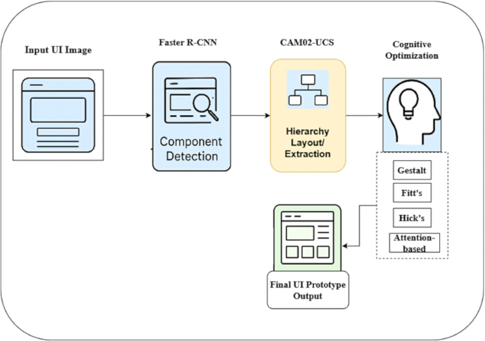
Figure 1. Overall architecture of the proposed automated user interface prototyping framework. The diagram illustrates the complete pipeline, starting from an input UI image. Component detection is performed using Faster R-CNN to identify interface elements. The detected components are then processed using CAM02-UCS-based perceptual modeling for hierarchy and layout extraction. Cognitive optimization is subsequently applied using Gestalt principles, Fitts’ law, Hick’s law, and attention-based adjustments. Arrows indicate the flow of data between modules, resulting in the final UI prototype output. Please click here to view a larger version of this figure.
Overview of the framework
Figure 1 illustrates the end-to-end workflow of the proposed automated UI prototyping framework, which transforms a raw UI screenshot into a cognitively refined prototype. The process begins with the input UI image, which is passed to the component detection module based on Faster R-CNN. This module identifies interface elements such as buttons, icons, text fields, and containers, and outputs their corresponding bounding boxes and class labels. The detected components are then processed in the hierarchy and layout extraction stage. Based on spatial relationships and structural patterns, the system constructs a hierarchical layout tree that reflects how users naturally perceive screen organization. This representation captures visual grouping and structural dependencies among UI elements. The extracted layout is subsequently refined through cognitive optimization by applying human-centered design principles. These include Gestalt grouping for visual clustering, Fitts’ law for optimizing touch-target size and accessibility, Hick’s law for reducing decision complexity, and attention-based spacing for improving visual hierarchy. As a result, the layout becomes more intuitive, readable, and efficient for user interaction. Finally, the optimized layout is combined with perceptual color modeling to generate a coherent UI prototype. The resulting interface is structurally accurate, visually harmonious, and aligned with human usability expectations.
The framework was implemented using PyTorch 2.0 on Ubuntu 22.04. Experiments were conducted on a system equipped with an NVIDIA RTX 4090 GPU (24 GB VRAM). The Faster R-CNN model employed a ResNet-50 backbone pre-trained on the ImageNet dataset. Training was performed using the stochastic gradient descent (SGD) optimizer with a learning rate of 0.001, batch size of 16, and up to 60 epochs. Early stopping was applied to prevent overfitting using a validation set comprising 20% of the data. Although training was performed for up to 60 epochs, convergence was typically achieved earlier through early stopping based on validation loss. Momentum and weight decay were set to 0.9 and 0.0005, respectively. Data augmentation included normalization, random horizontal flipping, and random cropping and resizing.
Dataset preparation
To support the proposed automated UI prototyping framework, three complementary datasets were utilized: ENRICO29, RICO30, and Guo’s UI Color Dataset1. The RICO dataset contains 66,261 Android UI screens collected from 9,700 applications, providing large-scale diversity for component detection and hierarchical layout extraction. ENRICO includes 1,464 high-quality UI screenshots manually categorized into 20 design patterns, enabling improved generalization for structural reasoning and layout consistency modeling. Guo’s UI Color Dataset consists of 128 curated UI images with annotated color themes, which are used for perceptual color modeling and palette evaluation. However, due to its relatively smaller size, this dataset may introduce some variability in layout characteristics. For this study, a combined dataset of 5,128 screens was prepared for training and evaluation. Specifically, approximately 4,000 images from RICO were used to train the Faster R-CNN model for component detection, 1,000 images from ENRICO were used for layout pattern learning and structural consistency modeling, and 128 images from Guo’s dataset were used for color evaluation tasks. All images were normalized to a resolution of 480 × 800 pixels, converted to a uniform sRGB color space, and re-annotated with standardized bounding boxes and hierarchical metadata to ensure compatibility across datasets. An overview of the datasets used in this study is provided in Table 2. The RICO dataset supports large-scale detection of UI components and structural analysis, while ENRICO enhances the model’s ability to recognize layout patterns and enforce cross-screen consistency. Guo’s UI Color Dataset, although smaller in size, plays a critical role in evaluating perceptual color harmony and contrast modeling. Together, these datasets provide a comprehensive and well-balanced foundation for training, validation, and evaluation of the proposed automated UI prototyping framework.
| Dataset | Total Images Available | Images Used in Study | Purpose in Proposed Framework |
| RICO Dataset30 | 66,261 | 4,000 | UI component detection, structural layout extraction |
| ENRICO Dataset29 | 1,464 | 1,000 | Design pattern learning, layout consistency modeling |
| Guo’s UI Color Dataset1 | 128 | 128 | Color theme extraction, perceptual color evaluation |
| Combined Total | 67,853 | 5,128 | Comprehensive dataset for detection, layout, color modeling |
Table 2: Summary of datasets used in the proposed framework. The table presents the datasets utilized for training and evaluation, including the RICO, ENRICO, and Guo’s UI Color Datasets. It reports the total number of images available, the subset used in this study, and the specific role of each dataset in component detection, layout modeling, and perceptual color analysis within the proposed framework.
A stratified sampling strategy was employed to preserve diversity in UI components, layout structures, and color distributions across RICO, ENRICO, and Guo datasets. The dataset was split into training (70%), validation (15%), and testing (15%) subsets using stratified sampling. Images were normalized using mean (0.485, 0.456, and 0.406) and standard deviation (0.229, 0.224, and 0.225). Data augmentation included random horizontal flipping (probability = 0.5) and random cropping (scale range: 0.8–1.0), followed by resizing to 224 × 224 pixels applied during training.
Component annotation and preprocessing
The RICO, ENRICO, and Guo’s UI Color Dataset collectively support the three core functional components of the proposed automated UI prototyping framework: component detection, layout modeling, and perceptual color optimization. The RICO dataset contains a large-scale collection of more than 66,000 mobile UI screens and is primarily used for training the component detection module. Its diversity enables the Faster R-CNN model to learn robust representations of common UI elements such as buttons, images, and text fields across a wide range of applications. This ensures accurate detection and localization of UI components under varying design conditions. The ENRICO dataset provides high-quality, pattern-labeled UI screens for learning structural relationships and layout patterns. It enables the system to understand inter-component relationships, hierarchical organization, and common design templates. This dataset plays a critical role in modeling layout structures and enforcing multiscreen consistency, allowing the framework to generate layouts that align with established design conventions. In contrast, Guo’s UI Color Dataset is specifically used for perceptual and cognitive color modeling. Unlike RICO and ENRICO, which focus on structural aspects, this dataset contains curated UI images with annotated color themes. These annotations are used to train color extraction and harmony evaluation modules. By mapping color relationships into perceptual color spaces such as CAM02-UCS, the framework learns to generate color palettes that balance contrast, accessibility, and aesthetic coherence. Together, these datasets form an integrated pipeline: RICO supports component detection, ENRICO enables layout pattern understanding and structural consistency, and Guo’s dataset facilitates perceptual color optimization. This integration ensures that the generated UI prototypes are structurally accurate, visually harmonious, and cognitively optimized.
Normalization was performed using a mean of [0.485, 0.456, 0.406] and a standard deviation of [0.229, 0.224, 0.225]. Data augmentation techniques, including random cropping, horizontal flipping, and rotation, were applied to improve model generalization. In addition, pixel values were scaled to the range [0, 1], and all images were resized to a resolution of 480 × 800 pixels to ensure consistency across datasets. Images resized to 224 × 224 pixels are used for augmentation during training, while the original resolution of 480 × 800 pixels is preserved for layout analysis. Bounding boxes were adjusted to filter out irrelevant annotations using predefined thresholds. To achieve uniformity across datasets, all UI elements were manually annotated using the LabelImg annotation tool. A predefined schema was established prior to annotation to classify UI elements into categories such as button, text, image, icon, and container. For bounding box representation, a uniform coordinate system was applied, and hierarchical information was constructed based on spatial relationships between elements and their parent–child associations within the layout tree. In addition, guidelines were established to ensure consistent annotation of elements, proper handling of overlapping components, and enforcement of minimum size thresholds across the RICO, ENRICO, and Guo datasets.
Detailed mathematical formulations for component detection training and layout pattern extraction are provided in Supplementary File 1.
The Faster R-CNN model was trained using SGD with a momentum of 0.9 and a weight decay of 0.0005. The initial learning rate was set to 0.001 and adjusted using a step decay policy based on validation performance. Training was performed for up to 60 epochs with a batch size of 16. Early stopping was applied to prevent overfitting, using a validation set comprising 20% of the training data.
The mapping function f(.) takes detected UI elements as input and produces a hierarchical layout representation as output. It computes adjacency relationships between UI elements based on spatial distance and alignment criteria, and constructs an adjacency matrix to represent these relationships. A clustering algorithm, such as DBSCAN, is then applied to group related components. Finally, clustered elements are organized into hierarchical structures based on parent–child relationships, forming a structured layout representation.
Detailed formulations for color harmony modeling and the unified optimization objective are provided in Supplementary File 1.
This objective function mathematically formalizes the integration of structural detection, layout reasoning, and perceptual color modeling, ensuring that all components of the framework contribute jointly to generating coherent and user-centered UI prototypes. Optimization is performed in a modular manner for each component of the framework. SGD is used for training the component detection module, while the Adam optimizer is used during joint optimization of the unified objective. The combined objective is used to guide overall system performance. For joint optimization stages, the objective function is minimized using the Adam optimizer with a learning rate of 0.001 and a batch size of 16. Training is performed for up to 60 epochs, with early stopping applied when the validation loss change is less than 10−4 for five consecutive epochs.
Component detection using Faster R-CNN
The proposed framework employs Faster R-CNN for automatic detection of UI components, including buttons, icons, text fields, images, and containers. Faster R-CNN is well suited for this task because it combines high object detection accuracy with efficient region proposal generation, which is essential for handling complex UI layouts containing densely packed elements. The model utilizes a ResNet-50 backbone pre-trained on the ImageNet dataset to extract convolutional feature maps from each UI screen. During training, the early layers were frozen to retain general visual features, while the higher layers (conv4_x and conv5_x) were fine-tuned for UI-specific component detection. These feature maps capture visual structures, edges, textures, and component boundaries. During detection, the region proposal network (RPN) identifies candidate regions (anchors) that are likely to contain UI components. Anchors are defined using multiple scales (128, 256, and 512) and aspect ratios (1:1, 1:2, and 2:1) to accommodate UI elements of varying sizes. During training, anchors with an intersection-over-union (IoU) greater than 0.7 with ground truth boxes are labeled as positive, while those with IoU less than 0.3 are labeled as negative; anchors with intermediate IoU values are ignored. Each anchor is assigned a probability indicating the presence of a component. Non-maximum suppression (NMS) is then applied to remove redundant and overlapping proposals, ensuring efficient localization of meaningful UI elements even in cluttered interfaces. Once candidate regions are generated, each proposal is classified into predefined component categories, and its bounding-box coordinates are refined. A region of interest (ROI) Align operation extracts fixed-size feature representations for each proposal, which are then processed by fully connected layers for classification and regression. The classification branch outputs class probabilities, while the regression branch predicts precise bounding-box coordinates. The entire Faster R-CNN model is trained end-to-end by optimizing a joint loss function that combines the RPN loss with the final detection loss. This enables the system to not only accurately recognize UI components but also precisely localize them across diverse interface structures. A detailed description of Faster R-CNN component detection, including the RPN stage, ROI classification, bounding-box refinement, and final optimization objective, is provided in Supplementary File 1.
Algorithm S1 provides the detailed component detection and structural extraction workflow (Supplementary File 1). It describes the complete process of automatic UI component detection and structural extraction from a raw screen image. The input image is first preprocessed and passed through a CNN backbone to extract deep visual features. These features are used by the RPN to generate candidate bounding boxes, which are then refined through classification and regression. NMS removes redundant detections to ensure accurate localization. Following detection, components are grouped based on spatial proximity using density-based spatial clustering of applications with noise (DBSCAN). This clustering step enables the construction of a hierarchical UI tree that captures parent–child relationships and logical groupings among components. This hierarchical representation forms the foundation for subsequent layout analysis and UI understanding. Figure 2 illustrates the Faster R-CNN component detection process on a mobile UI screen. The input interface (left) contains UI elements such as buttons and text blocks, which are automatically enclosed within bounding boxes. These detected regions are then classified into component categories (e.g., Button and Text), as indicated by labeled connections. The Faster R-CNN detection module (right) refines bounding-box coordinates, assigns semantic labels, and outputs structured component-level information. This step serves as a critical foundation for downstream processes, including layout extraction, cognitive optimization, and UI prototype generation, by providing accurate, semantically meaningful representations of UI components.
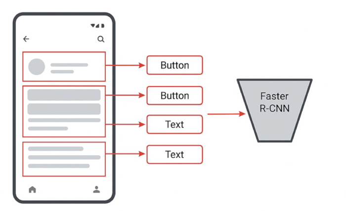
Figure 2. Component detection of user interface elements using Faster R-CNN. The figure illustrates the detection of UI components from an input interface screenshot. Regions of interest are identified using bounding boxes, and elements such as buttons and text fields are classified using Faster R-CNN. Arrows indicate the mapping of detected components to their corresponding semantic labels. Please click here to view a larger version of this figure.
Layout pattern extraction and hierarchical modeling
Following component detection using Faster R-CNN, each UI element is represented by a bounding box. However, these bounding boxes alone do not convey how elements are structurally organized within the interface, for example, which elements belong to headers, navigation bars, or grouped content regions. To address this limitation, the detected components are transformed into a logical UI tree, where each component is treated as a node and functionally or visually related components are grouped under common parent nodes. To identify meaningful layout groups, clustering techniques such as DBSCAN or hierarchical agglomerative clustering are applied. These methods analyze spatial proximity and alignment patterns among components to detect relationships between UI elements. In a manner analogous to human design practices, the system learns to recognize common structural patterns such as headers, footers, grids, and content blocks. Once grouping is established, additional structural properties—including alignment, grid organization, and reading order—are analyzed to construct a comprehensive layout representation. For example, components aligned in equal-width columns may indicate a card-based layout, whereas vertically stacked elements may indicate a form- or feed-based interface. By integrating clustering, spatial reasoning, and alignment rules, the framework constructs a hierarchical UI tree that captures both visual grouping and functional relationships. This hierarchical representation serves as the foundation for subsequent layout refinement and multiscreen consistency modeling, enabling the system to generate structured, coherent, and user-centered interface designs.
Detailed formulations for spatial distance and alignment similarity are provided in Supplementary File 1.
Clustering for layout grouping (DBSCAN)
To identify layout groups, DBSCAN is applied. DBSCAN uses two parameters: (1) ε = maximum distance between neighboring components and (2) = minimum number of components required to form a cluster. For this analysis, the DBSCAN parameters were empirically selected based on the normalized UI resolution (480 × 800 pixels). The neighborhood distance parameter was set to ε = 50 pixels to capture spatial proximity between adjacent UI components. The minimum number of points required to form a cluster was set to MinPts = 3 to avoid the formation of insignificant or spurious groups of UI components.
The detailed logical UI tree construction formulation is provided in Supplementary File 1.
Perceptual color modeling with CAM02-UCS
Perceptual color modeling ensures that colors used in the generated UI are harmonious, legible, and cognitively efficient. Dominant colors are extracted from input sources such as UI images using clustering techniques. Specifically, K-means clustering with and K-means++ initialization is applied for 300 iterations to obtain representative color palettes. However, the RGB color space does not accurately reflect human visual perception, meaning that numerically similar colors may appear perceptually different. To address this limitation, all extracted colors are transformed into CAM02-UCS, which is perceptually uniform. In this space, equal distances correspond to equal perceived color differences, making it suitable for modeling color harmony and contrast. Once mapped into CAM02-UCS, perceptual color differences are computed using Euclidean distance, enabling the system to quantify contrast, harmony, and variation between colors. Colors that are too similar are separated to improve legibility, while excessively contrasting colors are moderated to avoid visual discomfort. The generated palette also adheres to accessibility standards such as WCAG AA and AAA, ensuring sufficient contrast between foreground and background elements. Furthermore, color harmony is enforced by constraining palette relationships to complementary, analogous, or triadic schemes, depending on the intended UI theme. This ensures that the resulting color palette is not only visually appealing but also functionally accessible and cognitively optimized. To further refine the palette, an optimization process is applied under constraints of perceptual similarity, contrast, harmony, and brand consistency. A primary color is selected (e.g., from brand identity), and secondary colors are adjusted in terms of luminance and chroma to preserve visual hierarchy. A rule-based evaluation mechanism assesses candidate palettes based on perceptual distances and accessibility metrics, minimizing cognitive strain while maintaining aesthetic balance. As a result, the framework produces UI color schemes that exhibit professional-level coherence, readability, and perceptual consistency.
Detailed mathematical expressions for CAM02-UCS-based perceptual color modeling are provided in Supplementary File 1.
Algorithm S2 (Supplementary File 1) describes the CAM02-UCS-based perceptual color extraction and optimization workflow under harmony and accessibility constraints. Initially, dominant colors are extracted from the input image and transformed into CAM02-UCS to ensure that color differences correspond to human perception. Perceptual distances between colors are then computed and constrained within predefined bounds to maintain both clarity and harmony. Subsequently, accessibility is enforced by evaluating luminance contrast ratios according to WCAG guidelines. The final palette is obtained by optimizing a combined objective function that balances perceptual spacing, contrast requirements, and color harmony constraints. This ensures that the generated UI color schemes are not only visually appealing but also readable, accessible, and perceptually consistent.
Cognitive design optimization
Cognitive design optimization ensures that the automatically generated UI prototypes are not only visually consistent but also easy to understand and interact with. This module integrates key cognitive design principles, including Gestalt principles, Fitts’ law, and Hick’s law, to guide the arrangement, grouping, and spacing of UI components. Detailed mathematical formulations for cognitive design optimization are provided in Supplementary File 1.
Integrated cognitive optimization objective
The mathematical expression for the integrated cognitive optimization objective is provided in Supplementary File 1. Coefficients representing the importance of visual grouping, interaction efficiency, and decision complexity are denoted by alpha, beta, and gamma, respectively. In this study, the values of alpha, beta, and gamma were empirically determined using the validation dataset. For the present experiment, the coefficients were set as follows: α = 0.5, β = 0.3, and γ = 0.2. This configuration provides an effective balance between visual grouping, interaction efficiency, and decision simplicity.
Multiscreen consistency and UI generation
Multiscreen consistency modeling ensures that different screens within an application share a coherent visual identity, structural layout, and interaction pattern. As users navigate across screens, they develop expectations regarding element placement, typography, spacing, and visual hierarchy. To meet these expectations, the system analyzes cross-screen patterns using templates derived from the RICO and ENRICO datasets. These templates capture common UI structures such as home–detail layouts, list–detail patterns, multistep forms, and dashboard flows. By comparing component placement and grouping behavior, the system constructs a cross-screen structural profile that identifies which elements should remain consistent and which may vary. Once structural patterns are identified, the framework enforces consistency in typography scales, spacing ratios, grid layouts, and navigation anchors. For example, header bars maintain consistent height, primary buttons retain uniform size and alignment, and content blocks follow predictable visual ordering. This is achieved through a layout regularization process that evaluates each screen against global structural constraints. If a screen deviates from learned templates—such as inconsistent padding or misaligned titles—the system automatically adjusts the layout to restore coherence. These corrections help ensure a seamless UX and reduce cognitive switching costs across screens. The framework further analyzes the navigation graph between screens to maintain consistency in interaction flow. Common navigation patterns, including forward/backward transitions, tabbed navigation, and multistep workflows, are identified and enforced. Each transition is validated to ensure alignment with the user’s mental model, thereby improving usability and reducing confusion. As a result, the multiscreen consistency model minimizes visual noise, enhances familiarity, and promotes a unified interaction experience.
Detailed mathematical formulations for multiscreen consistency and UI generation are provided in Supplementary File 1.
Finally, the rendering engine generates visual outputs in formats such as SVG wireframes, HTML/CSS prototypes, or pixel-based UI mockups. The resulting UI screens exhibit correct reading order, harmonious color relationships, precise grid alignment, and consistent visual hierarchy across multiple screens.
Algorithm S3 provides the cognitive–visual layout optimization and multiscreen consistency workflow (Supplementary File 1). Algorithm S3 describes the integrated cognitive and structural optimization process used to generate user-friendly UI layouts. It combines perceptual grouping (Gestalt principles), interaction efficiency (Fitts’ law), and decision simplicity (Hick’s law) within a unified optimization framework. Initially, spatial relationships between components are evaluated to establish perceptual groupings. Interaction efficiency is then optimized by adjusting component size and placement, while decision complexity is controlled by limiting the number of choices presented to users. In addition, the algorithm enforces multiscreen consistency by aligning each screen with learned layout templates, ensuring uniformity in typography, spacing, and structural organization. A multiobjective optimization function then refines the layout by balancing alignment, spacing, and cognitive cost, resulting in an interface that is both visually coherent and cognitively efficient. Overall, this algorithm ensures that generated multiscreen layouts maintain high levels of visual consistency, usability, and perceptual clarity.
Access restricted. Please log in or start a trial to view this content.
Results
The proposed automated UI prototyping framework was assessed using an integrated dataset of 5,128 UI screens from three sources: 4,000 RICO images, 1,000 ENRICO screens, and 128 color-annotated UI samples from Guo’s UI Color Dataset. This blended dataset provides a well-balanced benchmark for evaluating component detection accuracy, layout structural clarity, multiscreen consistency, and perceptual color harmony.
Experimental results demonstrate that the Faster R-CNN–based detection model achi...
Access restricted. Please log in or start a trial to view this content.
Discussion
The findings demonstrate statistically significant improvements in usability, structural organization, and perceptual quality (p < 0.05), confirming the effectiveness of incorporating cognitive design principles into automated UI prototyping. Unlike traditional UI generation systems that rely primarily on visual detection or rule-based heuristics, the proposed framework integrates Gestalt grouping, hierarchy modeling, spacing constraints, and perceptual readability throughout the entire UI reconstruction process. Imp...
Access restricted. Please log in or start a trial to view this content.
Disclosures
The authors have no conflicts of interest.
Acknowledgements
The authors acknowledge the academic and institutional support provided by Wuhan College of Foreign Languages & Foreign Affairs, Keimyung University, and Shanghai Institute of Commerce and Foreign Languages during the completion of this research.
Access restricted. Please log in or start a trial to view this content.
Materials
| Name | Company | Catalog Number | Comments |
|---|---|---|---|
| CPU (Processor) | AMD Ryzen 9 7950X (16-core, 32-thread, 4.5–5.7 GHz) | Advanced Micro Devices (AMD), USA | Ryzen 9 7950X |
| CUDA Toolkit | Version 11.8 | NVIDIA Corporation, USA | CUDA Toolkit 11.8 |
| cuDNN | Version 8.9 | NVIDIA Corporation, USA | cuDNN v8.9 |
| Faster R-CNN | Object Detection Model (with Region Proposal Network) | Meta AI Research / Detectron2 | Detectron2 framework |
| Matplotlib | Version 3.7 | Matplotlib Development Team | v3.7.0 |
| NVIDIA RTX 4090 GPU | 24 GB GDDR6X Graphics Card | NVIDIA Corporation, Santa Clara, CA, USA | RTX 4090 |
| NumPy | Version 1.24 | NumPy Developers | v1.24.0 |
| OpenCV | Version 4.8 | OpenCV Foundation | v4.8.0 |
| PyTorch | Version 2.0 | PyTorch Foundation (Meta AI) | v2.0.0 |
| ResNet-50 with FPN | Backbone CNN with Feature Pyramid Network | Microsoft Research / Detectron2 | ResNet-50-FPN |
| Scikit-learn | Version 1.3 | Scikit-learn Developers | v1.3.0 |
| SciPy | Version 1.10 | SciPy Community | v1.10.0 |
| System Memory (RAM) | 64 GB DDR5 | Corsair / Kingston (or equivalent) | DDR5 64GB Kit |
| Ubuntu Operating System | Version 22.04 LTS | Canonical Ltd., UK | Ubuntu 22.04 LTS |
References
- Weingerl P. Automated image-based user interface color theme generation. Appl Sci. 2024;14:2850.
- Feng Z, Fang J, Cai B, Zhang Y. Guis2Code: Computer vision tool to generate code automatically from graphical user interface sketches. In: Proc Int Conf Artif Neural Netw; 2021; p. 53–65.
- Chen C, Zhang X, Yang Y, Li Y. GalleryDC: Design search knowledge discovery through auto-created GUI component gallery. Proc ACM Hum Comput Interact. 2019;3:1–22.
- Chen J, et al. Object detection for graphical user interface: Old-fashioned deep learning combination. In: Proc ACM Eur Softw Eng Conf Symp Found Softw Eng; 2020; p. 1202–1214.
- Xie M, et al. UIED: Hybrid tool for GUI element detection. In: Proc ACM Eur Softw Eng Conf Symp Found Softw Eng; 2020; p. 1655–1659.
- Gijsenij A, et al. Determining key colors from a design perspective using dE-means color clustering. Color Res Appl. 2023;48:69–87.
- Yuan LP, et al. InfoColorizer: Interactive recommendation of color palettes for infographics. IEEE Trans Vis Comput Graph. 2022;28:4252–4266.
- Cao Y, et al. Influences of color salience and location of website links on user performance and affective experience. Int J Hum Comput Interact. 2021;37:547–559.
- Liu W, Cao Y, Proctor RW. App icon color and border shape influence visual search efficiency and user experience. Int J Ind Ergon. 2021;84:103160.
- Yamin PAR, Park J, Kim HK, Hussain M. Effects of button colour and background on augmented reality interfaces. Behav Inf Technol. 2023;43:663–676.
- Deng L, Zhang ZR, Zhou FY, Liu RY. Effects of app icon border form and interface background color saturation. Adv Multimed. 2022;2022:1166656.
- Weingerl P, Hladnik A, Javoršek D. Machine learning model for extracting image prominent colors. Color Res Appl. 2020;45:409–426.
- Huang K, et al. WovenProbe: Probing possibilities for on-skin systems. In: Proc ACM Des Interact Syst Conf; 2021; p. 1193–1207.
- Dewez D, Guillemot C, Bailly G, Isenberg T. Dual body representations during an isomorphic 3D manipulation. IEEE Trans Vis Comput Graph. 2022;28:2047–2057.
- Kim J, Kim C, Nam KY. ThinkWrite: Design interventions for online petition deliberation. In: Proc CHI Conf Hum Factors Comput Syst Ext Abstr; 2022.
- Gao L, Wang Y, Müller S, Hudson SE. DataLev: Mid-air data physicalisation using acoustic levitation. In: Proc CHI Conf Hum Factors Comput Syst; 2023; p. 1–14.
- Khorsandi PM, Ogata M, Rekimoto J, Inami M. FabriCar: In-car media interactions using e-textile sensors. In: Proc ACM Des Interact Syst Conf; 2023; p. 764–776.
- Zhang Z, Ding Y, Huang C. Automatic front-end code generation via multi-head attention. In: Proc Int Conf Comput Eng Appl; 2023; p. 869–872.
- Jain V, et al. Sketch2code: Transformation of sketches to UI using deep neural network [preprint]. arXiv:1910.08930; 2019.
- Chai Y, et al. Dynamic prototype network for few-shot malware detection. IEEE Trans Knowl Data Eng. 2023;35:4754–4766.
- Qiu J, et al. AI security in 5G networks: Adversarial examples. IEEE Veh Technol Mag. 2020;15:95–100.
- Qiu J, et al. Automatic concept extraction from big data in smart city. IEEE Trans Comput Soc Syst. 2020;7:225–233.
- Xie M. UI2CODE: Computer vision-based reverse engineering of UI design [Internet]. GitHub; 2021. Available from: https://github.com
- Wang C, Bochkovskiy A, Liao HYM. CSPNet: Backbone enhancing learning capability of CNNs. In: Proc IEEE Conf Comput Vis Pattern Recognit Workshops; 2020; p. 1571–1580.
- Hui M, et al. Unifying layout generation with decoupled diffusion model. In: Proc IEEE Conf Comput Vis Pattern Recognit; 2023; p. 18434–18443.
- Wang Y, et al. Dolfin: Diffusion layout transformers without autoencoder. In: Proc Eur Conf Comput Vis; 2024; p. 513–530.
- Sobolevsky A, et al. GuiLGet: GUI layout generation with transformer [preprint]. arXiv:2304.09012; 2023.
- Lu Y, et al. UI layout generation with LLMs guided by UI grammar [preprint]. arXiv:2310.15455; 2023.
- Leiva LA, Hota A, Oulasvirta A. ENRICO: A dataset for mobile UI design modeling. In: Proc Int Conf Hum Comput Interact Mobile Devices Serv; 2020.
- Li G, et al. Learning to denoise mobile UI layouts. In: Proc CHI Conf Hum Factors Comput Syst; 2022; p. 1–15.
- Beltramelli T. pix2code: Generating code from a GUI screenshot. In: Proc ACM SIGCHI Symp Eng Interact Comput Syst; 2018.
- Zheng G, et al. LayoutDiffusion: Controllable diffusion model. In: Proc IEEE Conf Comput Vis Pattern Recognit; 2023; p. 18424–18433.
Access restricted. Please log in or start a trial to view this content.