Ten protokół przedstawia standaryzowany przepływ pracy bioinformatycznej do analizy zmian transkryptomowych w ostrym białaczu szpiaku (AML). Celem jest porównanie nowo rozpoznanych i nawrotowych próbek szpiku kostnego oraz uporządkowanie pod względem priorytetu sygnatur molekularnych związanych z opornością na chemioterapię i progresją choroby do dalszego badania.
Artykuł metodologiczny
Profilowanie transkryptomu i analiza bioinformatyczna próbek szpiku kostnego w celu zidentyfikowania sygnatur oporu na chemioterapię w ostrej białaczce szpikowej
* These authors contributed equally
W tym artykule
Podsumowanie
Streszczenie
Ostra białaczka szpikowa (AML) jest wysoce heterogeniczną chorobą hematologiczną, w której nawrót i nabyte oporność na chemioterapię pozostają głównymi przyczynami niepowodzenia leczenia. W tym artykule przedstawiono protokół bioinformatyczny do analizy transkryptomowej aspirowanych próbek szpiku kostnego. Głównym celem protokołu jest zapewnienie standaryzowanego przepływu pracy w celu zidentyfikowania sygnatur molekularnych związanych z progresją choroby i opornością na terapię w nawróconej AML. Przepływ opisuje procedury obliczeniowe do porównywania niesparowanych próbek szpiku kostnego, demonstrując je na danych sekwencjonowania z pięciu nowo rozpoznanych przypadków i czterech przypadków nawrotu. Ta metoda opisuje kluczowe kroki przetwarzania danych sekwencjonowania RNA, przeprowadzania analizy różnicowej ekspresji genów i przeprowadzania dalszych ewaluacji funkcjonalnych. Zastosowanie tego przepływu pozwoliło na zidentyfikowanie 2 025 różnicowej ekspresji genów (DEGs), w tym FOXC1, HOXA11, HOXA11-AS i AXL, jako kandydatów do transkryptów związanych z nawrotami w tym reprezentatywnym zestawie danych. Analizy funkcjonalne i sieciowe dodatkowo uporządkowały zbiory genów i centra interakcji związane z sygnałowaniem małych GTPaz, sygnałowaniem zapalnym, interakcjami z macierzą pozakomórkową i procesami biosyntezy RNA. Ogólnie rzecz biorąc, ta metodologia zapewnia powtarzalny komputerowy przepływ do mapowania sygnatur transkryptomowych związanych z nawróconej AML i generowania hipotez wymagających dalszej eksperymentalnej walidacji.
Wprowadzenie
Ostra białaczka szpikowa (AML) to grupa klonalnych złośliwych nowotworów wywodzących się z komórek macierzystych/przyprostokształtnych układu krwiotwórczego, charakteryzująca się nieprawidłową proliferacją niedojrzałych komórek szpikowych w rdzeniu kostnym i tłumieniem różnicowania układu krwiotwórczego1,2,3. Mimo że obecnie standardowa chemioterapia indukcyjna (jak cytarabina połączona z antracyklinami) może wywołać pełną remisję u większości pacjentów, wskaźnik nawrotów pozostaje wysoki, wynosząc 50–70%, a rokowanie dla pacjentów z nawrotami jest znacznie gorsze4,5,6. Nabyta oporność na chemioterapię jest związana z niepowodzeniem leczenia AML, co wymaga głębokiej analizy sygnałów molekularnych związanych z tym procesem, aby poprawić strategie terapeutyczne i wskaźniki przeżycia pacjentów7,8.
W szerszym korpusie literatury, istniejące badania wskazują, że oporność na chemioterapię w AML nie ogranicza się do nadregulacji pomp wydalających leki lub nieprawidłowego metabolizmu leków, ale jest również związana z utrzymaniem przeżycia komórek macierzystych białaczki (LSCs), tworzeniem fenotypów przypominających przemianę nabłonkowo-mezenchymalną (EMT) w środowisku hematologicznym oraz interakcjami z mikrośrodowiskiem rdzenia kostnego9,10,11. Na przykład, populacje LSC wykazują wysoką zdolność do samoregeneracji i stan spoczynku, co wiąże się z wrodzoną odpornością na środki chemioterapeutyczne działające w określonych fazach cyklu komórkowego12. Ponadto, nadregulacja receptorów kinaz tyrozynowych, takich jak AXL, została związana z opornością w przypadku AML z mutacją FLT3-ITD, występującą wraz z aktywacją szlaków PI3K/AKT i MAPK oraz zwiększoną zdolnością anty-apoptotyczną13,14. Przeprogramowanie metaboliczne i remodelacja epigenetyczna zostały również rozpoznane jako ważne osie regulacyjne w formowaniu oporności. Dowody sugerują, że komórki AML podczas nawrotu mogą przystosowywać się do stresu oksydacyjnego i uszkodzenia DNA wywołanego chemioterapią poprzez zwiększoną aktywność fosforylacji oksydacyjnej (OXPHOS), modulowane proporcje NAD⁺/NADH oraz zmienione stany modyfikacji histonów15,16,17. Czynniki zapalne w mikrośrodowisku rdzenia kostnego, takie jak IL-6 i CXCL8, są również związane z przeżyciem LSC i opornością na chemioterapię, często występujące w koordynacji z aktywacją szlaków sygnalizacyjnych STAT3/NF-κB11,18.
Mimo tych rozpoznanych mechanizmów, zmiany transkryptomowe związane z nawrotami AML i opornością na chemioterapię pozostają niedostatecznie scharakteryzowane, zwłaszcza jeśli oceniana jest łącznie metabolizm, epigenetyka i sygnały związane z mikrośrodowiskiem rdzenia kostnego w próbkach klinicznych. Ten przepływ pracy spełnia tę potrzebę, priorytetyzując kandydatów do genów różniczkowo ekspresowanych (DEGs), szlaków i sieci regulacyjnych związanych z przejściem od początkowej diagnozy do klinicznego nawrotu. Podejście to integruje analizę różnicowej ekspresji, analizę wzbogacania zestawów genów (GSEA) oraz budowę sieci interakcji białko-białko (PPI) w celu odwzorowania przeprogramowania transkrypcyjnego na skalę systemową i wskazania kandydatów do dalszej walidacji mechanotycznej.
Ogólnym celem tej metody jest przedstawienie standaryzowanego, powtarzalnego pipeline'u bioinformatycznego do porównywania transkryptomów masowych nowo rozpoznanych i nawrotowych próbek szpiku z AML. Racjonalnym zastosowania tej techniki in silico jest jej zdolność do rejestracji bezstronne, genomowe wydarzenia transkrypcyjne, wykraczając poza ograniczenia analiz pojedynczych szlaków, aby priorytetyzować złożone, wielowymiarowe sieci regulacyjne. Ta technika oferuje znaczne zalety w porównaniu z alternatywnymi metodami, takimi jak mikroarrays czy ukierunkowane panele qPCR wielokrotnego zmapu, poprzez zapewnienie wyższego zakresu dynamicznego, zdolności do wykrywania nowych transkryptów oraz precyzyjnego ilorazowanego ekspresji genów bez ograniczeń związanych z wstępnie zaprojektowanymi sondami19,20. Aby ustalić, czy ta metoda jest odpowiednia dla ich zastosowania, czytelnicy powinni zauważyć, że ten pipeline jest specjalnie zaprojektowany dla badaczy przetwarzających dane z sekwencjonowania RNA w ilości masowej z sparowanych lub niesparowanych kohortach klinicznych, takich jak aspiraty tkankowe. Jest odpowiedni do identyfikacji szerokich sygnatur związanych z opornością i kandydatów do sieci regulacyjnych, podczas gdy naukowcy wymagający rozdzielczości specyficznej dla typu komórki lub przestrzennej muszą skorzystać z uzupełniających przepływów sekwencjonowania jednokomórkowego lub przestrzennego. O
Protokół
Wszystkie metody wykorzystujące pobieranie próbek tkanki ludzkiej zostały wykonane zgodnie z wytycznymi instytucjonalnymi i Deklaracją Helsińską (zmieniona w 2013 roku). Kliniczne próbki szpiku kostnego zostały uzyskane za zgodą instytucjonalnego komitetu etycznego (Numery zgody TY-ZKY2024-116-01 i TY-ZKY2024-116-02).
1. Pobieranie próbek klinicznych i klasyfikacja pacjentów
- Wybierz próbki aspiratu szpiku kostnego u pacjentów formalnie zdiagnozowanych z ostrą białaczką szpikową (AML) na podstawie kryteriów klasyfikacji Światowej Organizacji Zdrowia (WHO).
- Zastosuj specyficzne kryteria dołączenia i wykluczenia podczas selekcji pacjentów, aby zapewnić jednorodność i powtarzalność grupy. Uwzględnij pacjentów dorosłych z pierwotną AML i wyklucz pacjentów z AML wtórną, ostrą białaczką promielocytową lub wcześniejszą historią innych nowotworów (Tabela 1).
- Przypisz zebraną próbkę do grupy nowo rozpoznanych, jeśli pacjent zgłasza się z niewcześniej leczonym AML w momencie początkowej diagnozy klinicznej.
- Przypisz zebraną próbkę do grupy nawrotowej, jeśli pacjent wykazuje ponowne pojawienie się blastów białaczkowych we krwi obwodowej lub ponad 5% blastów w szpiku kostnym po udokumentowanej pełnej remisji.
- Zbierz anonimowe resztkowe próbki szpiku kostnego natychmiast po rutynowym klinicznym pobraniu aspiratu szpiku kostnego.
UWAGA: W demonstracji tego konkretnego protokołu zebrano dziewięć kolejnych próbek (pięć nowo rozpoznanych i cztery nawrotowych) od września 2024 do września 2025. Ponieważ wykorzystano tylko anonimowe resztkowe próbki kliniczne, komitet etyczny zrezygnował z wymogu pisemnej pisemnej zgody pacjenta. - Natychmiast przetworz zebrany aspirat szpiku kostnego na zachowanie RNA przy użyciu standardowej metody lizy fenol-guanidyniowej21.
- Przenieś świeżo pobrany aspirat szpiku kostnego do probówki z antykoagulantem. Potrząśnij probówką, aby dokładnie wymieszać aspirat z antykoagulantem.
- Wyekstrahuj wymiarowany objętość próbki antykoagulowanej i dodaj ją do komercyjnego reagentu lizy fenol-guanidynowej. Zachowaj proporcję objętości 3 części reagentu lizy do 1 części próbki.
UWAGA: Reagent do lizy fenol-guanidynowej zawiera toksyczne i żrądzące chemikalia, które mogą powodować poważne oparzenia i uszkodzenie tkanek. Przeprowadzaj wszystkie operacje z reagentem wewnątrz kaptura chemicznego podczas noszenia odpowiedniego sprzętu ochrony osobistej. - Energicznie potrząśnij probówką, aby całkowicie zhomogenizować próbkę i reagent lizy. Upewnij się, że mieszanina jest w pełni przemieszana i zweryfikuj, czy nie ma widocznych skrzepów w roztworze.
- Nastąpi natychmiastowe zamrożenie próbki przez zanurzenie probówki w ciekłym azocie.
UWAGA: Ciekły azot jest niezwykle zimny i może powodować poważne odmrożenia po kontakcie. Podczas obsługi ciekłego azotu należy nosić rękawice kriogeniczne i pełną osłonę twarzy.
- Przenieś zamrożone próbki do zamrażarki -80 °C do przechowywania długoterminowego przed dalszym przebiegiem izolacji RNA oraz sekwencjonowania transkryptomu. Stanowi to bezpieczny punkt, w którym można przerwać eksperyment i później go wznowić.
UWAGA: Prezentowany przepływ pracy koncentruje się wyłącznie na generowaniu komputerowych sygnałów odporności. Nie przeprowadzono niezależnej walidacji eksperymentalnej, takiej jak rzeczywista czasowa reakcja PCR (RT-qPCR), na kluczowych genach o różnicowej ekspresji zidentyfikowanych w tym specyficznym przebiegu.
2. Kontrola jakości RNA i przygotowanie biblioteki
- Oceń integralność RNA za pomocą mikrofluidycznego układu elektroforetycznego kapillarnego. Dla tego reprezentatywnego przepływu pracy, uwzględnij próbki RNA z liczbą integralności RNA (RIN) ≥ 6,0, stosunkiem A260/280 między 1,8 a 2,1 i bez widocznego szczytu degradacji. Zapisz zmierane wartości RIN i stosunki czystości dla każdej próbki przed przygotowaniem biblioteki.
- Wprowadź 1 μg całkowitego RNA na próbkę do przygotowania biblioteki. Oczyść mRNA z całkowitego RNA, wykorzystując magnesowe kulki z przymocowanymi oligonukleotydami poli-T, aby wzbogacić transkrypty z ogonkiem poliA.
- Fragmentuj wzbogacone mRNA za pomocą kationów dwuwalencyjnych. Inkubuj mieszaninę w temperaturze 94 °C przez 15 min w buforze reakcji syntezy pierwszego łańcucha 5X.
- Syntetyzuj pierwszy łańcuch cDNA za pomocą losowych heksamerowych primerów i odwrotnej transkryptazy pozbawionej aktywności RNase H.
- Zdegraduj łańcuch matrycowy RNA za pomocą RNase H. Syntetyzuj drugi łańcuch cDNA za pomocą DNA Polimerazy I i dNTP w 20 μL systemie reakcji.
- Inkubuj reakcję syntezy drugiego łańcucha w temperaturze 16 °C przez 1 h. Krótko wyśrodkuj
Wyniki
Kohorta kliniczna i walidacja sekwencjonowania
Prawidłowe wykonanie protokołu ekstrakcji RNA i przygotowania bibliotek (Rycina 1) potwierdzono za pomocą wskaźników wydajności i jakości sekwencjonowania. W tym reprezentatywnym zestawie danych próbki szpiku kostnego od pięciu pacjentów z nowo zdiagnozowaną AML i czterech pacjentów z nawrotową AML dostarczyły średnio około 6,0 GB surowych danych na próbkę. Ocena kontroli jakości (Tabela 2) potwierdziła, że jakość zasad i głębokość odczytu spełniały progi wymagane do późniejszej analizy bioinformatycznej9. Niska integralność RNA (na przykład RIN < 6,0), niskie wskaźniki mapowania lub wysokie obciążenie degradacją transkrypcyjną stanowiłyby nieoptymalną jakość materiału wejściowego i obniżyłyby wiarygodność późniejszej analizy różnicowej ekspresji.
Globalna wariancja transkryptomiczna i analiza PCA
Aby ocenić globalną wariancję transkryptomu i sprawdzić grupowanie kliniczne, przeprowadzono analizę PCA danych ekspresji po normalizacji. W tym reprezentatywnym zbiorze danych grupy z nowo zdiagnozowanym schorzeniem oraz grupy z nawrotem wykazały rozdzielenie w przestrzeni dwuwymiarowej (Rycina 2A)20, przy czym PC1 i PC2 odpowiadały odpowiednio za 23,82% i 18,75% całkowitej wariancji. Diagramy Venna na Rycinnie 2B,C stanowią dodatkowe opisowe podsumowanie genów wykrytych w próbkach w obrębie grup z nowo zdiagnozowanym schorzeniem i grup z nawrotem, co służy weryfikacji powtarzalności na poziomie próbek przed dalszą analizą ekspresji różnicowej. Ze względu na małą liczebność i brak parowania kohorty, rozdzielenie w analizie PCA zinterpretowano jako ilustracyjny wynik procesu analizy, a nie jako definitywny dowód na biologię specyficzną dla stanu choroby.
Analiza genów o różnym poziomie ekspresji (DEG)
Zastosowanie ustalonych progów protokołu (|log2FC| ≥ 1 i skorygowana wartość P ≤ 0,05) do wyników analizy DESeq2 pozwoliło zidentyfikować 2025 DEG, w tym 772 geny o zwiększonej ekspresji i 1253 geny o zmniejszonej ekspresji w grupie z nawrotem (Rycina 3A). Do transkrypcji kandydackich o wysokiej zmienności należały FOXC1 (log2FC = 7,55, P = 4,92 x 10⁻⁵), HOXA11 (log2FC = 7,76), HOXA11-AS (log2FC = 7,23) oraz AXL (log2FC = 3,50), a także geny o zmniejszonej ekspresji: RHOB, PTX3 i CXCL8. W literaturze przedmiotu kilka z tych genów wiąże się z macierzystością komórek AML, sygnalizacją lub odpowiedzią na terapię13,29; jednak obecny schemat analizy identyfikuje je jedynie jako transkrypty kandydackie związane z nawrotem. Każda definitywna rola mechanistyczna w oporności klinicznej wymaga późniejszej niezależnej walidacji funkcjonalnej.
Analiza wzbogacenia funkcjonalnego i szlakowego (GO, KEGG oraz GSEA)
Protokół adnotacji funkcjonalnej pozwolił na przypisanie DEG do szerszych systemów biologicznych. Analiza GO wykazała wzbogacenie terminów związanych z transdukcją sygnału zależną od małych GTPaz, transportem jonów metali oraz montażem chromatyny (Rysunek 4A–C). Mapowanie szlaków KEGG wykazało powiązania z oddziaływaniami receptorów ECM oraz oddziaływaniami cytokina-receptor cytokiny (Rysunek 4D). Analiza GSEA wykazała wzbogacenie procesów biosyntezy RNA w grupie z nawrotem oraz wzbogacenie szlaków metabolizmu energetycznego w grupie z nową diagnozą (Rysunek 5A). Wyniki wzbogacenia te stanowią opisową mapę zmienionych zestawów genów i powinny być interpretowane jako powiązania generujące hipotezy, a nie jako udowodnione czynniki napędzające nawrót.
Konstrukcja sieci oddziaływań białko-białko (PPI)
Początkowa sieć STRING zawierała 56 węzłów i 193 oddziaływania. Po usunięciu węzłów odizolowanych lub osieroconych, wyświetlona podsieć Cytoscape zawierała 42 węzły i 136 oddziaływań (Rysunek 5B). Analiza modułowa sieci wskazała TP53, CCL2, CXCL8 oraz IL6 jako centralne huby matematyczne o największej liczbie oddziaływań. Ponieważ sieć PPI opiera się na wynikach oddziaływań przewidywanych przez bazy danych (np. wynik dla ATF3: 0,982), identyfikację hubów należy interpretować jako priorytetyzację celów do przyszłych badań empirycznych, a nie jako bezpośredni dowód na unikanie apoptozy pośredniczone przez p53 lub inne mechanizmy oporności.
Surowe dane z sekwencjonowania RNA wygenerowane w ramach niniejszego protokołu zostały zdeponowane w repozytorium Figshare i są publicznie dostępne pod następującym numerem DOI: https://doi.org/10.6084/m9.figshare.30655814. Przetworzone dane oraz powiązane pliki z analizami zostały zawarte w artykule i jego materiałach uzupełniających. Reprezentatywne parametry wiersza poleceń i ustawienia analizy wykorzystane do odtworzenia przepływu obliczeniowego zostały dostarczone jako Plik uzupełniający 1. Wszystkie dane wspierające wyniki niniejszego badania są dostępne bez ograniczeń.
| ID pacjenta | Wiek (lata) | Płeć | Mutacje molekularne | Przeżycie/Obserwacja (miesiące) | Stan kliniczny |
| R_AML_1 | 70 | Mężczyzna | FLT3-ITD (+) | 22 | Zmarł |
| R_AML_2 | 29 | Kobieta | NPM1 (+) | 11 | Żyje |
| R_AML_3 | 40 | Mężczyzna | CEBPA (+) | 17 | Żyje |
| R_AML_4 | 55 | Kobieta | Potrójnie ujemny* | 24 | Zmarł |
Tabela 1: Charakterystyka demograficzna i kliniczna pacjentów w grupie z nawrotową AML (R_AML).Tabela 1 podsumowuje cechy demograficzne i kliniczne kohorty pacjentów z nawrotową AML wykorzystanej w analizie reprezentatywnej, w tym cechy kliniczne na poziomie pacjenta istotne dla interpretacji przebiegu analizy transkrypcyjnej.
| Próbka | Biblioteka | Surowe odczyty | Surowe bazy | Oczyszczone odczyty | Oczyszczanie zasad | Współczynnik błędów | Q20 | Q30 | zawartość GC% |
| AML_1 | FRAS25 0244891-1r | 48705066 | 7,31 G | 47807532 | 7,17 G | 0.01 | 99.35 | 97.48 | 47.48 |
| AML_2 | FRAS25 0244896-1r | 42969940 | 6,45 G | 42237962 | 6,34 G | 0.01 | 99.35 | 97.44 | 46.74 |
| AML_3 | FRAS2502 44906-1r | 48738386 | 7,31 G | 47744462 | 7,16 G | 0.01 | 99.36 | 97.48 | 47.28 |
| AML_4 | FRAS250 244915-1r | 48723650 | 7,31 G | 47688240 | 7,15 G | 0.01 | 99.29 | 97.26 | 47.45 |
| AML_5 | FRAS2502 44920-1r | 49508198 | 7,43 g | 47740308 | 7,16 G | 0.01 | 99.37 | 97.53 | 47.73 |
| R_AML_1 | FRAS2502 44892-1r | 47879408 | 7,18 G | 46671584 | 7,0 G | 0.01 | 99.39 | 97.49 | 47.63 |
| R_AML_2 | FRAS2502 70005-1r | 47657378 | 7,15 G | 46957882 | 7,04 G | 0.01 | 99.39 | 97.49 | 50.5 |
| R_AML_3 | FRAS250 405722-1r | 58754766 | 8,81 G | 56867112 | 8,53 G | 0.01 | 99.38 | 97.42 | 46.52 |
| R_AML_4 | FRAS2502 44902-1r | 48491122 | 7,27 G | 47469334 | 7,12 G | 0.01 | 99.23 | 97.21 | 46.43 |
Tabela 2: Podsumowanie jakości danych.Tabela 2 przedstawia mierniki jakości sekwencjonowania dla każdej próbki, w tym wydajność odczytów, jakość zasad, zawartość GC oraz informacje z kontroli jakości dotyczące mapowania, które posłużyły do ustalenia, czy próbki nadają się do dalszych analiz.
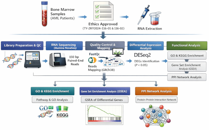
Rysunek 1: Workflow protokołu. Schemat przedstawia główne etapy eksperymentalne i obliczeniowe, w tym pobieranie próbek klinicznych, kontrolę jakości RNA, przygotowanie bibliotek i sekwencjonowanie, przetwarzanie i dopasowanie odczytów, kwantyfikację transkryptów, analizę różnicowej ekspresji, wzbogacenie GO/KEGG, GSEA oraz konstrukcję sieci PPI. Kliknij tutaj, aby wyświetlić powiększoną wersję tego rysunku.
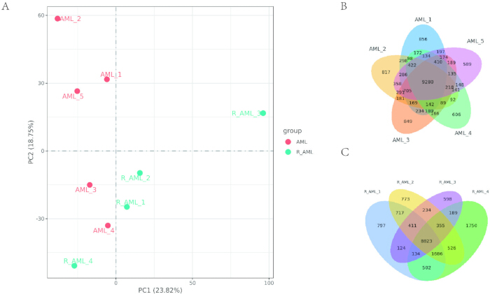
Rysunek 2: Analiza ilościowa próbek. (A) Przeprowadzono analizę głównych składowych (PCA), aby ocenić różnice międzygrupowe oraz powtarzalność próbek wewnątrz grupy. Analizę PCA wykonano przy użyciu metod algebry liniowej w oparciu o znormalizowane wartości ekspresji genów we wszystkich próbkach. (B, C) Diagramy Venna przedstawiające geny wykryte w próbkach odpowiednio z grup AML i R_AML. Obszary ograniczone do konkretnych próbek wskazują geny wykryte w poszczególnych próbkach, natomiast obszary wspólne reprezentują geny wykryte w dwóch lub więcej próbkach. Kliknij tutaj, aby wyświetlić powiększoną wersję tego rysunku.
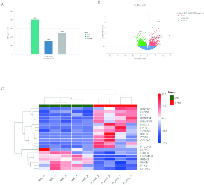
Rycina 3: Analiza różnicowej ekspresji genów. (A) Wykres słupkowy przedstawiający liczbę genów o różnicowej ekspresji (DEG) pomiędzy grupami porównawczymi, zidentyfikowanych za pomocą DESeq2 przy progach skorygowanej wartości P-value ≤ 0.05 oraz |log2FoldChange| ≥ 1. (B) Wykres wulkaniczny DEG. Oś x reprezentuje wartości log2FoldChange, a oś y reprezentuje -log10(P-value). Niebieskie linie przerywane wskazują linie progowe użyte do wyboru DEG. (C) Mapa ciepła z grupowaniem hierarchicznym DEG. Oś x oznacza nazwy próbek, a oś y pokazuje znormalizowane wartości ekspresji DEG. Kliknij tutaj, aby zobaczyć powiększoną wersję tej ryciny.
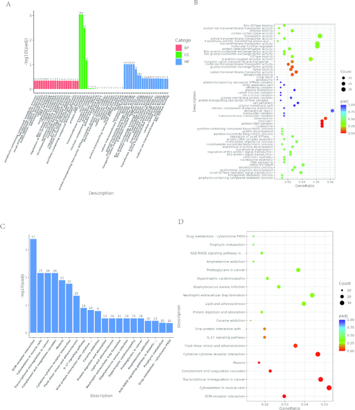
Rycina 4: Analiza wzbogacenia funkcjonalnego genów różnicowo wyrażonych. (A) Wykres słupkowy wzbogacenia GO. Oś x reprezentuje terminy GO, a oś y pokazuje istotność wzbogacenia, wyrażoną jako -log10(padj). Kolory reprezentują BP (proces biologiczny), CC (komponent komórkowy) i MF (funkcja molekularna). (B) Wykres bąbelkowy wzbogacenia GO. Oś x reprezentuje stosunek DEG przypisanych do każdego terminu GO w stosunku do całkowitej liczby DEG, a oś y wskazuje terminy GO. Wielkość bąbelka odpowiada liczbie przypisanych genów, a gradienty kolorów reprezentują istotność wzbogacenia. (C) Wykres słupkowy wzbogacenia KEGG. Oś x reprezentuje szlaki KEGG, a oś y oznacza istotność wzbogacenia. (D) Wykres bąbelkowy wzbogacenia KEGG. Wielkość bąbelka wskazuje liczbę przypisanych genów, a gradienty kolorów odzwierciedlają istotność wzbogacenia. Kliknij tutaj, aby wyświetlić większą wersję tej ryciny.
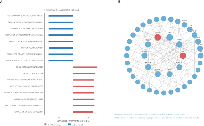
Rycina 5: Analiza wzbogacenia GSEA i analiza sieci oddziaływań białko-białko (PPI). (A) Wykres słupkowy przedstawiający znormalizowane wskaźniki wzbogacenia (NES) dla wybranych istotnych zbiorów genów. Dodatnie wartości NES wskazują na wzbogacenie w grupie R_AML, natomiast ujemne wartości NES wskazują na wzbogacenie w grupie z nowo zdiagnozowaną AML. (B) Sieć oddziaływań białko-białko (PPI). Każdy węzeł reprezentuje białko, a każda krawędź oznacza oddziaływanie między połączonymi białkami. Kliknij tutaj, aby wyświetlić powiększoną wersję tej ryciny.
Dyskusja
Kluczowe kroki w protokole
Pomyślne wykonanie tego przepływu pracy bioinformatycznej opiera się na kilku kluczowych krokach. Po pierwsze, natychmiastowe zamrażanie i odpowiednie lizysowanie aspyratu szpiku kostnego (Krok 1.6) są zasadnicze, ponieważ mikrośrodowisko szpiku kostnego jest bogate w rybonukleazy, które mogą szybko niszczyć integralność transkryptomu30. Podczas fazy obliczeniowej, poprawna konfiguracja wzorca projektu eksperymentu w pakiecie DESeq2 (Krok 6.3) jest krytyczna dla dokładnego różnicowania ekspresji, szczególnie gdy porównywany jest stan kliniczny (nowo rozpoznany w porównaniu z nawracanym), podczas gdy brane są pod uwagę potencjalne zmienne mylące. Wreszcie, zastosowanie rygorystycznych progów współczynnika fałszywych odkryć (FDR) podczas Analizy Obogacenia Zestawów Genów (GSEA) (Krok 9.6) jest kluczowy statystycznym kontrolnym, aby zapobiec nadmiernej interpretacji fałszywych dodatnich funkcjonalnych sieci.
Modyfikacje i rozwiązywanie problemów
Częstym wyzwaniem w tej metodzie jest obecność efektów partii, które często występują, gdy próbki kliniczne są zbierane i sekwencjonowane w dłuższych przedziałach czasowych. Zmienne partii powinny być zdefiniowane przed analizą, w tym data pobrania próbki, data ekstrakcji RNA, partia przygotowania biblioteki, pasmo sekwencjonowania i uruchomienie sekwencjonowania. Jeśli analiza PCA lub korelacji próbek ujawnia grupowanie na podstawie daty sekwencjonowania lub innej zmiennej technicznej, a nie na podstawie fenotypu klinicznego, użytkownicy powinni zmodyfikować protokół, włączając zmienną partii do wzorca różnicowej ekspresji, gdy jest to statystycznie wykonalne lub zastosować algorytmy korekcji partii, takie jak ComBat lub SVA, przed wizualizacja31. Jeśli stosuje się ten protokół do pełnej krwi zamiast aspyratów szpiku kostnego, istotną modyfikacją jest włączenie kroków wyczerpania mRNA globiny podczas przygotowania biblioteki, aby zapobiec monopolizacji głębokości odczytu sekwencjonowania przez wysoce obfite transkrypty globiny. Wersje oprogramowania i główne parametry reprezentatywnego przepływu pracy zostały uzupełnione następująco: fastp v0.23.2, HISAT2 v2.0.5, StringTie v1.3.3b, featureCounts v1.5.0-p3, R v3.5.0, DESeq2 v1.20.0, clusterProfiler v3.8.1, org.Hs.eg.db v3.6.0, sekwencjonowanie paired-end 150 bp, GSEA v4.2.3 z 1 000 permutacjami zestawów genów, MSigDB v7.5.1, STRING v11.5 z interakcjami o wysokiej pewności, i Cytoscape v3.9.1. Reprezentatywne parametry wiersza poleceń i ustawienia analizy są dostępne w Pliku uzupełniającym 1.
Ograniczenia metody
Mimo że jest kompleksowy, ten protokół ma wrodzone ograniczenia metodologiczne. Po pierwsze, wykorzystuje sekwencjonowanie RNA masowego, którego uchwytuje średni profil transkryptomu całego aspyratu szpiku kostnego i brakuje rozdzielczości przestrzennej pojedynczych komórek. Dlatego przepływ pracy nie może określić, czy wzmożony podpis związany z nawracaniem pochodzi od komórek macierzystych białaczki, komórek stromalnych, komórek odpornościowych, czy też zmian w składzie typu komórki32. Po drugie, reprezentatywny zestaw danych jest mały (n = 9) i niesparowany, co ogranicza moc statystyczną i uniemożliwia jednoznaczne wyciąganie wniosków przyczynowych. Po trzecie, przepływ pracy jest czysto in silico. Generuje kandydatów do regulatorowych węzłów i ścieżek sygnałowych, ale nie może niezależnie zweryfikować ich funkcjonalnej konieczności w chemorezystancji bez ortogonalnej walidacji eksperymentalnej in vitro lub in vivo.
Ostatnie badania pojedynczych komórek i genomów pojedynczych komórek poszerzyły ramy odniesienia AML, rozdzielając heterogeniczność stanu komórki, architekturę klonalną i ewolucję związaną z terapią z wyższą rozdzielczością33,34,35,36. Te podejścia uzupełniają opisany tu przepływ pracy sekwencjonowania RNA masowego: sekwencjonowanie masowe zapewnia praktyczną i opłacalną strategię przesiewową dla transkryptomu na poziomie kohorty, podczas gdy metody pojedynczych komórek i multi-omiczne mogą być stosowane w badaniach następczych w celu przypisania kandydatów do sygnałów do określonych populacji złośliwych lub mikrośrodowiskowych komórek.
Znaczenie w stosunku do istniejących metod
Mimo tych ograniczeń, ten przepływ pracy transkryptomu oferuje zalety nad alternatywnymi technikami diagnostycznymi i analitycznymi. Tradycyjne oceny kliniczne nawrotu AML często polegają na docelowych panelach qPCR multiplex lub standardowej cytometrii przepływowej. Chociaż są przydatne do szybkiego rozpoznawania, te ukierunkowane metody są ograniczone przez wstępnie zdefiniowane sondy i mogą oceniać tylko znane markery oporu19. Wykorzystując bezstronne sekwencjonowanie transkryptomu na skalę genomu połączone z analizą sieci, ten protokół może nominować nowe transkrypty i asocjacje
Oświadczenia
Autorzy deklarują brak konfliktu interesów.
Podziękowania
Badanie to było sfinansowane przez Biuro Nauki i Technologii Miasta Ganzhou (2022—ZD1368).
Materiały
| Nazwa | Firma | Numer katalogowy | Komentarze |
|---|---|---|---|
| Agilent 2100 Bioanalyzer | Agilent Technologies, Santa Clara, CA, USA | RRID:SCR_019389 | G2939BA |
| AMPure XP system | Beckman Coulter, Brea, CA, USA | RRID:SCR_008452 | A63881 |
| cBot Cluster Generation System | Illumina, San Diego, CA, USA | - | SY-301-2002 lub identyfikator systemu specyficznego dla instytucji |
| clusterProfiler (oprogramowanie) | Bioconductor | RRID:SCR_016884 | v3.8.1 |
| Cytoscape (oprogramowanie) | Cytoscape Consortium | RRID:SCR_003032 | v3.9.1 |
| DESeq2 (oprogramowanie) | Bioconductor | RRID:SCR_015687 | v1.20.0 |
| DNA Polymerase I | New England Biolabs (NEB, Ipswich, MA, USA) | - | M0209L |
| dNTP Solution Mix | New England Biolabs (NEB, Ipswich, MA, USA) | - | N0447L |
| edgeR (oprogramowanie) | Bioconductor | RRID:SCR_012802 | v3.22.5 |
| fastp (oprogramowanie) | OpenGene | RRID:SCR_016962 | v0.23.2 |
| featureCounts / Subread (oprogramowanie) | The Walter and Eliza Hall Institute | RRID:SCR_012919 | featureCounts v1.5.0-p3 |
| GRCh38 reference genome | Genome Reference Consortium / Ensembl | - | GRCh38; Ensembl release 109 |
| GSEA software | Broad Institute | RRID:SCR_003199 | v4.2.3 |
| HISAT2 (oprogramowanie) | Johns Hopkins University | RRID:SCR_015530 | v2.0.5 |
| M-MuLV Reverse Transcriptase (RNase H-) | New England Biolabs (NEB, Ipswich, MA, USA) | - | M0253L |
| MSigDB gene sets | Broad Institute | RRID:SCR_016863 | v7.5.1 |
| NEBNext Ultra II Directional RNA Library Prep Kit for Illumina | New England Biolabs (NEB, Ipswich, MA, USA) | - | E7760L/E7765L lub zestaw specyficzny dla laboratorium |
| NEBNext Ultra II RNA Library Prep Kit for Illumina | New England Biolabs (NEB, Ipswich, MA, USA) | - | E7770L |
| NovaSeq sequencing platform | Illumina, San Diego, CA, USA | RRID:SCR_016387 | NovaSeq system; identyfikator instrumentu dostawcy usług |
| org.Hs.eg.db (pakiet adnotacji) | Bioconductor | - | v3.6.0 |
| Phusion High-Fidelity DNA Polymerase | Thermo Fisher Scientific, Waltham, MA, USA | RRID:AB_2756816 | F530L |
| Qubit 2.0 Fluorometer | Thermo Fisher Scientific, Waltham, MA, USA | RRID:SCR_018095 | Q32866 |
| Qubit dsDNA HS Assay Kit | Thermo Fisher Scientific, Waltham, MA, USA | - | Q32851 |
| R software | R Foundation for Statistical Computing | RRID:SCR_001905 | v3.5.0 |
| Random Hexamer Primer | Thermo Fisher Scientific, Waltham, MA, USA | - | SO142 |
| RNA 6000 Nano Kit | Agilent Technologies, Santa Clara, CA, USA | - | 5067-1511 |
| RNase H | New England Biolabs (NEB, Ipswich, MA, USA) | - | M0297L |
| RNA-seq Library Prep Kit / Sequencing Service | Novogene, Beijing, China | - | Nr projektu X101SC25054246-Z01-J003 |
| STRING database | STRING Consortium | RRID:SCR_005223 | v11.5 |
| StringTie (oprogramowanie) | Johns Hopkins University / Center for Computational Biology | RRID:SCR_016323 | v1.3.3b |
| TruSeq PE Cluster Kit v3-cBot-HS | Illumina, San Diego, CA, USA | - | PE-401-3001 |
Bibliografia
- Döhner H, et al. Diagnosis and management of AML in adults: 2017 ELN recommendations from an international expert panel. Blood. 2017;129(4):424-47.
- Papaemmanuil E, et al. Genomic classification and prognosis in acute myeloid leukemia. N Engl J Med. 2016;374(23):2209-21.
- Arber DA, et al. The 2016 revision to the World Health Organization classification of myeloid neoplasms and acute leukemia. Blood. 2016;127(20):2391-405.
- Burnett AK, et al. Optimization of chemotherapy for younger patients with acute myeloid leukemia: results of the Medical Research Council AML15 trial. J Clin Oncol. 2013;31(27):3360-8.
- Ravandi F, et al. Phase I/II study of combination therapy with sorafenib, idarubicin, and cytarabine in younger patients with acute myeloid leukemia. J Clin Oncol. 2010;28(11):1856-62.
- Thol F, Schlenk RF, Heuser M, Ganser A. How I treat refractory and early relapsed acute myeloid leukemia. Blood. 2015;126(3):319-27.
- Zahreddine H, Borden KL. Mechanisms and insights into drug resistance in cancer. Nat Rev Drug Discov. 2013;12(4):314-28.
- Meads MB, Gatenby RA, Dalton WS. Environment-mediated drug resistance: a major contributor to minimal residual disease. Nat Rev Cancer. 2009;9(9):665-74.
- Ishikawa F, et al. Chemotherapy-resistant human AML stem cells home to and engraft within the bone-marrow endosteal region. Nat Biotechnol. 2007;25(11):1315-21.
- Pollyea DA, et al. Targeting acute myeloid leukemia stem cells: a review and principles for the development of clinical trials. Haematologica. 2014;99(8):1277-84.
- Shafat MS, Gnaneswaran B, Bowles KM, Rushworth SA. The bone marrow microenvironment-home of the leukemic blasts. Blood Rev. 2017;31(5):277-86.
- Lagadinou C, et al. BCL-2 inhibition targets oxidative phosphorylation and selectively eradicates quiescent human leukemia stem cells. Cell Stem Cell. 2013;12(3):329-41.
- Park IK, et al. Receptor tyrosine kinase Axl is required for resistance of leukemic cells to FLT3-targeted therapy in acute myeloid leukemia. Leukemia. 2015;29(12):2382-9.
- Ben-Batalla I, et al. Axl, a prognostic and therapeutic target in acute myeloid leukemia mediates paracrine crosstalk of leukemia cells with bone marrow stroma. Blood. 2013;122(14):2443-52.
- Farge T, et al. Chemotherapy-resistant human acute myeloid leukemia cells are not enriched for leukemic stem cells but require oxidative metabolism. Cancer Discov. 2017;7(7):716-35.
- Bosc C, et al. Mitochondrial inhibitors circumvent survival of leukemic stem cells. Cancer Cell. 2017;32(5):724-5.
- Li S, et al. Distinct evolution and dynamics of epigenetic and genetic heterogeneity in acute myeloid leukemia. Nat Med. 2016;22(7):792-9.
- Stevens AM, et al. Increased STAT3 activity in acute myeloid leukemia is driven by the bone marrow microenvironment. Cancer Res. 2017;77(18):5053-62.
- Wang Z, Gerstein M, Snyder M. RNA-Seq: a revolutionary tool for transcriptomics. Nat Rev Genet. 2009;10(1):57-63.
- Conesa A, et al. A survey of best practices for RNA-seq data analysis. Genome Biol. 2016;17(1):13.
- Chomczynski P, Sacchi N. Single-step method of RNA isolation by acid guanidinium thiocyanate-phenol-chloroform extraction. Anal Biochem. 1987;162(1):156-9.
- Love MI, Huber W, Anders S. Moderated estimation of fold change and dispersion for RNA-seq data with DESeq2. Genome Biol. 2014;15(12):550.
- Benjamini Y, Hochberg Y. Controlling the false discovery rate: a practical and powerful approach to multiple testing. J R Stat Soc Series B Stat Methodol. 1995;57(1):289-300.
- Yu G, Wang LG, Han Y, He QY. clusterProfiler: an R package for comparing biological themes among gene clusters. OMICS. 2012;16(5):284-7.
- Subramanian A, et al. Gene set enrichment analysis: a knowledge-based approach for interpreting genome-wide expression profiles. Proc Natl Acad Sci U S A. 2005;102(43):15545-50.
- Liberzon A, et al. Molecular signatures database (MSigDB) 3.0. Bioinformatics. 2011;27(12):1739-40.
- Szklarczyk D, et al. STRING v11: protein-protein association networks with increased coverage, supporting functional discovery in genome-wide experimental datasets. Nucleic Acids Res. 2019;47(D1):D607-13.
- Shannon P, et al. Cytoscape: a software environment for integrated models of biomolecular interaction networks. Genome Res. 2003;13(11):2498-504.
- Somerville TD, et al. Frequent derepression of the mesenchymal transcription factor gene FOXC1 in acute myeloid leukemia. Cancer Cell. 2015;28(3):329-42.
- Stark R, Grzelak M, Hadfield J. RNA sequencing: the teenage years. Nat Rev Genet. 2019;20(11):631-56.
- Leek JT, et al. The sva package for removing batch effects and other unwanted variation in high-throughput experiments. Bioinformatics. 2012;28(6):882-3.
- Hwang B, Lee JH, Bang D. Single-cell RNA sequencing technologies and bioinformatics pipelines. Exp Mol Med. 2018;50(8):1-14.
- Döhner H, et al. Diagnosis and management of AML in adults: 2022 recommendations from an international expert panel on behalf of the ELN. Blood. 2022;140(12):1345-77.
- Khoury JD, et al. The 5th edition of the World Health Organization classification of haematolymphoid tumours: myeloid and histiocytic/dendritic neoplasms. Leukemia. 2022;36(7):1703-19.
- Morita K, et al. Clonal evolution of acute myeloid leukemia revealed by high-throughput single-cell genomics. Nat Commun. 2020;11:5327.
- Miles LA, et al. Single-cell mutation analysis of clonal evolution in myeloid malignancies. Nature. 2020;587(7834):477-82.
- Kenderian SS, et al. CD33-specific chimeric antigen receptor T cells exhibit potent preclinical activity against human acute myeloid leukemia. Leukemia. 2015;29(8):1637-47.