Here we describe a protocol for the automated segmentation of fluorescently labeled tissues on slides using a widefield high-content analysis system (WHCAS). This protocol has wide-ranging applications in any field which involves the quantitation of fluorescent markers in biological tissues including the biological sciences, medical engineering, and health sciences.
Method Article
Automated Slide Scanning and Segmentation in Fluorescently-labeled Tissues Using a Widefield High-content Analysis System
* These authors contributed equally
In This Article
Summary
Abstract
Automated slide scanning and segmentation of fluorescently-labeled tissues is the most efficient way to analyze whole slides or large tissue sections. Unfortunately, many researchers spend large amounts of time and resources developing and optimizing workflows that are only relevant to their own experiments. In this article, we describe a protocol that can be used by those with access to a widefield high-content analysis system (WHCAS) to image any slide-mounted tissue, with options for customization within pre-built modules found in the associated software. Not originally intended for slide scanning, the steps detailed in this article make it possible to acquire slide scanning images in the WHCAS which can be imported into the associated software. In this example, the automated segmentation of brain tumor slides is demonstrated, but the automated segmentation of any fluorescently-labeled nuclear or cytoplasmic marker is possible. Furthermore, there are a variety of other quantitative software modules including assays for protein localization/translocation, cellular proliferation/viability/apoptosis, and angiogenesis that can be run. This technique will save researchers time and effort and create an automated protocol for slide analysis.
Introduction
The accurate and precise quantitation of fluorescently-labeled tissues on slides is a highly sought-after technique in many scientific fields. However, researchers often manually count specimens or spend considerable amounts of time developing esoteric automated techniques to achieve this. Herein, we provide a protocol for the automated slide scanning and quantitation of cells using a WHCAS and its associated software, with innate immune cells in frozen human brain tumor sections as an example. The associated software offers a wide range of built-in customizable modules from neurite outgrowth counting to differentiation of cell types1,2,3,4,5,6. The goal of this method is to provide researchers with a start-to-finish, easily reproducible protocol to acquire images of and quantitate fluorescently-labeled entities in any slide-mounted tissues.
In this protocol, the WHCAS is mainly used for imaging plates for the subsequent analysis on the associated software even though a slide adapter and the basics to slide scanning7 were available. It was prohibitive to image slides because the careful spatial calibration of the acquisition area, the selection of appropriate journals, the creation of tailored loadouts, and a liaison with product representatives were required. In the wider body of literature, in lieu of purchasing a dedicated slide-imaging and analysis apparatus8, a previous technological report with access to this software circumvented the image acquisition of slides on the WHCAS altogether9. Performing image acquisition or image analysis on different platforms necessitates extra work to ensure each is compatible with the other.
The ability to use the WHCAS and its software for image capture would avoid the unnecessary complications of searching for or developing a workflow alien to these tools. In this article, the steps required to create a low magnification overview scan and the corresponding high magnification images by treating the slide as a plate, and the subsequent analyses using the Multi-Wavelength Cell Scoring segmentation module allow for the repurposing of the WHCAS. This readily usable protocol provides an advantage over alternative techniques because there is no need to develop algorithms or multi-step counting protocols10,11 once the images are acquired on the WHCAS. This protocol mitigates the time required to optimize a quantitation technique, is more precise12 and efficient than manual counting and maximizes the use of the WHCAS. This protocol can be widely and easily used since it enables the imaging and analysis of any fluorescently-labeled tissues on slides.
Protocol
Tumor specimens were obtained as per the protocol approved by the local institutional review board and ethics committee and conducted in accordance with national regulations. The WHCAS and its associated software used in this article are listed in the Table of Materials.
1. Importing the Journals
- Open the associated software.
- Download the journal suite indicated in the Table of Materials.
- Import the journal suite to a suitable directory by clicking on the main menu heading Journal, selecting Import Journal Suite…, and clicking Import.
2. Creating Settings for Preview Scan Acquisition
- In the Plate Acquisition Setup dialog box, go to the Objective and Camera tab. Select 4X as the magnification, 1 as the camera binning, and 2 as the gain.
- Input the settings in Figure 1A under the tab Plate – Slidescanning.
NOTE: These settings have been created to allow the user to view and navigate up to 3 slides. Each slide has been divided into 3 adjacent wells for the easy navigation and 'live' visualization of the tissue slices or cells. - In the Sites to Visit tab, fill the wells uniformly with the sites.
- Click on Edit Plate Bottom Settings… and enter the values displayed in Figure 1B.
- Under the Acquisition Loop tab, enter the desired wavelength (any nuclear stain in this example) for the preview scan. For the best contrast and image-based focusing, use the brightest fluorescent signal (e.g., often a nuclear stain).
NOTE: Staining tissues with a bright stain such as a nuclear stain is recommended since this provides a high contrast compared to the background. Not only will this aid in the sample location, but when imaging more than one fluorophore in the following high magnification acquisition, the brightest color will be used to base the imaging offset of the other colors on. - Enable Shading Correction in Plate Acquisition mode to stitch images together.
- Save these settings as Setting A.
3. Creating Settings for Slide Acquisition at High Magnification
- In the Plate Acquisition Setup dialog box, go to the Objective and Camera tab. Select 40X as the magnification, 1 as the camera binning (for the highest digital resolution), and 2 as the gain (to increase the signal and brightness of images).
NOTE: A lower objective magnification setting can be used, but the authors found 40X to be the optimal setting for the analysis of human microglia and macrophages in brain tumor tissue using the Multi-Wavelength Cell Scoring module. - Ensure all settings for the Plate – Slidescanning and Edit Plate Bottom Settings… tabs are the same as that for Setting A (see step 2).
- If the images obtained are not crisp, change the Well depth, Plate height, and Plate Bottom Settings to adjust the focus. If there is still an issue with the focus, choose Laser with Image Recovery under the Autofocus options section.
- Under the Acquisition Loop tab, enter the number of wavelengths present in the sample. Check the Enable laser-based focusing and Enable image-based focusing (for acquisition or laser recovery) options.
- Under the Autofocus tab, select Focus on plate and well bottom.
- In the Journals tab, select the options as indicated in Figure 2, ensuring Prevent asynchronous hardware moves is also selected.
- Save these settings as Setting B.
4. Placing the Slide in the Widefield High-content Analysis System
- Press F4 to get the Main Menu. Select Slide Scanning. Click Open Door – Eject Slide and insert slide(s) and the slide adapter (that can hold up to three slides) into the WHCAS (Figure 3A and 3B). Orient the slide with the coverslip facing down and the label on the side of the notch in the slide adapter (Figure 3A).
NOTE: The slides used in this experiment were standard 25 x 75 x 1 mm slides. - Click on Close Door – Load Slide.
5. Acquiring a Preview Scan
- Under the Screening heading, select Plate Acquisition and Control… and Plate Acquisition Setup… and load Setting A.
- Under the Wells to Visit tab, move to the well containing the sample, using the right-click button on the mouse. Under the Sites to Visit tab, move to different sites with the Live image capture until the cells are located. Manually focus on the sample or use the Autofocus. Use Snap to capture the image.
NOTE: The sample is easier to locate with more sites, and by fitting the sites to the well (see step 2.3). - On the main menu, select Preview Slides.
- In the dialog box that automatically pops up, select the option reflecting how many slides are going to be scanned. Scan one slide at a time. Press OK. Select 4X as the magnification. Press OK. Select Coverslip down (0.17 mm) as the slide orientation (use a correction collar if a different coverslip thickness is used). Press OK. Click Continue.
NOTE: If the user wishes to acquire preview scans for 2 or more slides, each preview scan has to be opened individually prior to the acquisition of the corresponding high magnification image. - Under Load Scan Slide Setting, ensure the Acquisition settings and Calibrations boxes are checked. Press Cancel. When the Scan Slide Settings box reappears, select Continue.
- When the Scan Slide dialog box appears, adjust the settings as suggested in Figure 4A-4C. Select Close when finished.
NOTE: Increasing the camera binning and decreasing the camera exposure time will result in faster scanning, albeit at a lower digital resolution and dynamic range, respectively, hence decreasing the image quality. Shading correction will ensure a uniform intensity across a single field of view. Turning on Hardware and Image Autofocus will ensure the scan is in focus but will slow down the scanning. In the interest of saving time, it is recommended to have Shading correction and Hardware and Image Autofocus off while acquiring the low magnification scan, but to have these options turned on for step 6 during the high magnification imaging. The resolution of the low magnification scan will not affect the resolution of the high magnification scan. - Select a directory for the slide scanning data. Click OK. Enter a name for the file. Click OK.
- The Draw Region dialog box will automatically appear. Use the Rectangular Region tool (Figure 5A) to select the entire preview scan region as shown in Figure 5B. Click Continue.
- The Setup Complete dialog box will appear. Select Continue.
NOTE: The preview slide scan will now commence. - When the preview is completed, the Scanning Complete dialog box will appear. Select Continue. Do not close the preview scan window (in this example the DAPI Scan window; see Figure 6).
NOTE: The setup and low magnification scan acquisition process will take approximately 20 min. The subsequent high magnification image acquisition time will depend on the number of sites chosen as well as the exposure times for each channel.
6. High Magnification Scanning
- Load Setting B.
- Determine which wells are to be imaged. Under the Wells to Visit tab, move to the well containing the sample, using the right-click button on the mouse.
NOTE: The technique is demonstrated here by imaging Well 1. - Under the Sites to Visit tab, move to different sites with the Live feature until the cells or tissue is located. Manually focus on the sample or use the Autofocus. Use Snap to capture the image.
NOTE: To aid in locating the sample at a high magnification, use the Plate Acquisition and Control dialog box to adjust the Step size anywhere from 5 to 100 µm to find the sample if Autofocus cannot. - Under the W1 DAPI tab, click Auto Expose. Ensure the Plate Acquisition Snap - DAPI image is crisp.
- Under the main menu, click on Journal to reveal the pull-down. Select Run Journal….
- Double-click on the Slide Region Acquisition Setup journal to launch it. When the Setup Slide Region Acquisition dialog box appears, select Continue.
- When instructed, properly select the DAPI Scan to select the low-magnification slide image. Press OK. Similarly, highlight the Plate Acquisition Snap - DAPI when asked for the plate acquisition snap. Click on OK.
- When the Create or Load Regions box appears, use the Rectangular Region tool to select (a) region(s) of interest on the DAPI Scan (Figure 6). Press Continue.
NOTE: The maximum area that can be selected at 40X is 45 columns by 35 rows. If multiple regions of interest are selected, the regions will be resized to the box with the greatest area. The boxes can be repositioned after the resizing. - Select No under the Load Regions dialog box.
NOTE: Selecting Yes loads previously saved regions for batches of slides with the same region of interest locations. - Using the Locator tool, highlight the largest region of interest and press Continue under the Select Region dialog box. When the Confirm regions box appears, select Continue. Decide whether the region needs to be saved when the Save Regions dialog box appears.
- The next dialog box, Site Spacing, allows the user to choose Tiled, which results in an image with no overlap, or 10% overlap. Choose an option and click OK. The authors chose Tiled.
- Three dialog boxes will appear now. The Setup Complete box can be dismissed by pressing Continue. Keep the Acquisition Site Setup for 40X box (Figure 7A) open for now since it makes clear how many columns and rows need to be entered into the Plate Acquisition Setup box (Figure 7B). Keep the WellPositions box (Figure 7C) that appears in the bottom left-hand corner open for the duration of the imaging.
- In the Plate Acquisition Setup box, under Wells to Visit, the same number of wells as regions of interest previously selected must be highlighted (Figure 7D).
NOTE: The authors developed this protocol for a maximum of nine regions of interest per slide. If there are more, simply increase the number of columns or rows in the Plate - SlideScanning tab to reflect the number of regions of interest. These wells do not spatially represent the location of the regions of interest in any way, but the appropriate number must be highlighted (left-click). - In the Plate Acquisition Setup box, go to the Sites to Visit tab. Enter the suggested columns and rows (Figure 7B). Remember to click on Tile sites.
- To eliminate the guesswork of finding the sites containing the sample, press Acquire Plate under the Summary tab to position the stage at the pre-selected region of interest. Once the camera pans over a site containing cells, press Cancel at the bottom right-hand corner to stop the image acquisition. Ensure the stage is now located over the sample.
- Optimize the wavelength settings to ensure that a focused and a high dynamic range image is obtained. When satisfied, click on the Summary tab and Acquire Plate.
7. Image Analysis
- Select the desired custom module.
NOTE: The authors chose the Multi-Wavelength Cell Scoring module to demonstrate an automated segmentation of the brain tumor slides. - Run the analysis on all sites. If the analysis parameters are the same for many slides, the analysis can be included in the Plate Acquisition Setup box under the Post Acquisition tab.
- Once the analysis is finished, exclude any sites of poor image quality so as not to bias the results. Since the goal of this analysis is to quantify microglia and macrophages in the tumor parenchyma, select the region of interest within the tumor sample's edges. Furthermore, exclude the sites that are out of focus and/or contain tissue folds or bubbles and tears in the tissue. For a demonstration, see the Representative Results. Alternatively, use the Laser focus score generated for each site depending on the amplitude of the laser reflection as a threshold below which sites are to be excluded (the threshold is customizable and depends on parameters such as the exposure time and the type of media used).
NOTE: The high magnification images make it possible to specifically exclude structures, such as large blood vessels and areas of necrosis, if necessary. It is also possible to include only areas of interest, such as those that are hypercellular. This way, the specificity and accuracy of the analyses can be increased.
Results
The images can be viewed within the WHCAS software. Figure 8 shows the high magnification thumbnails of all sites within the defined region of interest. Review each site to identify the ones that should be excluded from the analysis (examples are shown at low and high magnification in Figure 8 and Figure 9, respectively). For example, Site 149 is out of focus (Figure 9A), Site 219 has bubbles (Figure 9B), and Site 54 contains a fold (Figure 9C) and should be excluded. It is typical to exclude 10 - 15% of all sites imaged. In the example provided, 15.3% of the sites were excluded (25/300 had bubbles, 17/300 were out of focus, 3/300 were folded, and 1/300 was on the edge). Figure 10A is a representative image chosen for analysis (its corresponding low magnification thumbnail is shown in Figure 8). Here, the corresponding overlays generated by the Multi-Wavelength Cell Scoring module demonstrate the results of the automated segmentation performed on Site 59, customized to the authors' specifications (nuclei minimum width = 2.5 µm, maximum width = 7.5 µm, and intensity above local background = 35 graylevels; CD11b-positive cells' minimum width = 4 µm, maximum width = 18 µm, minimum stained area = 15 µm2, and intensity above local background = 310 graylevels; and CD45-positive cells' minimum width = 4 µm, maximum width = 18 µm, minimum stained area = 15 µm2, and intensity above local background = 50 graylevels). Following the segmentation, the quantitative data of the proportion of cells staining positive for each marker (6.2 ± 5.1% and 3.8 ± 2.1% of CD11b+ and CD45+ cells, respectively), both markers (3.5 ± 2.1% CD11b+CD45+ cells), no markers (86.6 ± 9.0% CD11b-CD45- cells; Figure 10B), mean stained area (40.0 ± 9.2 µm and 36.7 ± 7.6 µm of CD11b+ and CD45+ cells, respectively; Figure 10C), and mean fluorescence intensity (408.9 ± 40.3 relative fluorescence units and 373.9 ± 38.1 relative fluorescence units of CD11b+ and CD45+ cells, respectively; Figure 10D) can be obtained.
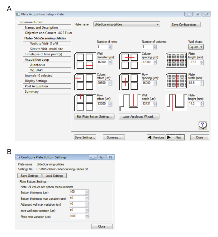
Figure 1: Settings for slide acquisition at low magnification. A. This image displays the plate settings. B. Here, the plate bottom settings are displayed. Please click here to view a larger version of this figure.
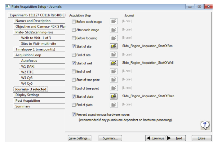
Figure 2: Settings for slide acquisition at high magnification. This figure displays the selection of the appropriate journals. Please click here to view a larger version of this figure.
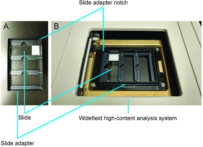
Figure 3: Demonstration of how to load slides using the slide adapter. A. The slide is placed coverslip down with the label on the side of the slide adapter notch. B. The slide adapter is loaded into the widefield high-content analysis system. Please click here to view a larger version of this figure.
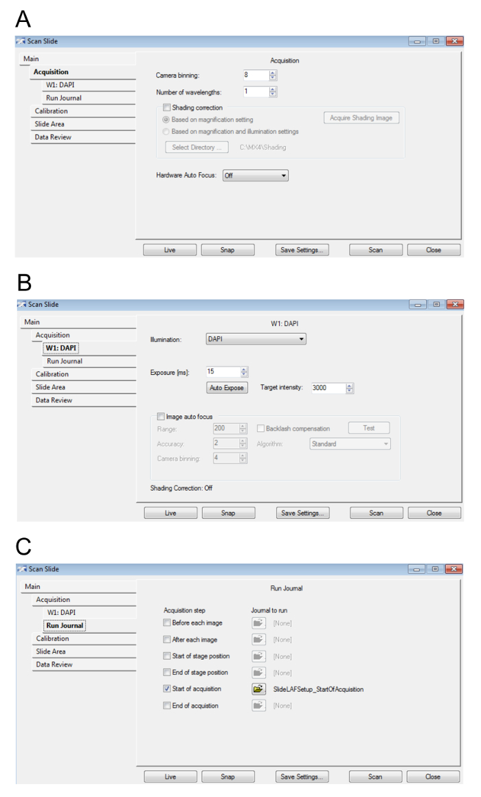
Figure 4: Preview slide settings. A. This figure displays the parameters for the acquisition. B. Here, the values for the Hoescht/DAPI wavelength settings are displayed. C. This image shows the journal settings. Please click here to view a larger version of this figure.
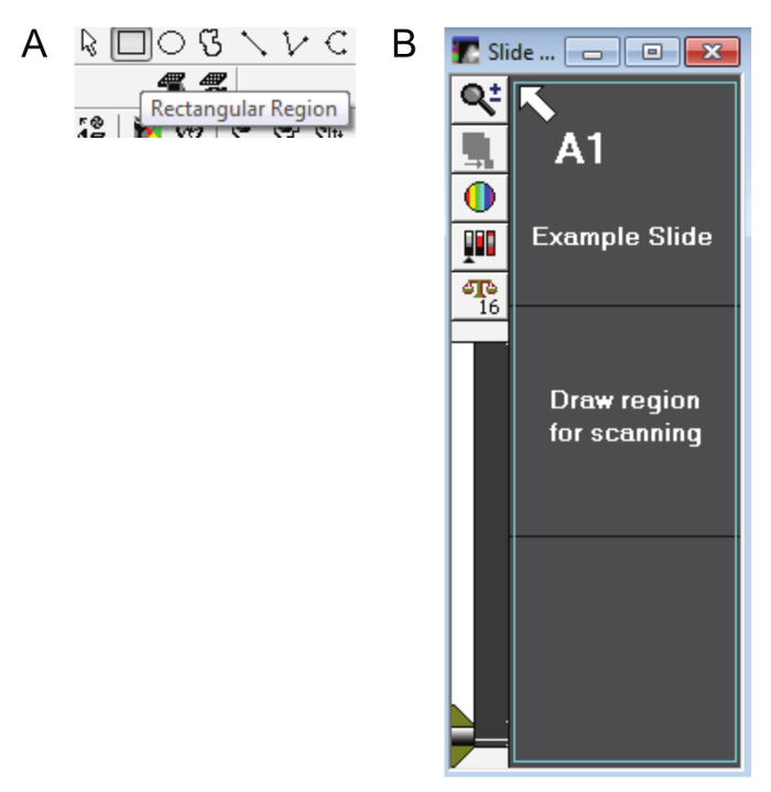
Figure 5: Drawing a slide region. A. The rectangular region tool (other drawing tools cannot be used) is used to select the preview scan area and create regions of interest on the DAPI scan. B. The teal outline in this figure shows how the entire area of the slide (including the label) should be selected. Please click here to view a larger version of this figure.
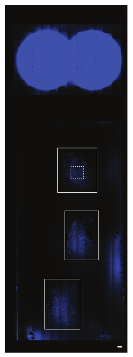
Figure 6: Creating regions of interest on the preview scan. The preview or DAPI scan represents the entire slide area. In this example, there are three serial brain tissue sections (the solid white rectangular outlines). The area above these sections represents the circular labels on the slide. Different section arrangements will not limit the subsequent selection of regions of interest. The region of interest in this particular example is shown with a dashed white rectangular outline. The scalebar = 1 mm. Please click here to view a larger version of this figure.

Figure 7: Essential windows for high magnification image acquisition. A. The Acquisition Site Setup window will show how many columns and rows are within the region(s) of interest. B. Ensure the correct number of columns and rows indicated in Figure 7A are entered into the Plate Acquisition Setup box and the sites are tiled. C. It is necessary to keep the WellPositions window open for the duration of the image acquisition even though it is blank. D. The appropriate number of regions of interest must be highlighted. Please click here to view a larger version of this figure.
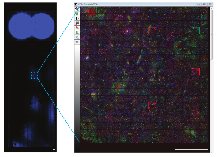
Figure 8: Representative image of the region of interest. Each site can be displayed in a composite thumbnail of the region of interest. The representative sites that have been excluded (marked with red boxes) and an example of an included site (marked with a green box) is shown at a higher magnification. It is recommended to review each site to ensure it is of sufficient quality for the analysis. The scalebar = 1 mm. Please click here to view a larger version of this figure.
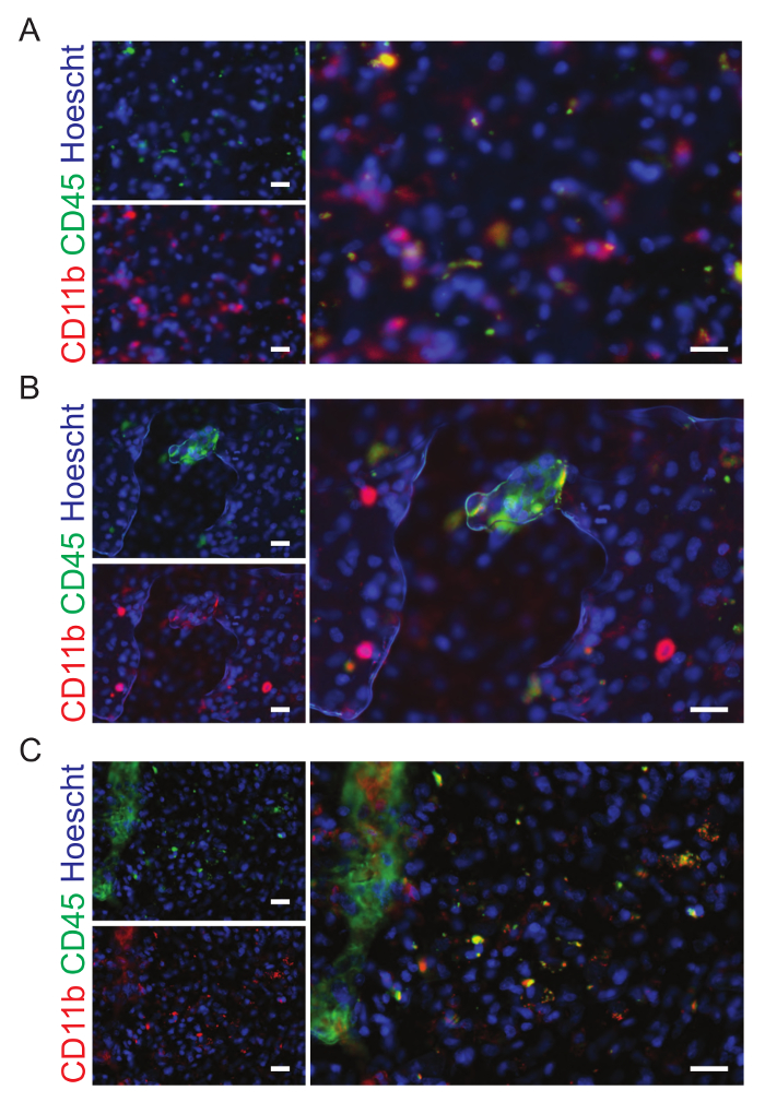
Figure 9: Examples of sites that should be excluded from analysis. A. The human brain tumor sections have been stained with CD11b (green) and CD45 (red), markers of microglia and macrophages. This image is out of focus and has been excluded from the analysis. B. Bubbles are present in this image which has been excluded from the final analysis. C.This site was excluded from the analysis because of the fold in the tissue. The scale bars are 20 µm. Please click here to view a larger version of this figure.
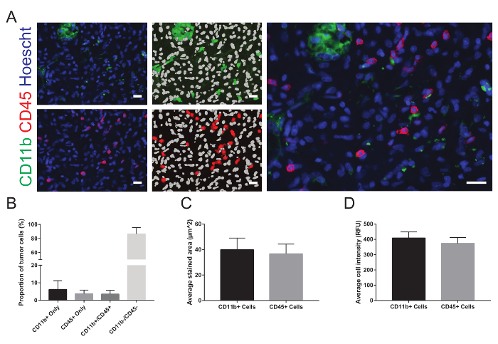
Figure 10: Representative images and analysis. A. Each image is displayed next to the overlays representing the results of the automated segmentation. In the overlay, nuclei are displayed in white and positively stained cells are shown in green for CD11b and red for CD45. After excluding the sites of inadequate quality from the analysis and combining the results of all the remaining sites, B. the average proportions of the total number of cells in each site that stained positive for each marker and co-labeled for both markers, C. the average stained area, and D. the average cell intensity are graphically represented. RFU = relative fluorescence units. The data are expressed as mean ± standard deviation. The scale bars are 20 µm. Please click here to view a larger version of this figure.
Discussion
A common problem still impeding the efficiency of biological science research is the development of protocols for the unbiased, accurate, and precise quantification of fluorescently-labeled tissues and their structures within. Significant amounts of time and effort are directed towards finding ways to analyze tissue slides once they have been imaged. Many existing methods provide algorithms for users to recreate within programs12,13,14. These methods are acceptable, but the significance of this report is that it enables the user to easily and quickly establish a holistic image acquisition and analysis protocol if the user has access to a WHCAS. Assays that differentiate cell types and quantify multiple structures and processes, cell cycle analysis, and nuclear translocation, for example, are already available in the associated software.
The setup involves a few critical steps. Firstly, the spatial parameters of the slide are defined as if it were a plate. Secondly, a low magnification overview scan is created from which regions of interest are selected for high magnification imaging. Lastly, sites that affect the accuracy and precision of subsequent analyses are excluded. The biggest limitation of this technique is that its applicability depends on if the user has access to a WHCAS. However, with the increasing need for high-content analysis systems, many institutions are providing these to their researchers to remain competitive15. Troubleshooting is needed most commonly when tissue sections do not have the same thickness. If multiple regions of interest are selected, some will be in focus while others will not. Ideally, during sectioning, the user would take care to create homogeneous samples. However, if the samples are inconsistent, the focus on the nuclear stain wavelength (or the user's brightest fluorophore), which is used to focus, can be readjusted for each out-of-focus region of interest and even for each field of view. As the other wavelengths are simply offset from the nuclear stain wavelength, only this wavelength needs readjustment.
In this report, we detail how to scan and analyze slides using a WHCAS and associated software. The Multi-Wavelength Cell Scoring module allows the user to automatically count any nuclear or cytoplasmic markers that are fluorescently labeled. After adjusting the focus settings and defining the cellular characteristics such as width and area to customize the module to the tissue imaged, there is no further need for user intervention to obtain the imaged slides and quantitative data. Up to three slides can be imaged at a time and multiple regions of interest can be defined. This protocol lets WHCAS users who need to analyze slides take advantage of customizable, multipurpose, automated workflows that require little to no optimization and can be applied in any projects in the future that involve the histological analysis of tissue.
Disclosures
The authors have no financial interests in the products described in this manuscript and have nothing else to disclose.
Acknowledgements
This project was funded by a grant from the Canadian Institutes of Health Research and Alberta Innovates - Health Solutions/Alberta Cancer Foundation. The authors wish to acknowledge the Regeneration Unit in Neurobiology core facility for the use of their equipment, the work of Paula Gedraitis in building the foundation upon which slide scanning on the WHCAS was made possible, and the creator of the products mentioned in this article, Molecular Devices.
Materials
| Name | Company | Catalog Number | Comments |
|---|---|---|---|
| ImageXpress MicroXLS | Molecular Devices | NA | Apparatus for image acquisition |
| MetaXpress 5.1 | Molecular Devices | NA | Associated software for ImageXpress MicroXL (runs on a PC with the Windows operating system). |
| Slide adapter | Molecular Devices | NA | Metal slide holder that fits into ImageXpress MicroXL |
| Slide_Region_Acquisition_revA.jzp | Molecular Devices | NA | The journal can be obtained from metamorph.moleculardevices.com/forum/showthread.php?tid=218&highlight=slide or from contacting a Molecular Devices representative |
| Slide_Region_Acquisition _Setup.JNL | Molecular Devices | NA | Select this journal in Step 6.6. |
References
- Hua, Y., Shun, T. Y., Strock, C. J., Johnston, P. A. High-content positional biosensor screening assay for compounds to prevent or disrupt androgen receptor and transcriptional intermediary factor 2 protein-protein interactions. Assay and Drug Development Technologies. 12 (7), 395-418 (2014).
- Rishal, I., et al. WIS-NeuroMath enables versatile high throughput analyses of neuronal processes. Developmental Neurobiology. 73 (3), 247-256 (2013).
- Kanungo, J., Lantz, S., Paule, M. G. In vivo imaging and quantitative analysis of changes in axon length using transgenic zebrafish embryos. Neurotoxicology and Teratology. 33 (6), 618-623 (2011).
- Schurmann, C., et al. Analyzing illumina gene expression microarray data from different tissues: methodological aspects of data analysis in the MetaXpress Consortium. PLoS ONE. 7 (12), e50938(2012).
- Vogt, A., Codore, H., Day, B. W., Hukriede, N. A., Tsang, M. Development of automated imaging and analysis for zebrafish chemical screens. Journal of Visualized Experiments. (40), e1900(2010).
- Bravo-San Pedro, J. M., et al. High-throughput quantification of GFP-LC3+ dots by automated fluorescence microscopy. Methods in Enzymology. , 71-86 (2017).
- Gedraitis, P. Slide Region Acquisition Journal Suite. , Available from: http://metamorph.moleculardevices.com/forum/showthread.php?tid=218&highlight=slide (2013).
- Varga, V. S., et al. Automated multichannel fluorescent whole slide imaging and its application for cytometry. Cytometry Part A. 75 (12), 1020-1030 (2009).
- Narayan, P. J., et al. Assessing fibrinogen extravasation into Alzheimer's disease brain using high-content screening of brain tissue microarrays. Journal of Neuroscience Methods. 247, 41-49 (2015).
- Du, Y., Budman, H. M., Duever, T. A. Segmentation and quantitative analysis of apoptosis of Chinese hamster ovary cells from fluorescence microscopy images. Microscopy and Microanalysis. 23 (3), 569-583 (2017).
- Mueller, J. L., et al. Quantitative segmentation of fluorescence microscopy images of heterogeneous tissue: application to the detection of residual disease in tumor margins. PLoS One. 8 (6), e66198(2013).
- Donnelly, D. J., Gensel, J. C., Ankeny, D. P., van Rooijen, N., Popovich, P. G. An efficient and reproducible method for quantifying macrophages in different experimental models of central nervous system pathology. Journal of Neuroscience Methods. 181 (1), 36-44 (2009).
- Kozlowski, C., Weimer, R. M. An automated method to quantify microglia morphology and application to monitor activation state longitudinally in vivo. PLoS One. 7 (2), e31814(2012).
- Fish, K. N., Sweet, R. A., Deo, A. J., Lewis, D. A. An automated segmentation methodology for quantifying immunoreactive puncta number and fluorescence intensity in tissue sections. Brain Research. 1240, 62-72 (2008).
- Zock, J. M. Applications of high content screening in life science research. Combinatorial Chemistry & High Throughput Screening. 12 (9), 870-876 (2009).
Reprints and Permissions
