High-resolution cryo-EM maps of macromolecules can be also achieved by using 200 kV TEM microscopes. This protocol shows the best practices for setting accurate optics alignments, data acquisition schemes, and selection of imaging areas that are all essential for the successful collection of high-resolution datasets using a 200 kV TEM.
Method Article
Routine Collection of High-Resolution cryo-EM Datasets Using 200 KV Transmission Electron Microscope
* These authors contributed equally
In This Article
Summary
Abstract
Cryo-electron microscopy (cryo-EM) has been established as a routine method for protein structure determination during the past decade, taking an ever-increasing share of published structural data. Recent advances in TEM technology and automation have boosted both the speed of data collection and quality of acquired images while simultaneously decreasing the required level of expertise for obtaining cryo-EM maps at sub-3 Å resolutions. While most of such high-resolution structures have been obtained using state-of-the-art 300 kV cryo-TEM systems, high-resolution structures can be also obtained with 200 kV cryo-TEM systems, especially when equipped with an energy filter. Additionally, automation of microscope alignments and data collection with real-time image quality assessment reduces system complexity and assures optimal microscope settings, resulting in increased yield of high-quality images and overall throughput of data collection. This protocol demonstrates the implementation of recent technological advances and automation features on a 200 kV cryo-transmission electron microscope and shows how to collect data for the reconstruction of 3D maps that are sufficient for de novo atomic model building. We focus on best practices, critical variables, and common issues that must be considered to enable the routine collection of such high-resolution cryo-EM datasets. Particularly the following essential topics are reviewed in detail: i) automation of microscope alignments, ii) selection of suitable areas for data acquisition, iii) optimal optical parameters for high-quality, high-throughput data collection, iv) energy filter tuning for zero-loss imaging, and v) data management and quality assessment. Application of the best practices and improvement of achievable resolution using an energy filter will be demonstrated on the example of apo-ferritin that was reconstructed to 1.6 Å, and Thermoplasma acidophilum 20S proteasome reconstructed to 2.1-Å resolution using a 200 kV TEM equipped with an energy filter and a direct electron detector.
Introduction
Determination of protein structure is critical for understanding the molecular architecture, function, and regulation of protein complexes involved in key cellular processes, such as cell metabolism, signal transduction, or host-pathogen interactions. Cryo-electron microscopy (cryo-EM) has emerged as a powerful technique capable of solving the 3D structure of many proteins and their complexes that were too challenging for the traditional structural techniques, such as X-ray diffraction and NMR spectroscopy. Particularly, cryo-EM has been proven as the method of choice for membrane proteins, which cannot be readily crystallized or prepared in sufficient quantities for the traditional structural techniques, and provided new insights into the structure and function of important cellular receptors and ion channels1,2,3,4,5. Most recently, cryo-EM has played an important role in battling the Covid-19 pandemic by determining the mechanism of SARS-CoV-2 infection at the molecular level, which elucidated the origins of Covid-19 disease and provided the basis for the rapid development of efficient vaccines and therapeutics6,7,8,9,10.
Typically, high-end 300-kV transmission electron microscopes (TEM) are used for high-resolution structure determination of biomolecules by cryo-EM single-particle analysis (SPA) to reveal their conformation and interactions. Recently, the SPA technique reached a new frontier when the common benchmark cryo-EM sample apo-ferritin was reconstructed at atomic resolution (1.2 Å)11,12 using a 300-kV TEM equipped with the cold field emission gun (E-CFEG), a direct electron detector, and an energy filter. At this resolution, it was possible to unambiguously resolve positions of individual atoms in the structure, conformation of individual amino acid side chains as well as hydrogen bonding and other interactions, which open new possibilities for structure-based drug discovery of new targets and optimization of existing drug candidates.
Mid-range 200 kV TEM microscopes are often used for sample screening and sample optimization before final high-resolution data collection using the high-end TEM microscopes, particularly at larger cryo-EM facilities. Typically, imaged samples can be resolved in the 3-4 Å resolution range that is sufficient for moving to a high-end 300-kV TEM for final data collection. Consequently, data collection using the 200-kV TEM is often not further optimized for the highest-possible resolution results. Moreover, many interesting biological questions can be already answered and published at these resolutions as all amino acid side chains are already resolved, and occupancy of ligand binding sites can also be reliably determined13. It has already been shown that 200-kV TEMs can reach resolutions beyond 3 Å for numerous samples14,15,16,17,18. Images taken at 200 kV exhibit inherently higher contrast of imaged particles, which may even facilitate more accurate initial alignment of the particles despite more attenuated signal at high resolution in comparison with 300 kV TEM images. It is important to note that the achieved resolution of reconstructed cryo-EM maps is also limited by structural flexibility and conformational heterogeneity of imaged samples, which impacts both 200-kV and 300-kV reconstructions. In fact, much more cryo-EM reconstructions obtained using the 300-kV systems were resolved in the 3-4 Å resolution range than at higher resolutions19. As 200 kV TEM microscopes are less complex and fit into smaller rooms, these microscopes represent a good, lower-cost option for structure determination of biological macromolecules by cryo-EM while preserving automation of long data collections from multiple samples stored within the microscope Autoloader system.
Collection of cryo-EM datasets for high-resolution structure determination requires accurate alignment of the microscope optics. Column alignments proceed systematically from the electron source down to the condenser lens system, the objective lens, and the energy filter with an electron detector. The full sequence of alignments is not typically required. When needed, the user is guided via semi-automated procedures with a proper description of each step in a context-aware help window throughout the alignment procedure in the microscope user interface (Direct Alignments control panel). Once the microscope is fully aligned, electron optics remains stable, and the alignments do not need to be changed for at least a few months. Only the most sensitive alignments, such as parallel illumination of the sample plane, objective astigmatism, and coma-free alignment, must be refined just before starting the collection of each dataset. The quality of collected data can then be monitored during data collection using different software packages, such as EPU Quality Monitor, cryoSPARC Live20, Relion21, Scipion22, WARP23, or Appion24.
Besides accurate alignments of the microscope, the high quality of well-purified samples with minimal conformational and compositional heterogeneity is also a prerequisite for the collection of high-resolution datasets and solving high-resolution structures. More details about typical protocols, frequent challenges, and possible remedies can be found in other reviews dedicated to this topic25,26,27. Essentially, it is critical to find areas on a given cryo-EM grid that has sufficiently thin ice to preserve high-resolution information, and individual particles are densely distributed at random orientations without overlaps. However, typical cryo-EM grids have non-uniform ice thickness, and it is therefore important to find and select the optimal areas for imaging. Different means for estimation of ice thickness on the grid are available in software packages dedicated for automated collection of cryo-EM datasets, such as EPU 2, Leginon28, or SerialEM29.
The advent of fast and sensitive direct electron detectors enabled the collection of images in many fractions as movies that enabled compensation of beam-induced movements and resulted in a substantial increase in the quality and quantity of data used in image processing and final 3D reconstruction30. At the same time, automation and high throughput data collection provide huge datasets with thousands of images/movies that represent challenges for data storage and access. The adopted model with large cryo-EM facilities serving tens to hundreds of users especially calls for organized data management with proper tracking and data sharing in established cryo-EM pipelines31,32.
This study describes a protocol for routine collection of high-resolution cryo-EM datasets using the 200 kV Glacios TEM microscope. Necessary alignments of the microscope optics are described together with procedures for evaluation of cryo-EM samples and selection of suitable areas for high-resolution data collection. The organization of collected data and related metadata with sample information is demonstrated in Athena - a data management platform that facilitates the review of sample information and collected data. Using the mouse apo-ferritin sample, it was possible to achieve a 3D reconstruction at 1.6 Å resolution13. Using the described protocol, we also reconstructed the 3D density map of the 20S proteasome from Thermoplasma acidophilum at 2.1 Å resolution.
Protocol
All the steps of the protocol are described for the 200 kV Glacios TEM system (referred hereafter as 200 kV TEM) equipped with the Selectris-X energy filter (referred hereafter as energy filter) and the Falcon 4 detector (referred hereafter as direct electron detector). The protocol steps are specific for the EPU application, which is the default SPA-data collection software pre-installed on each Glacios system. The protocol steps below correspond to the EPU version 2.14 and small modifications are expected when using a different EPU version. Prerequisites for this protocol are: i) the gun and column alignments are well aligned, ii) the EM calibrations are correct and iii) the EPU auto-functions are correctly calibrated.
1. Loading grids into the microscope
NOTE: The 200 kV TEM used in this experiment can hold up to 12 autogrids (i.e., conventional TEM grids clipped into a special cartridge) within a cassette that is loaded inside the Autoloader of the microscope and constantly kept at temperatures below -170 °C to prevent sample devitrification.
- Insert autogrids into the Autoloader cassette under liquid nitrogen conditions.
- Insert the cassette with autogrids into a liquid-nitrogen-cooled transfer capsule.
- Insert the capsule into the microscope and click on the Dock button in the microscope UI to load the cassette from the capsule into the Autoloader of the microscope.
- Click on the Inventory button to check the presence of autogrids in the loaded cassette.
- Click on the Load and Unload buttons to insert autogrids into the column for TEM imaging.
2. Setting a project in a data management platform (Optional)
NOTE: Sample information and collected data can be organized in the provided data management platform that allows storage of structured data for all connected instruments. A project can be created for which any workflow steps can be defined to capture the images and metadata in an organized way for review and export.
- Start the data management portal application and login with a username and password.
- In the left panel of the portal UI, click on the Add Project button to create a new project or click on a button of an existing project in the list below to open a project.
- Click on the Add Experiment button to create a new experiment within the opened project.
- Fill description in the Metadata panel of the new experiment and click on the Add Workflow button to create a new workflow within the experiment (e.g., Single Particle Analysis).
- Optionally, click on the Add Step button in the middle panel to create a custom-made Workflow or add additional steps to the predefined SPA Workflow (Figure 1 and Figure 2).
NOTE: The steps may represent sample preparation, sample characterization by biochemistry techniques, sample vitrification, screening of cryo-EM grids, data collection sessions, and data analysis. - Optionally, fill descriptions in the Notes of each step, which may include images and photos.
- Create a dataset step in the Workflow and select the dataset type as EPU.
NOTE: This will allow the analysis software to place all results data/metadata in the correct place in the data management portal automatically during data acquisition and export the data automatically to the preferred destination while maintaining a complete record of all steps and data transfer. - Fill templates about the Sample and EM grids in the Biochemistry step and associate each grid with a sample (note that one sample can be associated with multiple grids).
- Associate sample-grids combinations in the metadata section of the Dataset step.
3. Set up imaging presets and image shift calibrations in the analysis software
- Set imaging parameters for individual imaging modes as shown in Table 1. Considerations for the selection of specific settings are described in detail in the Discussion section.
- Set parallel illumination for the chosen magnification in the Data Acquisition preset of the analysis software
NOTE: There is only one setting of the C2 lens for parallel illumination of the sample at the given SPOT size (i.e., preset strengths of the C1 lens) on 2-condenser TEM systems, such as the 200 kV TEM used in this study. The electron dose rate per unit area (e-/Å2/s) can therefore be adjusted only by changing the SPOT size settings and readjusting the C2-strength (beam intensity) according to the steps below.- Move to an area with support carbon foil and thin or no ice.
- Select the 100 µm or 70 µm objective aperture in the Aperture menu of the TEM UI.
- Press the Diffraction button on the control panels to switch to the diffraction mode.
- Insert the fluorescent screen and change the FluCam mode to High Resolution.
- Move the central diffraction spot to an edge of the aperture. If the aperture edge is not visible, increase the camera length (using the Magnification knob).
- Carefully turn the Focus knob on the control panel to bring the back-focal plane into focus. The back-focal plane is focused when the aperture edge is visibly sharp.
- Reduce sensitivity of the FluCam to the lowest level and move the central diffraction spot to the center of the FluCam.
- Minimize the size of the central spot using the Intensity knob on the control panel.
- Retract the objective aperture in TEM UI and switch back to the imaging mode.
- Click on the Get button in analysis software to save the settings to the Data Acquisition preset.
- Adjust electron dose rate in the Data Acquisition preset that is optimal for used detector:
- Move to an empty area on the grid (e.g. a grid square with broken carbon foil)
- Click on the Measure Dose button in analysis software to measure the electron dose rate.
- Change the SPOT size to achieve the optimal dose rate. In the case of the direct electron detector used in this protocol, a dose rate of 4-5 e-/pixel/s is typically used for high-resolution data acquisition. This typically corresponds to the SPOT size 4-6.
- Check and adjust parallel illumination at the new SPOT size setting as described above.
- Select EER option under Fractions to use the EER mode on the direct electron detector33.
- Click on the Get button in the analysis software to save the settings to the Data Acquisition preset.
- Switch to the Autofocus preset and press the Get button to save the illumination settings for focusing. Manually change exposure time to 1 s and binning mode 2.
- Switch to the Thon Rings preset and press the Get button to save the illumination settings for this preset. Manually change exposure time to 1-2 s and binning mode 2.
- Switch to the Zero Loss preset and press the Get button to save the illumination settings for this preset. Manually change exposure time to 0.5 s and binning mode 4.
- Calibrate image shifts between the set optical settings as is described in the analysis software manual using the Image Shift Calibration task in the Preparation tab (Supplementary Figure 1).
Table 1: Typical imaging settings for high-resolution data acquisition using a 200 kV cryo-TEM equipped with an energy filter and a direct electron detector. The settings are shown for each optical preset used in setting up automated data collection (section 3 of the Protocol). These settings are specific to the 200 kV TEM microscope and direct electron detector used in this study. Please click here to download this Table.
4. Grid mapping and selection of best cryo-EM grids for data collection
- Select the Atlas tab and click on the New Session button to open a new session.
- Fill in details such as session name and data storage location and click on the Apply button to open a new Screening task window, which shows a list of all grids in the Autoloader inventory. Optionally, edit the Names of the grids.
- Select the grids of interest by selecting a checkbox next to the corresponding grid number.
- Click the Start button to start a fully automated collection of atlases of all selected grids.
- When the collection is completed, click on grid labels to review the acquired atlases.
NOTE: Individual grid squares are classified according to their relative ice thickness, which is based on relative greyscale value assessment in each atlas. The classified grid squares are depicted in different color schemes that can be used for guiding the selection of data acquisition areas. A grid produced with a Vitrobot Mk IV will typically display an ice thickness gradient over the whole grid, which might help to identify the ideal ice thickness for data collection. An optimal grid should contain as little transfer ice contamination as possible and exhibit enough unbroken and crack-free grid squares (Figure 3). Grids with suitable ice distribution can be further investigated to assess the distribution of particles in ice at high magnification (i.e., density and orientations of individual particles). - Click on the Load Sample button in the top menu to insert a chosen grid with suitable ice distribution into the microscope column.
- Select the Atlas tab, right-click on a suitable grid square in the atlas image and select the option Move stage Here from the dropdown menu to move the stage to the grid square.
- Select the Auto Functions tab to set the grid square to the Eucentric height. Switch to the Eucentric Height preset, click on the Auto-Eucentric by Beam Tilt auto-function in the middle of the chosen grid square and click on the Start button.
- Switch to the Grid Square preset and acquire an image. Move the stage to a hole with ice and no or minimal contamination by a right-click and the Move Stage Here option.
- Switch to the Hole/Eucentric Height preset and acquire an image. Move the stage to a carbon area next to the hole of interest by a right-click and the Move Stage Here option.
- Click on the AutoFocus auto-function and set values for the Desired defocus to 0 µm and Iterate to -2 µm. Switch to the Autofocus preset and click on the Start button.
- Select the Preparation tab again and switch to the Hole/Eucentric Height preset. On the previously acquired hole image, select an area of interest within the hole and move the stage to this position by right-clicking and selecting the Move Stage Here option.
- Switch to the Data Acquisition preset and set the waiting time after beam shift to 0.5 s and the waiting time after stage move to 20 s. Acquire an image using defocus between -3 µm and -5 µm to boost low-resolution contrast for better visualization of individual particles.
- Optionally, repeat steps 4.7-4.13 to image particles in different holes and different grid squares with different ice thicknesses as needed.
- Once the most suitable grid for high-resolution data collection is identified and selected, click the Load Sample button in the top menu to load the selected grid into the TEM.
NOTE: Alternatively, if more information is needed and/or automation of this screening process is desired, perform section 5.
5. Setting up a data collection session in the single particle analysis software
NOTE: If using the gold foil grids, refinement of objective astigmatism and coma alignments (section 6) may not work reliably. It is advised to load a carbon foil grid or cross-grating EM grid and perform these final alignments before setting up data collection.
- Select the EPU tab and click on the Session Creation button to create a new session in the left panel. Select the New Session option to use current optical presets or the New from Preferences option to load previously exported session set-up.
- Fill in session name and data storage location.
NOTE: This location will be used for saving integrated images and metadata from the data collection session in a subfolder with the session name. Although these data will not take up a significant amount of storage space, it is recommended to save these data on the Falcon offload data storage of the DMP server as the EER camera frames are always stored in the root directory of this data storage in a directory with the session name. - Select the Manual type of the session to have control over the selection of individual holes in grid squares selected for data collection later in the protocol.
- Select the Faster acquisition mode to use aberration-free image shifting (AFIS) for data collection to reduce stage movements between individual holes, reduce overall sample drift and increase the throughput of data collection without deterioration of image quality.
- Select the default mrc format of saved integrated images.
- Specify the used grid and its type. This protocol used the R-1.2/1.3 UltraAufoil for apo-ferritin and the R-2/1 Quantifoil grid for the 20S proteasome. Select Quantifoil under Specimen carrier and R1.2/1.3 or 2/1 under Quantifoil Type.
- OPTIONAL: Click on the Athena Login button in the bottom right corner to utilize EPU Quality Monitor (EQM).
- Enter login details in the browser pop-up window to activate the settings section in the Session Setup overview.
- Click on the Select button in the settings section and browse for the previously created dataset (Protocol section 2) to associate it with the current data collection. Toggle the Enable Quality Monitor check box on.
- Click on the Apply button to create a new session.
NOTE: This action will open new tasks in the left column menu. At any point during the session, if some details are incorrect, it is possible to return to the Session Setup task, change/update the details and click on Apply again to update the session. - Select the Square Selection task in the left panel to show the collected atlas of the grid.
- Optionally, double click on any tile of the atlas to see a higher quality image to better judge ice quality in the grid squares. Double click again on the image to return to the grid atlas.
- Identify grid squares with the following characteristics (Figure 4): (i) The support foil in the grid square is intact without damage, (ii) Vitreous thin ice in foil-holes (the holes appear brighter than the support carbon foil), (iii) As little crystalline ice contamination (black speckles) in the grid square as possible, (iv) Minimal brightness gradient across the grid square and within individual foil-holes.
NOTE: With the presets chosen and with a good grid, the 200 kV cryo TEM used in this study can image at a rate of ~200-300 movies/h. With that in mind, select as many squares as needed, or add more later by returning to the square selection task according to the amount of microscope time is available. For reference, 3000 movies were collected for achieving 1.6 Å resolution of apo-ferritin. - Select grid squares for data collection either in the full atlas or high-quality tile images
- Right-click on a grid square of interest and choose the Select option in the context menu
- Alternatively, hold the Ctrl key on the keyboard and left-click on the desired grid squares
- Conversely, right-click and Unselect or hold the Shift key and left-click to remove squares
- Select the Hole Selection task in the left panel to select holes in the selected grid squares.
- Click on the Auto-Eucentric button to automatically move to the first selected grid square, adjust the Eucentric height and acquire a grid square image for finding foil-holes.
- Click on the Find Holes button to find foil-holes in the image.
NOTE: If hole-finding did not work well (i.e., there are either skipped holes or incorrectly sized holes in the image), check that correct values were input in the Quantifoil Type entry of the Session Setup task and find holes again. If holes are still not found correctly, click on the Measure Hole Size button to set the hole diameter and distance manually and find holes again. - Click on the Remove Holes button close to the grid bar button to deselect holes near grid bars.
- Adjust limits in the brightness histogram of the Ice filter (at the bottom right of the software window) to remove all holes with too thick ice (using the left limit line) as well as all empty holes (using the right limit line) as shown in Figure 4.
NOTE: For refinement, specific intensity values can be also entered in the corresponding text boxes next to the Apply button. - Optionally, use the Selection Brush to refine the selection of holes manually: Left click and drag the brush to deselect unwanted holes. Hold the Ctrl key and left-click to can reselect foil holes. Hold the Shift key and scroll with the mouse wheel to adjust the brush size.
- Select a hole for setting and testing a data acquisition template that will be used repeatedly throughout data collection: Right-click on a hole in the grid square image and select the option Move Stage to Location.
- Select the Template Definition task in the left panel.
- Select the Hole/Eucentric preset and click on the Acquire button to acquire an image.
- Click on the Find and Center Hole button to center a hole in the image.
- Set values for Delay After Image Shift to 0.5 s (default) and Delay After Stage Shift to 20 s.
NOTE: As the parallel beam diameter is fixed on the 200 kV cryo-TEM system used in this study and typically corresponds to 1.6-1.7 µm with a 50-µm aperture, only 1 image can be acquired per hole using the R-1.2/1.3 grids and 2 images per hole (near opposite edges) using the R-2/1 or R-2/2 grids. Please note that the size of the set acquisition areas on the screen does not correspond to the actual beam diameter. The image scale bar can be utilized to estimate an appropriate placement distance. - Select the Add Acquisition Area button and click on the image to select the location in the centered hole where high-magnification image acquisition will be taken from.
- Select the Add Autofocus Area button and click on the image to select the location on the support foil next to the centered hole where image autofocus will be performed.
NOTE: The beam size for focusing is 1.6-1.7 µm and should be placed equidistantly from neighboring holes on carbon. - Click on the green acquisition area to set a sequence of defocus values in the Defocus List in the top section of the software window. Enter the highest defocus as first to enhance visualization of particles in a test run of the following Template Execution task.
- Click on the blue autofocus area to set the autofocus-specific settings in the same area:
- Choose the option After Centering to autofocus at the start of each AFIS cluster.
- Choose the option Objective Lens for faster autofocusing and reduced stage drift.
- Select the Template Execution task and click on the button Execute.
- Observe individual steps of the data acquisition procedure (center the hole, autofocus in the area selected, and image acquisition in the set areas) and check the quality of imaged particles in the final high-magnification image.
- Click the FFT button in the bottom right of the high magnification image window to check the FFT image and visually assess whether Thon rings show multiple oscillations and extend to high resolution in the FFT image.
- If the template execution is completed successfully, click on the Prepare All Squares button in the Hole Selection task to have data collection set automatically in all other selected grid squares according to the used settings in this first grid square.
6. Final microscope alignments before starting data collection
NOTE: To achieve the best high-resolution results, the most sensitive alignments should be done exactly at the same settings as the Data Acquisition mode in the data collection software and just before starting the actual data acquisition. These alignments should be done at a position with thin support carbon of the grid, sufficiently distant from any grid bars, and aligned at the Eucentric height.
- Select the Template Execution task, acquire a new image and move with the stage to a clean area on carbon foil by a right-click and select the menu option Move Stage Here.
- Select the Auto Functions tab and set the Desired defocus to 0 µm and Iterate to -2 µm. Switch to the Autofocus preset and click on the Start button to run the Autofocus function.
- Put the fluorescent screen down and open the menu of Direct Alignments in the TEM UI.
- For best results, experienced users may verify pivot point alignments: Choose the nP Beam Tilt pp X task in the Direct Alignments menu and maximally overlap the bouncing beams using the Multifunction knobs on the control panels. Repeat for the np Beam Tilt pp Y task.
- Click on the EF button in the fluorescent screen camera menu to show a green circle that indicates the energy-filter entrance aperture and center the beam over the green circle.
NOTE: Make sure that the Turbo pump is stopped before continuing; vibrations from it reduce the number of visible thon rings and frequently cause the auto functions to fail. - Go back to the software window and select the Auto Functions tab in the menu bar.
- Select the Autostigmate task, switch to the Thon Ring preset, and press the Start button. Observe the process to make sure that (i) the images taken are on carbon, (ii) the Thon-rings are clearly visible, and (iii) the calculated CTF fit (dotted lines) are well placed at the Thon-ring minima (Supplementary Figure 2).
- Select the Autocoma task and press the Start button. Observe the process to make sure that the images taken are on carbon and that the Thon rings are clearly visible and that the calculated fits (dotted lines) are well placed at the Thon-ring minima. Zoom into each Thon-ring image using the mouse scroll wheel (Supplementary Figure 3).
NOTE: If the microscope is equipped with an energy filter, energy filter tuning should be done as part of the alignment sequence to center the filter slit to the zero-loss peak and to correct any distortions in the prism of the energy filter (steps 6.9-6.14). These alignments should be done at an empty area of the grid, such as inside a broken grid square. - Open Sherpa UI and select the Energy Filter application (Supplementary Figure 4).
- Set the camera to EF-Falcon, bin 4x, exposure time 0.2 s in the Settings window.
- Click on the Center button in the Zero Loss option to center the zero-loss energy filter slit.
- Click on the Tune button in the Isochromaticity option (Supplementary Figure 4).
- Click on the Tune Magnification and Tune Distortions in the option of Geometric and Chromatic Distortions (Supplementary Figure 5, Supplementary Figure 6)
- If results are not within indicated specifications and shown in red color in the output report, iterate the alignments from step 6.11 again.
NOTE: Although the direct electron detector gain reference can be stable over months, a new gain reference should be taken using the Falcon 4 Reference Image Manager if images of empty areas do not show uniform intensity but exhibit stripes or other distinct features. Alternatively, calculate a Fast Fourier Transform (FFT) of such an image and ensure that no lines are visible. - In the software window, select the Preparation tab and switch to the Data Acquisition preset.
- Set the dose setting to 40 e-/Å2 and click on the Measure the Dose Rate button.
- Go to the EPU tab, select the Automated Acquisition task, and optionally check the Auto Zero Loss function; click on the Start Run button to begin fully automated data collection.
7. Monitoring and optimization of data quality during data collection
NOTE: While data collection is ongoing, collected data can be monitored using the EQM through the data management portal. EQM performs motion correction and CTF determination on-the fly and displays the results in the portal. The user is then able to judge the quality of individual acquisitions, see graphs on various quality indicators, filter out unwanted acquisitions and export the data to their final storage either on the fly or as a batch job.
- Navigate to the dataset that analysis software places the data to using a web browser.
- In the dataset overview, acquisition cards display the information about motion correction and CTF determination in a graphic format. Click on individual cards to get more information.
- Enable the DataViz panel to show aggregated graphs from the full dataset that show the defocus, astigmatism, and CTF confidence range per acquisition (Supplementary Figure 7).
- Use the filters on top of the panel to select only the data that are within the requested defocus range, have astigmatism close to zero, and the CTF can be determined up to the specified (target) resolution. Once the filters are set up, press the Apply button to display only the chosen data in the dataset overview window.
- When most of the acquired images are within the set criteria, let the data collection session continue to completion. If only a very small fraction of the acquired images fulfill the set criteria, either re-configure the analysis software settings, move to another area on the sample (press the Next Grid Square button in analysis software), or stop the data collection.
Results
The data management portal provides efficient, structured storage of collected images, data, and metadata from multiple experimental workflows in a single software platform. Each defined experiment in a created project consists of a workflow with customer-defined steps to capture sample information, collected data, and related metadata without any constraints to provide maximal flexibility and usability for any possible experiments and all use cases (Figure 1, Figure 2). The data management portal also has a lab note functionality to illustrate workflow steps, including image processing with intermediate results, that can be all together associated with a project and provide as complete a record as possible for analysis and creation of reports and publications.
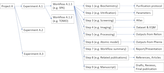
Figure 1: Example of possible organization of data and metadata in the data management platform. Each project can consist of multiple experiments, such as cryo-EM or mass-spectroscopy (viz. Protocol step 2.3). Each experiment can include multiple user-defined workflows (viz. Protocol step 2.5), each consisting of multiple configurable steps (viz. Protocol step 2.7). Please click here to view a larger version of this figure.
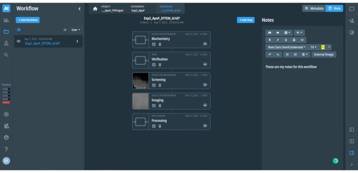
Figure 2: View at an opened project workflow in the data management platform. The figure shows associated metadata and notes to the opened step in the workflow. The left bar with icons provides quick access to different options and menus of the data management platform. The left panel includes a list of saved Workflows (shown only one saved workflow "Exp2_ApoF_EFTEM_Grid7") and a blue button to add a new Workflow. The central panel shows individual steps in the opened Workflow, as is shown for the SPA workflow here. The blue button on top right can add an additional step to the opened workflow. The right panel includes space for either recorded Metadata or user-input Notes of the workflow, which may include text, tables and images. Different formatting options for the text are available. Please click here to view a larger version of this figure.
Cryo-EM grids produced with traditional plunge-freezing devices, such as Vitrobot will typically display a gradient of ice thickness over the grid surface. Some grids can be also damaged (bent) after manual handling and/or clipping into an autogrid ring carrier. Figure 3 shows examples of different grids as shown in the Atlas overview. The grids with thick ice or damage should be excluded from further investigation.
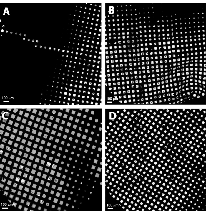
Figure 3: Gallery of different grids as seen in the Atlas overview. (A) A bad grid with thick ice, (B) a bent grid with bad ice and ice contamination, (C) an acceptable grid with good ice gradient, (D) a typical grid with good thin ice and small ice gradient. Please click here to view a larger version of this figure.
The selection of grid squares with no damage and optimal ice thickness is critical for collecting high-resolution datasets. Ice thickness may vary even at the level of individual grid squares, and it is, therefore, important to select only holes with optimally thin ice from each selected grid square. Figure 4 shows a suitable grid square with intact foil and thin ice in the center. The shown grid square is good for setting a filter for automated selection of holes with thin ice in all selected grid squares as it contains a range of different ice thickness as well as empty holes without ice, which is extremely useful for setting an appropriate range of intensity in the ice filter in the Hole Selection task.

Figure 4: An example grid square with a gradient of ice thickness, from empty grid squares in the center and thick ice near the grid bars. The filter of ice quality can be used to select the range of intensities inside holes with the ideal ice thickness that are accordingly selected in the grid square (the holes with green overlay). Please click here to view a larger version of this figure.
Benchmark results using the described protocol were obtained using the sample of mouse apo-ferritin (apoF) from the Kikkawa group11. ApoF is a highly α-helical protein that forms a very stable octahedral cage. The high stability and high symmetry make apoF an optimal sample for high-resolution cryo-EM imaging and image processing. ApoF has therefore become a standard sample for assessing the performance of cryo-EM instruments11,12,13. A frozen aliquot containing 15 mg/mL purified apoF sample was thawed on ice and clarified by centrifugation at 10,000 x g for 10 min. The supernatant was diluted to 5 mg/mL with 20 mM HEPES pH 7.5, 150 mM NaCl. 3 µL of the diluted sample was applied onto a glow-discharged R-1.2/1.3, 300 mesh gold grids for 30 s. Then the grids were blotted for 5 s before plunge-freezing into liquid ethane cooled by liquid nitrogen. Plunge-freezing was performed using a fully automated vitrification system at 100% humidity and 4 °C. All grids were clipped in autogrids and loaded into a 200 kV Cryo-TEM. About 3000 movies were collected at a throughput of 300 movies/h. Data were processed using the methods as described11 with the following modifications: i) Relion 4-beta version was used instead of Relion 3.1, ii) automated particle picking was done using 2D class averages of previous apoF reconstructions as references, and iii) the initial 3D model was generated from the previous apoF reconstruction low-passed to 15-Å resolution. Optics grouping was not done for this dataset as the used AFIS procedure34 has been proven to efficiently and reliably minimize beam-tilt induced phase shifts that do not limit data quality to reconstruct 3D maps at the reported resolutions. 3D refinement after Bayesian polishing and CTF refinement led to 1.68 Å resolution map. The resolution was further improved with Ewald sphere correction resulting in a 1.63 Å resolution map. The overview of data collection and processing parameters is shown in Table 2, and the final reconstructed density map is shown in Figure 5, with the Fourier Shell Correlation (FSC) curve shown in Supplementary Figure 8.
Table 2: Data collection and image processing parameters used for the 3D reconstruction of apo-ferritin. Please click here to download this Table.
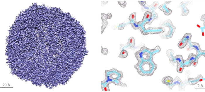
Figure 5: Cryo-EM reconstruction of apo-ferritin. (Left panel) 3D rendering of the reconstructed apoF cryo-EM map at 1.6 Å resolution. (Right panel) Detailed view of the reconstructed map at the level of individual amino acid side chains. The density of amino acid sidechains is well resolved, and the atomic model can be unambiguously built within this map. Please click here to view a larger version of this figure.
Effects and benefits of using an energy filter in the SPA reconstructions were evaluated using the prokaryotic 20S proteasome isolated from T. acidophilum. The prokaryotic 20S proteasome has been also used as a standard cryo-EM sample as it represents the stable catalytic core of the proteasome complex with the D7 symmetry. Grids were prepared by adding 4.5 µL of the purified T. acidophilum 20S proteasome sample onto a glow-discharged 200-mesh R 2/1 copper grid. Samples were vitrified in a liquid ethane/propane mixture using a fully automated vitrification system set to 4 °C and 100% humidity with blot force of 20 and blot time of 4.5 s.
Three different datasets were collected from the same cryo-EM grid with similar grid squares using a different slit width of the energy filter in the order: i) slit fully open (no slit inserted), ii) 20 eV slit and iii) 10 eV slit. The grid squares were selected using an ice quality filter within the analysis software. All other parameters for data collection and data processing were kept the same. Datasets were collected for 15 h with a total of 4000 movies and processed using the methods as described11 using Relion 3.1 with the modification that Laplacian-of-Gaussian particle picking algorithm was used to produce initial 2D class averages for reference-based particle picking from the full datasets. The same number (102,200) of randomly selected particles was chosen and used for the final iteration and 3D reconstruction of each dataset. Data processing variables are described in the table (Table 3) below to achieve the final reconstructed EM density map shown in Figure 6 with the FSC curve shown in Supplementary Figure 9. Optics grouping and Ewald sphere correction were not done for these datasets either.
Table 3: Data collection and image processing parameters used for the 3D reconstruction of the T. acidophilum 20S proteasome. Please click here to download this Table.
Table 4: Summary of achieved resolution and B-factor for cryo-EM reconstructions of the T. acidophilum 20S proteasome using datasets with different energy slit width. Please click here to download this Table.

Figure 6: Effect of energy filtering on cryo-EM images. (A) Cryo-EM images at different defocus values collected with or without 10 eV slit. (B) Overview of the 20S proteasome cryo-EM map with segmented subunits. (C) Zoom view at the 20S proteasome map with a fitted atomic model. Please click here to view a larger version of this figure.
Supplementary Figure 1: Calibration of image shifts task (yellow ellipse) to align image shifts between different optical presets (red ellipses) in the analysis software, using a crystal of hexagonal ice that is visible in the full magnification range between 100x to 165,000x. (Top) Calibration between the Data Acquisition and Hole/Eucentric Height presets, (middle) calibration between the Hole/Eucentric Height and Grid Square presets, (bottom) calibration between the Grid Square and Atlas presets. Please click here to download this File.
Supplementary Figure 2: Autostigmate function in analysis software (yellow ellipse). (Left image) Acquired image. (Right image) Fourier transfer of the acquired image showing concentric Thon rings and their CTF fit shown in radial beams. Please click here to download this File.
Supplementary Figure 3: User interface of the Autocoma function in analysis software (yellow ellipse) for coma alignment. The image panel shows Fourier transfer images acquired at different beam tilts and their CTF fits that are used for calculation of the coma. Please click here to download this File.
Supplementary Figure 4: User interface of Energy Filter tuning. Example of a good tunning report of the energy filter isochromacity with all parameters (shown in green text) within specifications. Please click here to download this File.
Supplementary Figure 5: User interface of Energy Filter tuning. Example of good tuning report of the energy filter magnification distortions with all parameters (shown in green text) within specifications. Please click here to download this File.
Supplementary Figure 6: User interface of Energy Filter tuning. Example of good tuning of the energy filter chromatic distortions with all parameters (shown in green text) within specifications. Please click here to download this File.
Supplementary Figure 7: DataViz panel of the EPU Quality Monitor with an overview of data quality in a collected cryo-EM dataset. The graphs with aggregated data from all collected images/movies show values (dot plots) and distribution (bar plots) of selected critical quality indicators, such as the CTF fit confidence (blue), defocus (orange), and astigmatism (green). A subset of the collected images/movies can be selected by setting parameter filters in the top of the DataViz panel. After applying the filters, selected images/movies can be exported for further processing in another image processing package, such as Relion or CryoSpark. Please click here to download this File.
Supplementary Figure 8: FSC curve of the final reconstruction of apoF to 1.6 Å resolution, as reported by Relion 4-beta. The blue curve shows the FSC of masked 3D maps from two independently refined 3D reconstructions from two mutually exclusive half-datasets. According to the gold standard FSC at 0.143, the resolution of the final 3D map reconstructed from the full dataset corresponds to 1.6 Å. The orange curve shows the FSC of the masked 3D reconstructions with randomized phases. The rapid drop of the FSC curve indicates that the used mask did not contribute to the observed FSC of the original reconstructed maps (blue curve) beyond ~2 Å resolution. Please click here to download this File.
Supplementary Figure 9: FSC curves of the final reconstruction of T. acidophilum 20S proteasome using different slit widths of the energy filter, as reported by Relion 3.1. The blue curves show the FSC of masked 3D maps from two independently refined reconstructions from two half-datasets of each dataset, respectively. The gold-standard FSC at 0.143 indicates the achieved resolutions of the final 3D maps reconstructed from the respective full datasets (2.3 Å, 2.2 Å, and 2.1 Å resolution, respectively). The red curves show the FSC of masked maps with randomized phases. The rapid drop of the red FSC curves indicates that the used mask did not contribute to the FSC of the original reconstructed maps beyond ~3 Å resolution. The green curves show the FSC of unmasked 3D maps, which are influenced by noise in the entire reconstructed 3D volume and therefore drop sooner than the FSC of the masked 3D maps. Please click here to download this File.
Availability of data: The cryo-EM density maps have been deposited in the EM Data Bank under accession numbers: apoferritin: EMD 14173, EMPIAR-10973. 20S proteasome: EMD 14467, EMPIAR-10976.
Discussion
The described protocol assumes that the optics of the used TEM microscope is in a well-aligned state. For the 200 kV TEM used in this Protocol, such column alignments are done, verified, and saved by an experienced service engineer after microscope installation or any significant service intervention. These alignment settings can be recalled anytime in the microscope UI. Users can use the Direct Alignment procedures in the microscope UI to re-tweak critical parameters. Some alignments, such as gun tilt and gun shift, are stable and do not need to be adjusted by users on a daily basis. Checks and re-alignments (if required) of gun tilt and shift by the microscope supervisor are advised twice a year. On the other hand, some alignments are critical and must be aligned before each data collection as described in the protocol above (such as objective astigmatism and coma-free alignment). If the Autocoma function in the analysis software fails to converge, alignment of beam tilt pivot points and/or rotation center should be verified and adjusted, and the correct centering of the C2 aperture should be confirmed. Afterward, the Autostigmate function should be run as objective stigmators are used for coma correction as well. These alignments should be iterated until both Autostigmate and Autocomafunctions succeed on their first iteration. If necessary, another area may be selected (e.g., support carbon foil without ice), imaged defocus adjusted, or image acquisition time increased to optimize the signal-to-noise ratio in acquired images, and visibility of multiple Thon rings in the Fourier transform of the acquired images.
Modern cryo-EM microscopes generate vast amounts of data that often exceed 1 TB per dataset to achieve high-resolution 3D reconstructions, particularly for proteins with low symmetry. Cryo-EM data and results are also typically complemented by data and results from orthogonal methods to fully understand structure-function relationships in each scientific project. Organization of collected data, their transfer into an image processing pipeline, and sharing of a resulting cryo-EM reconstruction among collaborators put additional requirements on new adopters of cryo-EM methodology to set up their local IT infrastructure. Data management software, such as Athena, facilitate centralized storage of data acquired by any connected instrument or software operated by a registered user. Stored data and metadata are accessible using a simple web browser interface by multiple users, who can have different roles in the project with different access rights (either as the owner, collaborator, or viewer) based on their login credentials and data sharing definition in the Experiment setup. This digitization of experimental workflows provides means for data and metadata sharing among collaborators without unnecessary duplication and increases productivity and traceability of used workflows. Implementation of a general and customizable structure of projects, experiments, and workflows in data management software is universal and allows for customization and integration of orthogonal experiments using complementary methods into a single project database.
The selection of areas for the data collection on a cryo-EM grid is critical for the successful acquisition of high-resolution datasets. Cryo-EM grids produced with traditional plunge-freezing devices, such as the Vitrobot (a fully automated vitrification system), will typically display a gradient of ice thickness over the grid surface (Figure 4). This may be beneficial as the grid contains areas with different ice thicknesses; however, areas with the ideal ice thickness for data collection must be identified as described in the protocol above. An optimal cryo-EM grid should contain as little transfer ice contamination as possible and contain enough grid squares with intact holey support foil. Collection of data on grid-squares that have cracks or broken areas is not recommended as collected images will be affected by significantly stronger overall drift upon illumination by an electron beam in comparison with the grid squares with intact support foil. Excess of crystalline ice can occlude the majority of foil-holes and/or interfere with autofocusing and such grid squares should be avoided as well. Grid squares with thin ice usually exhibit large vitreous areas and many bright foil-holes that are visible in an image taken using the Atlas preset. The occurrence of thicker ice close to grid bars is to be expected and uncritical as foil-holes in these areas of the grid square are excluded during the Hole Selection procedure. The presence of several empty holes in a grid square may signify that vitreous ice in the surrounding holes is extremely thin and may contain damaged particles or no particles at all. Generally, it is wise to choose grid squares with a variety of ice thicknesses at different regions on the grid for initial screening and assessment to understand what areas have the best conditions for high-resolution data collection and exhibit the ideal particle density and orientation distribution. For the apoF and 20S proteasome samples used in this study, areas with the thinnest observable ice contain the best conditions for high-resolution imaging of these samples.
When selecting holes automatically in all selected grid squares using the data collection software, it is advised to perform Template Execution task on a representative hole in each grid square to check and ensure that neither overly thick nor overly thin nor unexpectedly non-vitreous squares were chosen for data collection. During data acquisition, key quality indicators of collected images, such as image drift and CTF fitting, can be monitored using EQM. Data collection can then be optimized by skipping areas that yield images of poor quality. However, images with high-resolution CTF fits can still contain images with particles in a few preferred orientations or particles denatured in a too-thin ice layer. Real-time particle picking and 2D classification from collected images would provide additional information about the quality of structural data in imaged particles and reveal both preferred orientations of intact particles in ice or inconsistent structure of (partly) denatured particles. Calculation of class averages can therefore help to further refine appropriate regions for data collection, as has been already implemented and shown in other software packages23,28.
Selection of the imaging settings for data acquisition, such as magnification, electron dose rate and defocus range, depend on several criteria, such as the target resolution, size of the protein, sample concentration, desired microscope throughput, etc. For the direct electron detector camera used in these experiments, the electron dose rate was chosen in the range of 4-5 e-/pix/s by selecting an appropriate SPOT size and intensity to maintain parallel illumination. As shown in Table 1, a different SPOT size may be used in the Hole/Eucentric Height preset to assure sufficient signal-to-noise ratio in the image for centering of holes during data collection. The magnification should be chosen such that the pixel size is at least 2-3x smaller than the target resolution for the cryo-EM reconstruction. However, the higher magnification (i.e., smaller pixel size) is used, the smaller field of view is captured in images, and there are less particles per image, which ultimately leads to longer data collection time to collect images with enough particles to reconstruct 3D maps to a high resolution. For the apoF sample, we used the pixel size of 0.43 Å as we had sufficient sample concentration for high density of particles in images and aimed sub-2 Å resolution of the reconstruction. For the 20S proteasome sample, we used the pixel size of 0.68 Å to cover a larger field of view in acquired images. Typically for 200 kV TEM microscopes, cryo-EM images are acquired in the defocus range from 0.8 to 2.0 µm. However, with the improved contrast and signal-to-noise ratio using the energy filter, data acquisitions can be done much closer to focus to better preserve high-resolution information in acquired images due to smaller aberrations and correspondingly reduced decay of the CTF envelope function. We also do not use an objective aperture as the aperture may introduce additional image aberrations while image contrast is already sufficiently enhanced by using the energy filter. For the apoF and 20S proteasome samples, we used the defocus settings of 0.5 µm, 0.7µm, and 0.9 µm. For smaller proteins (<200 kDa), we used defocus settings of -0.5 µm, -0.7 µm, and -0.9 µm to improve the contrast of particles and facilitate easier particle picking and initial coarse alignment in the 3D refinement step of 3D reconstruction, which led to ~2.5 Å resolution 3D maps (unpublished results).
We have already shown that imaging with an energy filter improves signal-to-noise ratio (SNR) in cryo-EM images collected on the high-end 300-kV TEM microscopes11. In fact, when electrons pass through a sample, two main types of interactions occur: i) Elastically scattered electrons maintain their energy and contribute to image formation by interference with the non-scattered incident beam via the phase-contrast mechanism ii) inelastically scattered electrons lose some energy in the sample and contribute mainly to noise in images. Therefore, SNR can be significantly improved by filtering the inelastically scattered electrons, which have lower energy than the incident beam and elastically scattered electrons, using a narrow energy slit. However, it is critical to use a sufficiently stable energy filter, such as the Selectris or Selectris-X, to be able to use very narrow (10 eV or smaller) slits over long (12+ hours) automated data acquisition of high-resolution cryoEM datasets.
Cryo-EM images acquired with 200 kV TEM microscopes at the same conditions as with 300 kV TEM microscopes exhibit smaller SNR at high resolution (particularly <4 Å) due to faster decay of the CTF envelope functions. Consequently, a higher number of particles (and therefore a higher number of collected images) is required to achieve a certain resolution when using 200 kV TEMs. Additionally, the depth of field (10-25 nm in the 2-3 Å resolution range) is also about 20% smaller in 200 kV images35, meaning that less particles in the ice layer (typically 20-50 nm thick) will be fully in focus and constructively contribute to all high-resolution features of a calculated 3D reconstruction unless defocus values are refined for each particle independently in the later stages of the 3D reconstruction procedure. For larger particles (such as icosahedral virions or other macromolecular assemblies), the particle size may exceed the depth of field at high resolutions and introduce phase errors due to planar approximation of the Ewald sphere in the standard 3D reconstruction algorithms36. These errors can be refined by advanced algorithms that are already implemented in common cryo-EM image processing packages37,28,39. As the Ewald sphere has larger curvature in 200 kV data than 300 kV data, the Ewald sphere correction is needed at relatively lower resolutions and/or for relatively smaller macromolecular assemblies when using 200 kV TEMs. On the other hand, 200 kV images exhibit higher contrast of particles in thin ice (20-50 nm) that is significantly thinner than the 200-300 keV electron mean free path (220-280 nm). The higher contrast helps to improve the correct global alignment of individual particles, particularly for weakly scattering smaller proteins whose structure is not yet known, and the 3D reference model is not yet well established.
Here, we demonstrated on the example of a 20S proteasome that image contrast and quality could be similarly improved with an energy filter when using a 200 kV TEM microscope. Using the same number of particles, data collected using the 20 eV slit were reconstructed to 2.26 Å resolution in comparison to data collected with the fully opened energy slit that was reconstructed only to 2.34 Å resolution. The best reconstruction was achieved from data collected using the 10 eV slit that was reconstructed to 2.14 Å resolution. These results are in agreement with the theoretical prediction that filtering of the inelastically scattered electrons increases SNR in collected images and facilitates higher resolution in cryo-EM reconstructions from the given number of particles, as summarized in Table 4. These results were further confirmed by the B-factors calculated from these datasets that indicate higher quality of images in the energy-filtered datasets.
We can therefore conclude that while 300 kV TEM microscopes deliver the highest throughput and the highest possible resolution in cryo-EM reconstructions, the 200 kV TEM microscopes also provide high-quality datasets for high-resolution cryo-EM reconstructions. We showed here that the quality of acquired images, and therefore overall time-to-structure, can be further improved by using the 200 kV TEM equipped with an energy filter and a direct electron detector. The presented Protocol describes all necessary steps on how to routinely obtain high-resolution cryo-EM data using this setup and reveal fine structural details of macromolecular 3D structures, which are essential for understanding the key structure-function relationships in structural biology and structure-based drug design.
Disclosures
Sagar Khavnekar reports no conflicts of interest. The other authors are employees of Thermo Fisher Scientific, the MSD-EM division.
Materials
| Name | Company | Catalog Number | Comments |
|---|---|---|---|
| AutoGrid rings | Thermo Fisher Scientific | 1036173 | Package of 100x AutoGrid rings for the standard EM grids. |
| C-Clip | Thermo Fisher Scientific | 1036171 | Package of 100 clips that secure the standard EM grids inside the AutoGrid rings. |
| Data Management Platform | Thermo Fisher Scientific | 1160939 | Part of the Glacios base configuraiton; includes Athena Software |
| EPU Quality Monitor | Thermo Fisher Scientific | 1179770 | |
| EPU Software | Thermo Fisher Scientific | 1025080 | Part of the Glacios base configuration |
| Ethane 3.5 | Westfalen | A06010110 | Ethane gas used for making liquid ethane (puritiy at least N35, i.e. 99.95% vol) |
| Falcon 4 200kV | Thermo Fisher Scientific | 1166936 | Direct electron detector |
| Glacios | Thermo Fisher Scientific | 1149551 | 200 kV TEM |
| GloQube Plus Glow Discharge System for TEM Grids and surface modification | Quorum | N/A | also available via Thermo Fisher Scientific (PN 1160602) |
| QuantiFoil grids | Quantifoil | N/A | R-2/1, 300 mesh; carbon foil grid |
| Relion | MRC Laboratory of Molecular Biology | N/A | open source software: https://relion.readthedocs.io/en/release-3.1/ |
| Selectris with Falcon 4 for 200 kV | Thermo Fisher Scientific | 1191753 | Energy filter |
| Selectris X with Falcon 4 for 200 kV | Thermo Fisher Scientific | 1191755 | Energy filter |
| UltrAuFoil grids | Quantifoil | N/A | R-1.2/1.2, 300 mesh; gold foil grids |
| Vitrobot Mk. IV | Thermo Fisher Scientific | 1086439 | Automated vitrification system |
| Whatman 595 filter paper | Thermo Fisher Scientific | AA00420S |
References
- Wang, J., Hua, T., Liu, Z. -J. Structural features of activated GPCR signaling complexes. Current Opinions in Structural Biology. 63, 82-89 (2020).
- Chen, S., Gouaux, E. Structure and mechanism of AMPA receptor - auxiliary protein complexes. Current Opinions in Structural Biology. 54, 104-111 (2019).
- Kühlbrandt, W. Structure and mechanisms of F-Type ATP synthases. Annual Review of Biochemistry. 88, 515-549 (2019).
- Laverty, D., et al. Cryo-EM structure of the human α1β3γ2 GABA A receptor in a lipid bilayer. Nature. 565 (7740), 516-520 (2019).
- Liu, F., Zhang, Z., Csanády, L., Gadsby, D. C., Chen, J. Molecular structure of the Human CFTR ion channel. Cell. 169 (1), 85-95 (2017).
- Wrapp, D., et al. Cryo-EM structure of the 2019-nCoV spike in the prefusion conformation. Science. 367 (6483), 1260-1263 (2020).
- Ke, Z., et al. Structures and distributions of SARS-CoV-2 spike proteins on intact virions. Nature. 588, 498-502 (2020).
- Yan, R., Zhang, Y., Li, Y., Xia, L., Guo, Y., Zhou, Q. Structural basis for the recognition of SARS-CoV-2 by full-length human ACE2. Science. 367 (6485), 1444-1448 (2020).
- Walls, A. C., Park, Y. -J., Tortorici, M. A., Wall, A., McGuire, A. T., Veesler, D. Structure, function, and antigenicity of the SARS-CoV-2 spike glycoprotein. Cell. 180, 281-292 (2020).
- Chiba, S., et al. Multivalent nanoparticle-based vaccines protect hamsters against SARS-CoV-2 after a single immunization. Communications Biology. 4 (1), 597(2021).
- Nakane, T., et al. Single-particle cryo-EM at atomic resolution. Nature. 587, 152-156 (2020).
- Bai, X. C. Seeing atoms by single-particle Cryo-EM. Trends in Biochemical Sciences. 46 (4), 253-254 (2021).
- Koh, A., et al. High-resolution cryo-EM at 200kV enabled by Selectris-X and Falcon 4. Microscience Microscopy Congress 2021. , Abstract 212 (2021).
- Herzik, M. A., Wu, M., Lander, G. C. Achieving better-than-3-Å resolution by single-particle cryo-EM at 200 keV. Nature Methods. 14 (11), 1075-1078 (2017).
- Herzik, M. A., Wu, M., Lander, G. C. High-resolution structure determination of sub-100 kDa complexes using conventional cryo-EM. Nature Communications. 10 (1), 1032(2019).
- Wu, M., Lander, G. C., Herzik, M. A. Sub-2 Angstrom resolution structure determination using single-particle cryo-EM at 200 keV. Journal of Structural Biology X. 4, 100020-100029 (2020).
- Mori, T., et al. C-Glycoside metabolism in the gut and in nature: Identification, characterization, structural analyses and distribution of C-C bond-cleaving enzymes. Nature Communications. 12 (1), 6294(2021).
- Hamdi, F., et al. 2.7 Å cryo-EM structure of vitrified M. musculus H-chain apoferritin from a compact 200 keV cryo-microscope. PLoS One. 15 (5), 0232540(2020).
- Abbott, S., et al. EMDB web resources. Current Protocols in Bioinformatics. 61 (1), 1-12 (2018).
- Punjani, A., Rubinstein, J. L., Fleet, D. J., Brubaker, M. A. CryoSPARC: algorithms for rapid unsupervised cryo-EM structure determination. Nature Methods. 14 (3), 290-296 (2017).
- Scheres, S. H. W. RELION: Implementation of a Bayesian approach to cryo-EM structure determination. Journal of Structural Biology. 180 (3), 519-530 (2012).
- Gómez-Blanco, J., et al. Using Scipion for stream image processing at Cryo-EM facilities. Journal of Structural Biology. 204 (3), 457-463 (2018).
- Tegunov, D., Cramer, P. Real-time cryo-electron microscopy data preprocessing with Warp. Nature Methods. 16 (11), 1146-1152 (2019).
- Lander, G. C., et al. Appion: an integrated, database-driven pipeline to facilitate EM image processing. Journal of Structural Biology. 166 (1), 95-102 (2009).
- Carragher, B., et al. Current outcomes when optimizing 'standard' sample preparation for single-particle cryo-EM. Journal of Microscopy. 276 (1), 39-45 (2019).
- Drulyte, I., et al. Approaches to altering particle distributions in cryo-electron microscopy sample preparation. Acta Crystallographica. Section D, Structural Biology. 74 (6), 560-571 (2018).
- Bloch, M., Santiveri, M., Taylor, N. M. I. Membrane protein Cryo-EM: Cryo-grid optimization and data collection with protein in detergent. Methods in Molecular Biology. 2127, 227-244 (2020).
- Cheng, A., et al. Leginon: New features and applications. Protein Science. 30 (1), 136-150 (2021).
- Schorb, M., et al. Software tools for automated transmission electron microscopy. Nature Methods. 16 (6), 471-477 (2019).
- Li, X., et al. Electron counting and beam-induced motion correction enable near-atomic-resolution single-particle cryo-EM. Nature Methods. 10 (6), 584-590 (2013).
- Alewijnse, B., et al. Best practices for managing large CryoEM facilities. Journal of Structural Biology. 199, 225-236 (2017).
- Baldwin, P. R., et al. Big data in cryoEM: automated collection, processing and accessibility of EM data. Current Opinion in Microbiology. 43, 1-8 (2018).
- Guo, H., et al. Electron-event representation data enable efficient cryoEM file storage with full preservation of spatial and temporal resolution. International Union of Crystallography Journal. 7, 860-869 (2020).
- Weis, F., Hagen, W. J. H. Combining high throughput and high quality for cryo-electron microscopy data collection. Acta Crystallographica. Section D, Structural Biology. 76 (8), 724-728 (2020).
- Zhou, H., Chiu, W. Determination of icosahedral virus structures by electron cryomicroscopy at subnanometer resolution. Advances in Protein Chemistry. 64, 93-124 (2005).
- DeRosier, D. J. Correction of high-resolution data for curvature of the Ewald sphere. Ultramicroscopy. 81 (2), 83-98 (2000).
- Wolf, M., DeRosier, D. J., Grigorieff, N. Ewald sphere correction for single-particle electron microscopy. Ultramicroscopy. 106 (4-5), 376-382 (2006).
- Leong, P. A., Yu, X., Hong Zhou, Z., Jensen, G. J. Correcting for the ewald sphere in high-resolution single-particle reconstructions. Methods in Enzymology. 482, 369-380 (2010).
- Zivanov, J., et al. New tools for automated high-resolution cryo-EM structure determination in RELION-3. eLife. 7, 42166(2018).
Reprints and Permissions
